
Today we're here with a basket of happiness!! :-) Yes, the announcement would definitely make your day and would be a reason to be highly delighted fo...
Today we're here with a basket of happiness!! :-) Yes, the announcement would definitely make your day and would be a reason to be highly delighted for.
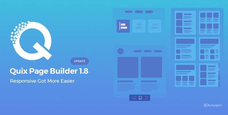
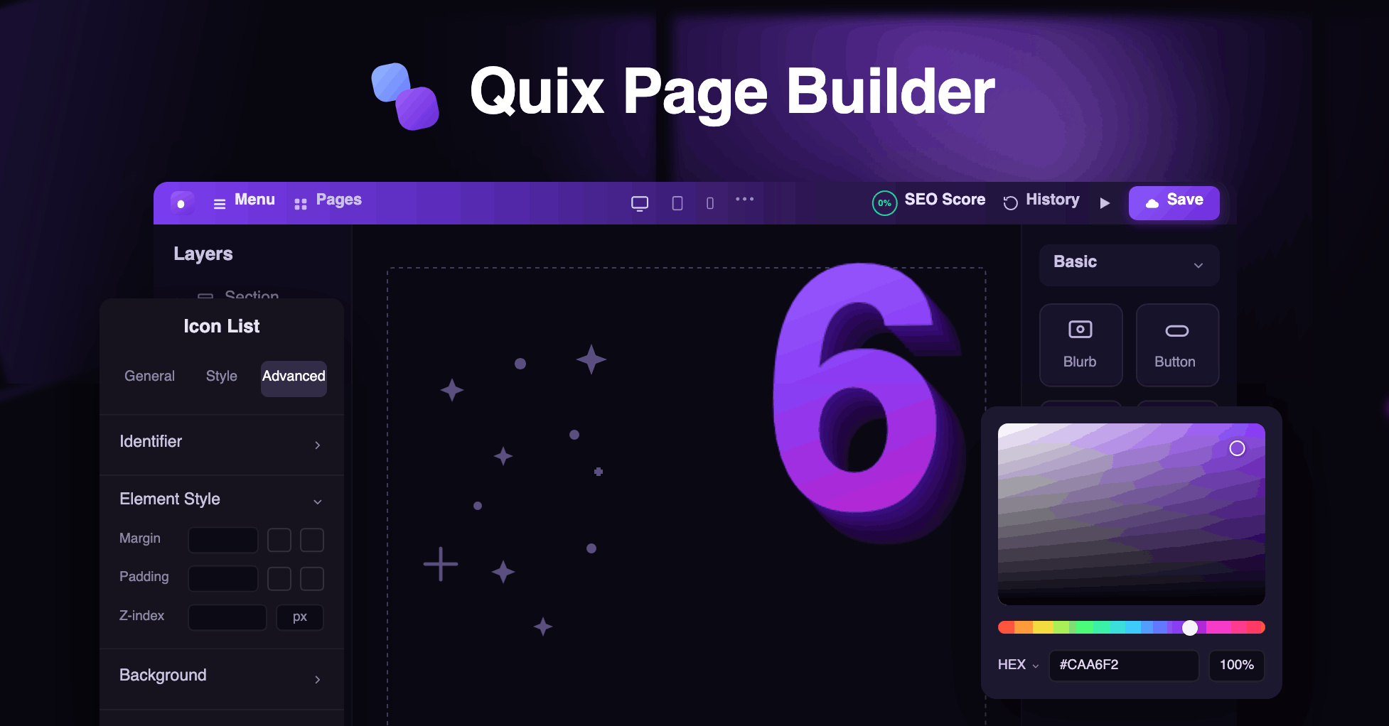
Your favorite Quix Pagebuilder has been upgraded in v1.8.1 with a bunch of cool features, and it would undoubtedly change your web building experience forever. Quix now allows you to control device responsiveness from the back-end and got improvements in its overall UI.
In addition- 15 of our Joomla templates got improvised with fixing sort of previous issues and much more. The list of updated Joomla templates including their detail changelog will be found below.
It is clear that Quix has been satisfied you with its shiny features and functionalities since its appearance. The tons of appreciations and love from all of you guys have already proved it, and your feedbacks are always behind the reason we remain inspired. We are continuously working hard to meet you the best thing so that you can reside with the most recent technology as close as possible.
Let's not talk about something else and explore Quix v1.8.1
Responsive Fields Value
Quix already does have the ability to represent each content in an ever responsive way, based on different screen sizes. But who cares about the default responsive control and what if- you want your site behaves according to the way you like? Scratching your head thinking- Quix surely fails in that case?
Well, you are not right, unfortunately. Grab Quix v1.8 and the extreme power is yours. So, how your site is suppose to behave in various devices- is now entirely your wish. This is the very first time you can control responsiveness of your own, exactly how you like.
This is a long known fact that the fundamental goal of being responsive is to make sure the most appropriate content alignment including padding and margin based on different smart devices. This time in Quix- each Section, Column, Row, and Elements comes with an additional control option which lets you apply changes for particular devices with ease.
Responsive Toolbar

Preparing the site- Device Responsive is a must for web development business, but the effort behind doing so isn't that enjoyable, we know. We give values to each of your second.!
So we have introduced Quix 1.8 with the Responsive Toolbar at its front-end, and you are beyond requiring multiple devices to check your site responsiveness. Select the device, and you can see the preview according to that selected device right away.
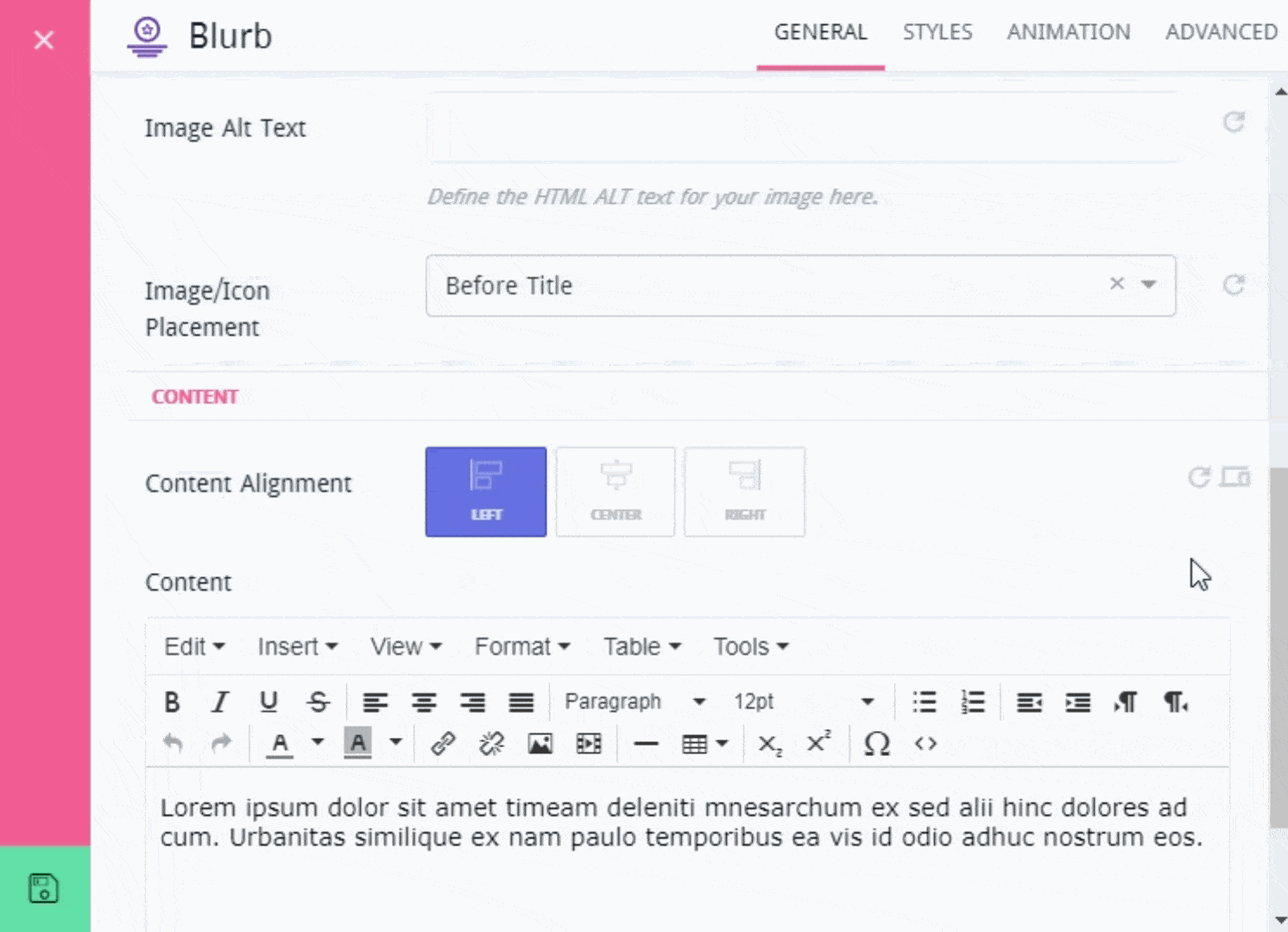
Image Selector
Wouldn't it be great if you visually can see what changes you are going to apply to the content? Definitely it would be..!
Keeping this thought in mind, we have included a small preview image with content alignment and some other options as well. So, no chance for uncertainty while you already know what's going to happen with the content you are applying change for.
Column Reverse for Mobile Devices
Mobile responsiveness is crucial for any website, since almost half of the total amount of traffic we get from mobile devices.
But in case of mobile preview, do you ever feel- "it would be more meaningful and lucrative if the column content is appearing at the bottom, would appear at the beginning"? We know, sometimes you feel that way and having felt your need, this time we have included this option with Quix at your disposal.
The Reverse option allows you to toggle the column order for mobile preview. You are just one click behind. Isn't that great? Indeed it is.!
Nested Column Re-structure

Suppose- you are hoping to add four elements on a column, and you want only the first element to take the full column width. The rest of them are to appear side by side.
Seems a complex thinking, right? But, who guarantees- any of you wouldn't need that way?
In case of multiple elements inside a column, they used to appear one below one, earlier. But you're fortunate enough even to make that complicated thinking come true with this current version of Quix. Its introduced with the new column structure that is able to let you take columns inside a column in the way you like. So, no more stuck in designing with Quix, only the sky is the limit.
New Quix Module
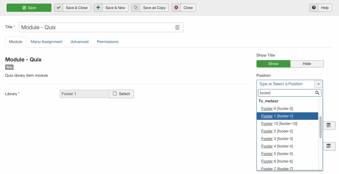
Showing a Quix Library on the website's front-end is no longer requiring to insert its shortcode from the editor. This time Quix has brought a brand new Module which allows you to show any quix library- anywhere on the front-end just by defining its position.
Besides, if you are thinking of the previous approach is right for you, even that is possible. Its entirely your wish what approach you are comfortable with.
SEO Meta tag Options
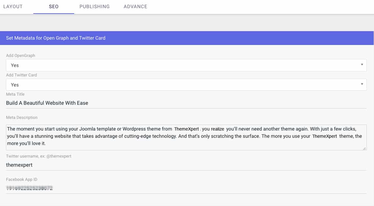
Every Quix page now contains this option to let you define the meta information for the page. Elase, you can disable this if you wish to.
Border Option for Section Row and Column
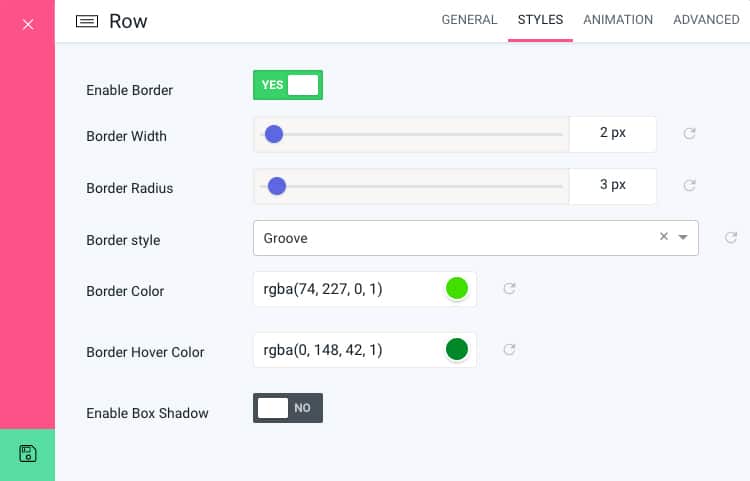
Previously in Quix, the user were unable to apply border on a section, row or even on a column. But they were feeling its urgency. So, as soon as we got to know the user desire for this feature, we started working to bring it in Quix, and so it is.
Applying border on a section/ row/ column is just a click away. You can choose border style, radius, width, color, hover color and much more. Its like- you have limitless possibilities to customize and consider which looks matches your site best.
Much faster and lightweight UI- reduced 70% Size
Quix is now faster than ever before and has significantly been reduced in size. Its because to ensure your fastest and most flexible working experience. So, working with your beloved pagebuilder is now like a fun playing.
Improved all element's overall UI
Besides, you will find a massive improvisation on every of its elements overall UI, and enjoy working with them.
Now, let's have a look at Quix v1.8 detail Changelog.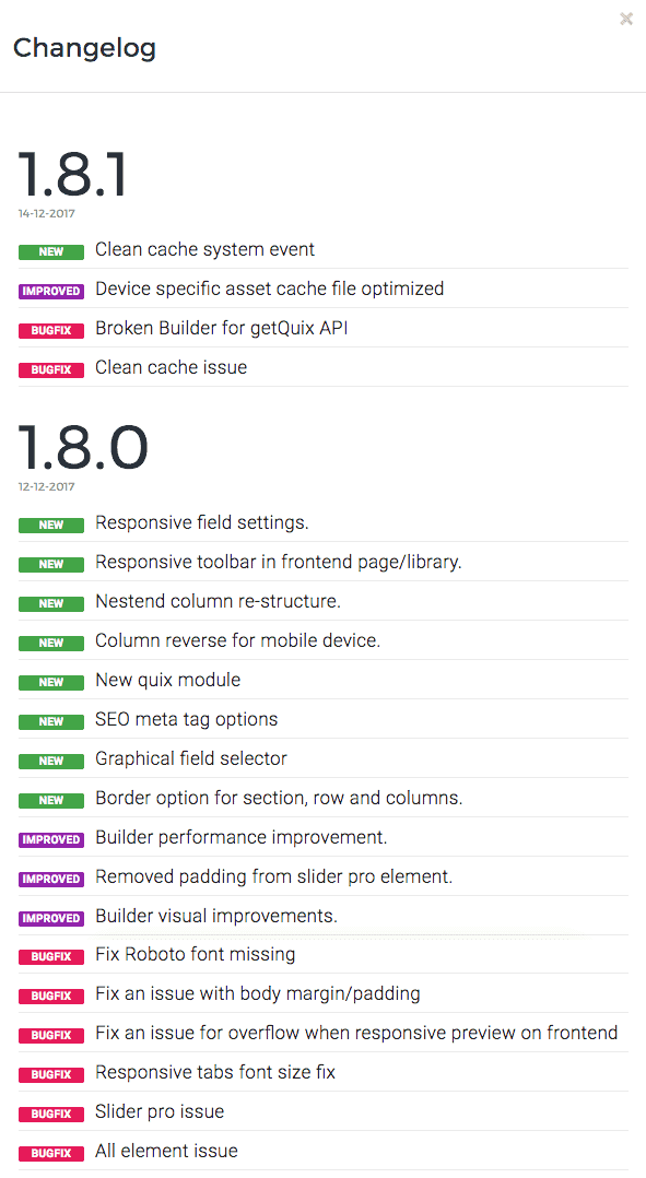
At-a-Glance Updated Templates
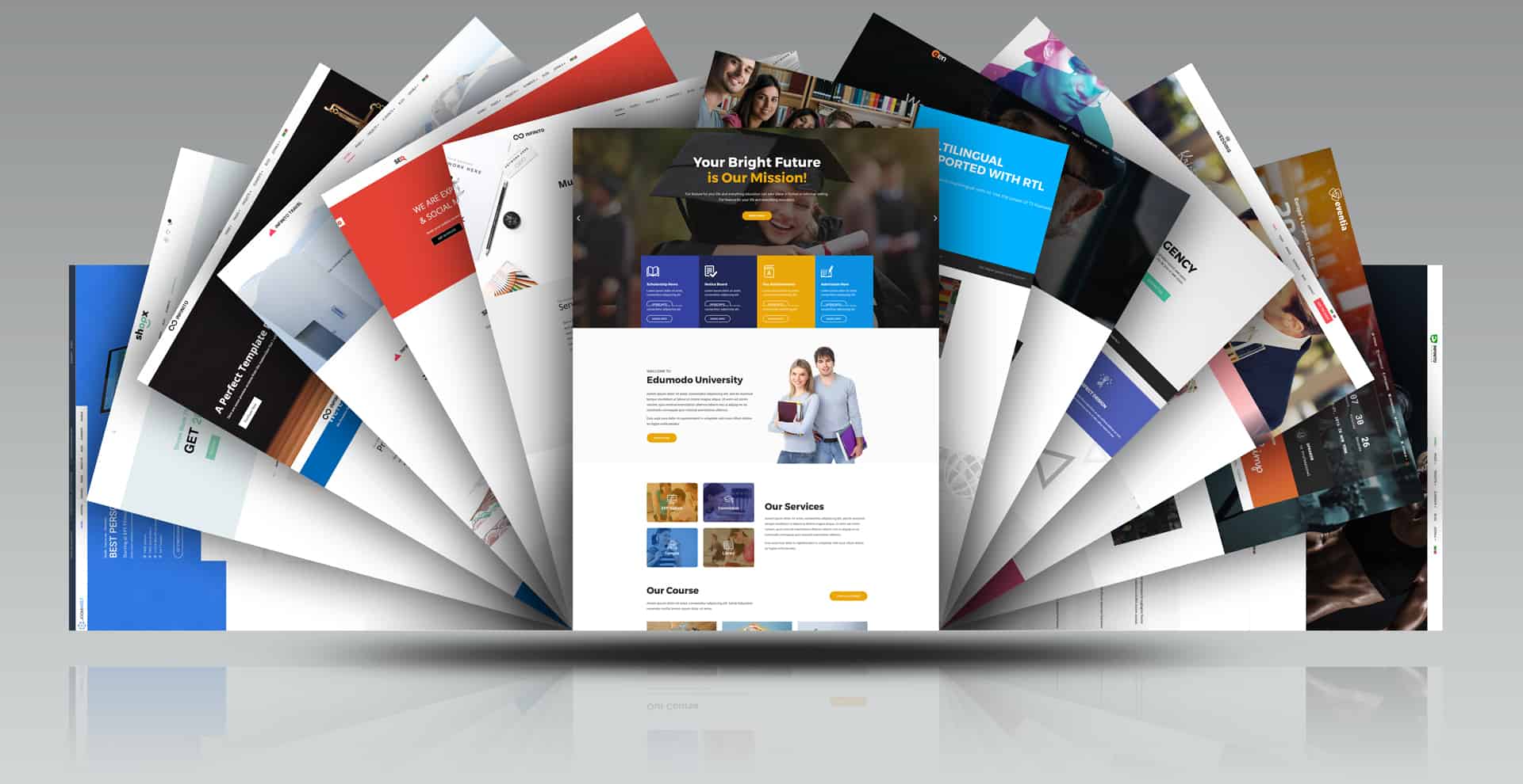
The last couple of weeks, dedicatedly we were working to introduce Quix v1.8. Concurrently we're busy- updating fifteen of our most desired Joomla templates and were planning to unfold in a row. So, here they come.
Edumodo Joomla Template got the integration with the most popular LMS component Shika. The rest of the templates got updated with fixing previous issues including the improvements to the overall functionalities.
Find the list of all templates with their changelog below.
Updated Templates
1. Always take a full backup of your website first.
2. Update your template first before update Quix. If you are not using our template, please consult with your template developer before update. If they have Quix override, you may experience fatal error.
Conclusion
Our goal is to make Quix able to satisfy all your wants and needs possibly reduce your effort. Restlessly we are working towards the aims to make it possible as soon as possible. If you have any suggestion or specific requirements- wish to experience in its upcoming version, the below comment section is all yours. Be smart, be Quix!!