

Welcome to the third part of our 2-weeks series post about Exploring Quix. Today, I am going to show you how can enable responsive mode and efficiently use Quix to build a perfect responsive website.There is no doubt about the importance of responsive design, in the point of view of today's web designing strategy.Before the spread of smartphones and tablets, the only concern of web designers was to deal with keeping the same look of the websites in computer screens.However, as time passes the use of mobile devices such as smartphones, tablets are rapidly increased, and The Research shows that mobile internet users grow massively by 2015 with an increase of 16% from 2010, and the percentage is rising day by day.While building a responsive website you have to follow some procedures because responsive design requires some different approaches.>Either you are a web designer or a developer, it is quite challenging to you to build a responsive site. But the Quix page builder lets you do everything without taking any challenges because we meet all the challenges that you might be going to faced.Quix has changed the way of building a responsive website. With Quix you can visually design your website for every screen size.While other page builders use display: none to hide something from mobile users, Quix lets you define the different layout for different size screens.Even you can hide something for a particular screen using the element visibility option.For example, if you don't want to show a particular item or a section on mobile devices just turn the visibility off for those, Quix will never load that element for that screen. Therefore, the mobile pages will be lighter, smaller and load faster.Let's see how Quix responsive mode works!## How to Enable Quix Responsive Mode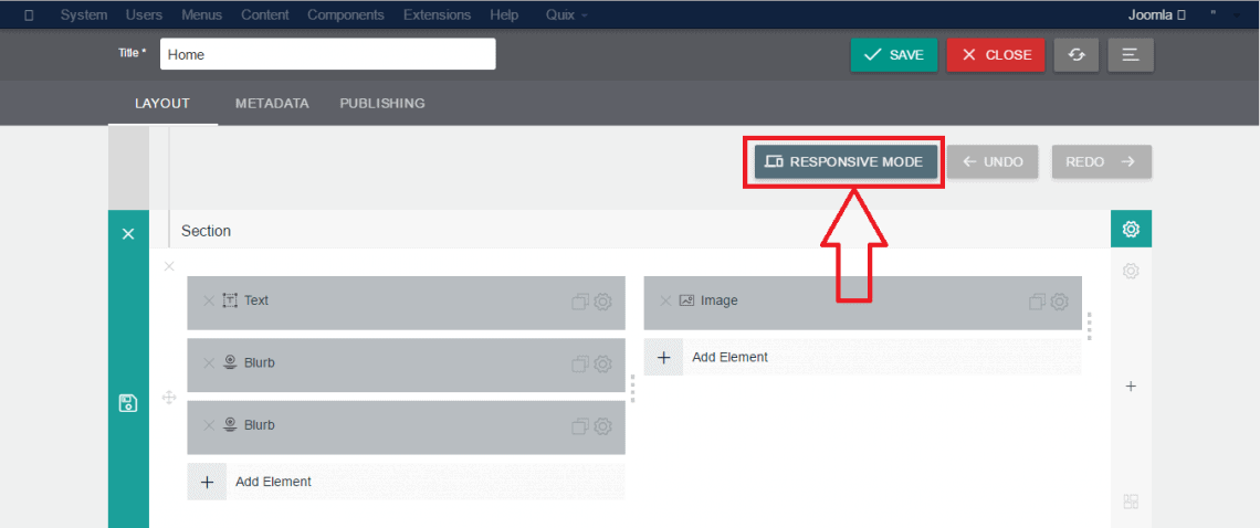 At the very beginning step, you need to enable the responsive mode as this functionality has not enabled by default.Just look at the top most of your Quix admin panel. The Responsive Mode button will be caught by your eyes apparently. Click on it.## Visually Design Responsive Website with Quix
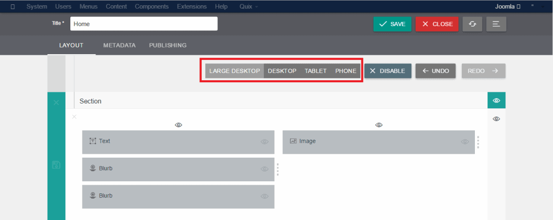 Do you enable the responsive mode from your Quix admin area?If yes, then you can see the setting options for different screen size such as Large Desktop, Desktop, Tablet, and Phone.Now design the layouts for different screens. The image in below shows the layout of the screen of tablets.
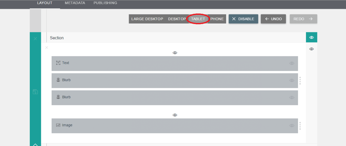 ## Visibility OptionAs I give a hints about Quix visibility in before you may get some idea about this functionality. Let's dig into it.
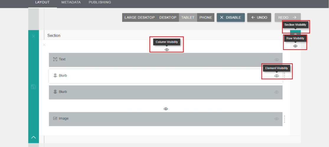 You can control four types of visibility with Quix. These are Section visibility, Row visibility, Column visibility, and Element visibility.>These controlling options indicate that the power is in your hand.You can control anything including a section, row, column and elements with the most powerful Quix page builder.
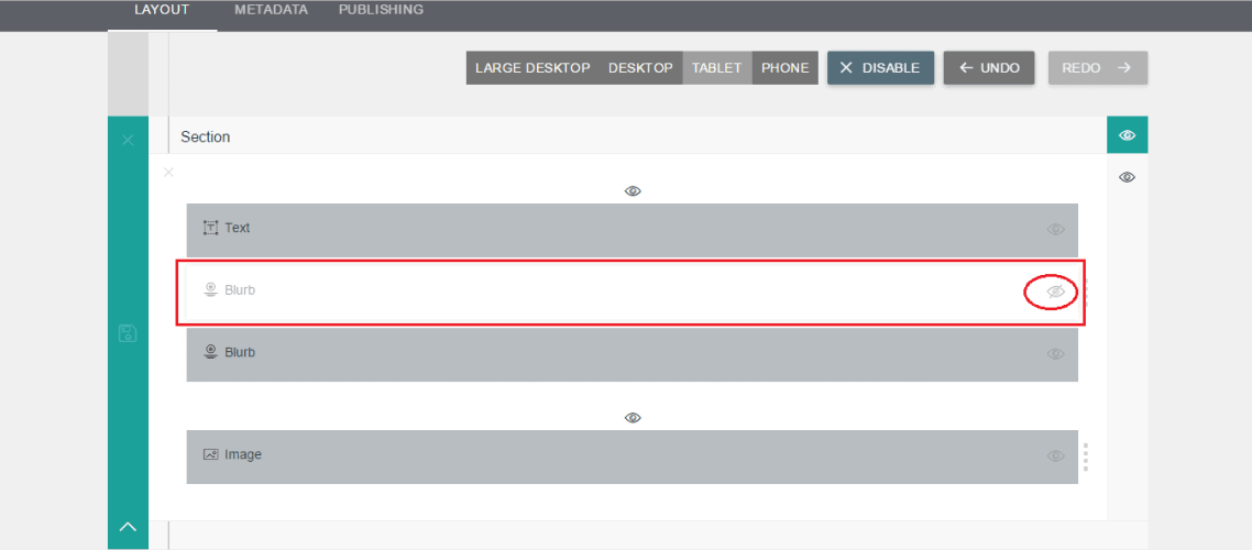 So, why you are waiting for?If you don't have responsive design in your Joomla site, you need it because according to the new strategy of Google the search rankings will decrease if a website doesn't meet the responsive designing strategy.In case of you miss the previous parts, here is these:First Part: Understanding Quix's structure and How You Can Use Them EffectivelySecond Part: Built-in Pages And How You Can Get Started Faster## Wrapping UpQuix will help you to go this way with the fastest process even if you are not a coding enthusiast. The user-friendly layout will speak out automatically that expose almost everything to its users.Hope you have found this article helpful and now can efficiently use the Quix page builder to build a perfect and responsive Joomla website. Leave your query through the comment section in below. We will be glad to hear from you about your experience or any opinion regarding Quix.Next: How To Enable & Disable Quix Elements
Welcome to the third part of our 2-weeks series post about Exploring Quix. Today, I am going to show you how can enable responsive mode and efficiently use Quix to build a perfect responsive website.
There is no doubt about the importance of responsive design, in the point of view of today's web designing strategy.
Before the spread of smartphones and tablets, the only concern of web designers was to deal with keeping the same look of the websites in computer screens.
However, as time passes the use of mobile devices such as smartphones, tablets are rapidly increased, and The Research shows that mobile internet users grow massively by 2015 with an increase of 16% from 2010, and the percentage is rising day by day.
While building a responsive website you have to follow some procedures because responsive design requires some different approaches.
Either you are a web designer or a developer, it is quite challenging to you to build a responsive site. But the Quix page builder lets you do everything without taking any challenges because we meet all the challenges that you might be going to faced.
Quix has changed the way of building a responsive website. With Quix you can visually design your website for every screen size.
While other page builders use display: none to hide something from mobile users, Quix lets you define the different layout for different size screens.
Even you can hide something for a particular screen using the element visibility option.
For example, if you don't want to show a particular item or a section on mobile devices just turn the visibility off for those, Quix will never load that element for that screen. Therefore, the mobile pages will be lighter, smaller and load faster.
Let's see how Quix responsive mode works!
How to Enable Quix Responsive Mode
At the very beginning step, you need to enable the responsive mode as this functionality has not enabled by default.
Just look at the top most of your Quix admin panel. The Responsive Mode button will be caught by your eyes apparently. Click on it.
Visually Design Responsive Website with Quix
Do you enable the responsive mode from your Quix admin area?
If yes, then you can see the setting options for different screen size such as Large Desktop, Desktop, Tablet, and Phone.
Now design the layouts for different screens. The image in below shows the layout of the screen of tablets.
Visibility Option
As I give a hints about Quix visibility in before you may get some idea about this functionality. Let's dig into it.
You can control four types of visibility with Quix. These are Section visibility, Row visibility, Column visibility, and Element visibility.
These controlling options indicate that the power is in your hand.
You can control anything including a section, row, column and elements with the most powerful Quix page builder.
So, why you are waiting for?
If you don't have responsive design in your Joomla site, you need it because according to the new strategy of Google the search rankings will decrease if a website doesn't meet the responsive designing strategy.
In case of you miss the previous parts, here is these:
First Part: Understanding Quix's structure and How You Can Use Them Effectively
Second Part: Built-in Pages And How You Can Get Started Faster
Wrapping Up
Quix will help you to go this way with the fastest process even if you are not a coding enthusiast. The user-friendly layout will speak out automatically that expose almost everything to its users.
Hope you have found this article helpful and now can efficiently use the Quix page builder to build a perfect and responsive Joomla website. Leave your query through the comment section in below. We will be glad to hear from you about your experience or any opinion regarding Quix.
Next: How To Enable & Disable Quix Elements