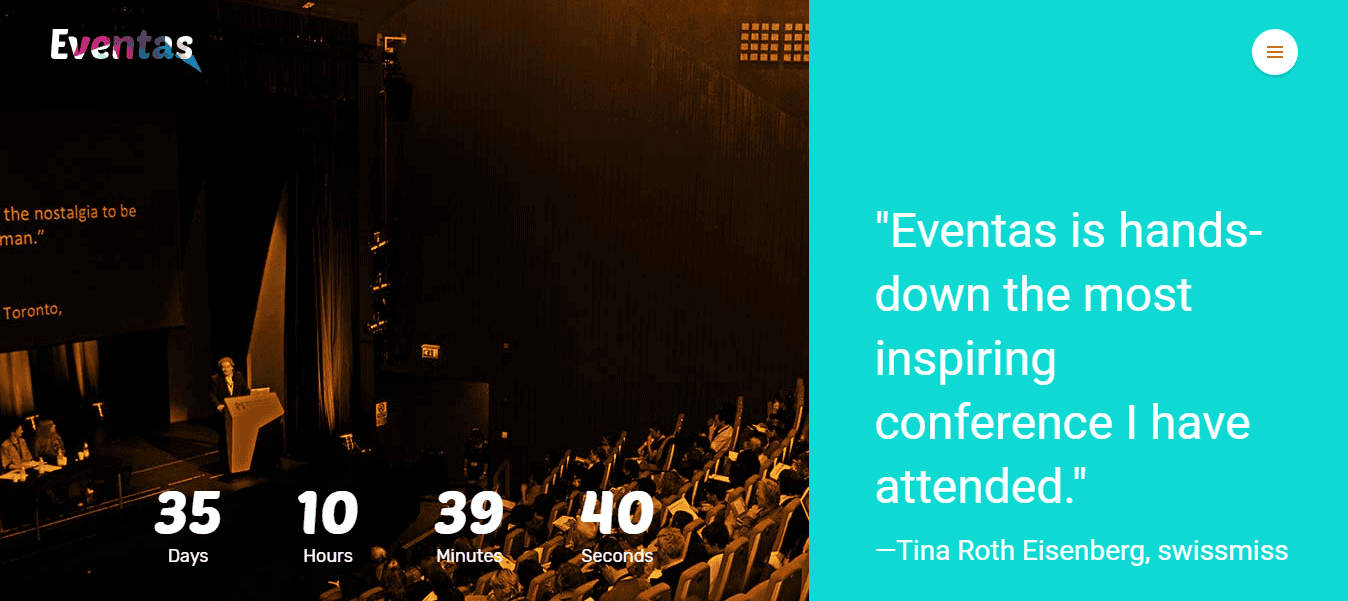
Eventas
A pre-SEO optimized and responsive Joomla template with 7 interactive homepage variations, crafted beautifully for event management websites.
Key Features
- Fully Responsive
- Fast Loading
- One Click Demo Import
- Stunning Layout
- Multiple Attractive Home Variations
- Huge Built-in Pages
- SEO Optimized
- RTL Supports
- Dynamic Navigation Menu
- Smooth Collapsing Transaction
- Quick Social Sharing
- Multiple Social Commenting
- Revolution Slider and Carousel
- Drag and Drop page builder
- Color Variations
- Sticky Headers
- Eye-catching Slider
Requirements
In order to run Eventas smoothly on your server, you need to fulfill this requirement listed below:
- Wordpress: 3.9+
Download
Head over to Eventas download page on www.themeforest.net then download the EventasPackage.zip file. In this .zip file, you have everything you need.
Installation
Installing WordPress
To install this theme, you must have a working version of WordPress already installed on your server. If you need help installing WordPress, go through the link and follow the instructions: Installing WordPress
Installing Theme
There are a couple of simple steps to install Eventas theme on your server. Its quite straightforward.
If you are starting from the scratch, we recommend you to follow the installation guide below to install with the pre-built existing demo data. This is the simplest way to get started.
On the other hand, if you already have an existing WordPress site and want to apply Eventas theme, in that case, you just need to install the following package:
- eventas.zip
You can find this package inside the downloaded .zip file of Eventas theme. So, before getting started with the installing process, Extract the .zip file and you'll find the desire eventas.zip in the Theme folder after the extraction.
- Log in to the WordPress Administration Panels.
- Now, go to
Appearance> Themes> Add New> Upload Themethen click on the Choose File button then select the eventas.zip file and hit upload. - After installation being done, roll over to
Appearance> Themes. - Find just uploaded theme on the Theme Thumbnail area.
- Click the Activate button below to the theme's thumbnail, to set it as default.
Do not forget to Activate the theme as default after installation process successfully been done.
To know more, visit WordPress Codex
Installing Child Theme
If you plan to modify the source code of the main parent theme (php, js, style.css) we strongly recommend to install this child theme and make such modifications inside this child theme in order to avoid any possible problems & issues by installing updates of Eventas main parent theme in future. You can find this child theme in Theme folder – please look for eventas-child.zip.
The installation of the child theme works in the same way as the installation of the main parent theme (see description above).
DON’T TRY TO INSTALL CHILD THEME IF THE MAIN THEME IS NOT INSTALLED YET. THIS WILL GIVE NO RESULT!
Alternative: Upload Eventas via FTP
In case you wish install the theme via FTP, proceed as follows:
- Unzip eventas.zip
- Login to your hosting space via an FTP Client
- Upload the whole contents of the unzipped eventas.zip into wp-content/themes/ folder under your WordPress installation.
- Once you’ve uploaded the theme you can open Appearance → Themes page and activate the theme from list. After that you need to install and activate the plugins as described above.
Active Required Plugins
There are four plugins, required for Academia theme to work properly. Those are listed below:
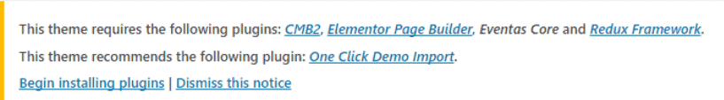
- Eventas Core: Theme Core Functionality (CPTs and shortcodes).
- CMB2: The metabox framework we used to create metaboxes.
- Elementor: Drag and Drop page builder.
- Redux Framework: The option framework we used to create options panel.
- (recommended)One Click Demo Import : Import demo data with one click.
- (recommended)Contact Form 7 : For creating the contact form.
Before activating those plugins, you have to install them manually. To do so,
- Go to
Appearance> Install Plugins - Select those required plugins.
- From the drop-down menu, select Install and click on Apply.
After plugins installation been completed, to activate those required plugins, simply go to Plugins> Installed Plugins
- Select all those required plugins.
You can use the search module to find the desired plugins. The search box can be found on the right-top side of the module.
- Select Activate from the drop-down menu just above the list of plugins.
- Click to the Apply button next to the drop-down box and you are done.
To know more about the installation process of plugins, visit here: WordPress Codex
If there is any problem with automatic plugin installation, install them manually. You can find plugin bundle in your theme's /lib/plugins subdirectory. WooCommerce and Contact Form 7 can be found in WordPress plugins repository, install them through Plugins Screen
Import Demo Data
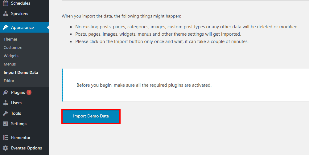
- Log in to the WordPress Administration Panels.
- Go to
Appearance> Import Demo Data - Just click on the Import Demo Data button below of the module and it’ll successfully import with taking a minimum amount of time.
You can import demo data manually with the following procedures.
- Log in to the WordPress Administration Panels.
- Go to
Tools> Import - Select the WordPress from the list. It can be found at the bottom of the list of plugins, normally.
- Install the WordPress Importer plugin, if you haven't installed it yet.
- After being installed, click on Run Importer to open the module.
It allows you to select the demo data file from your local drive and upload into your server.
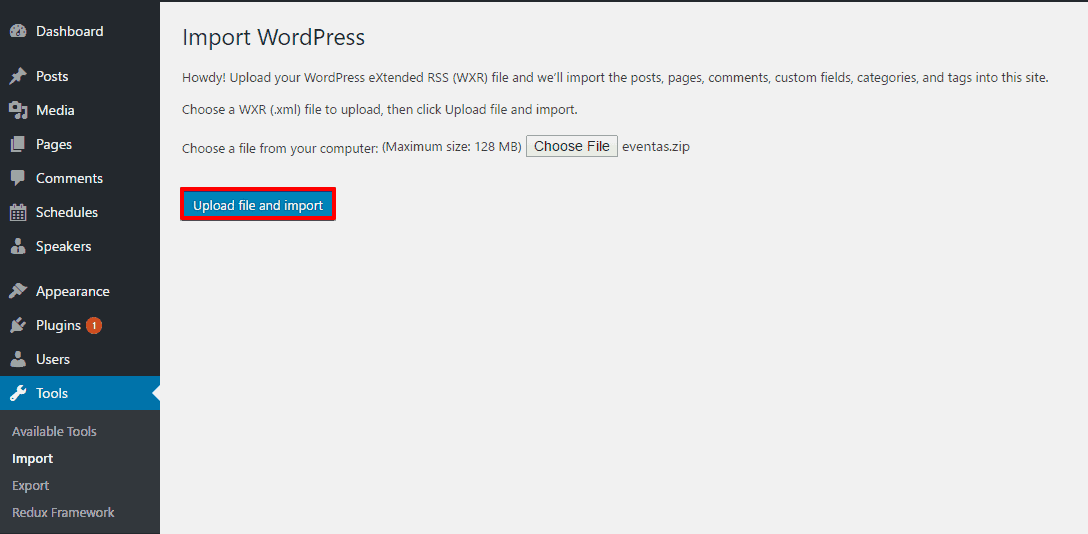
- Now, click on Choose File. Once you click on it, it prompts up a screen, allowing you to select the demo data file from your local drive.
- Choose the eventas-content-demo.xml file and click Upload file and import
Demo data files can be found in Demo folder after you extract the theme package and the path should be
/Demo/eventas-content-demo.xml.
- On the second screen, set up an author and don't forget to check the Download and import file attachments. After making sure it is checked in, click on Submit button.
You can also import widget setting via this widget Importer Plugin
Widget setting file can be found in Demo folder after you extract the theme package and the path should be
/Demo/widget_data.jason.
Theme Options
Eventas has an advanced admin panel for Theme Options, which gives you plenty of options and settings to customize your website. Go to Dashboard -> Eventas Options and you will get Eventas admin panel. All settings are organized in logical sections and have brief descriptions of what they do. A lot of these settings are self explanatory.
Things to Remember
- Always click on Save Changes in order to make your settings take effect.
- By clicking on Reset Section you can reset current section you are customizing and with Reset All you can reset all your settings to the defaults.
- You can always make a backup and/or restore your settings by using Import/Export option in admin panel. So you can freely experiment with all of Eventas options without having fear to loose some of them.
- Please Note: in order to ensure the correct working of theme options (saving your style changes) all caching plugins you may be using on your website should be better deactivated. After you are done with your changes you can activate this caching plugins again.
General
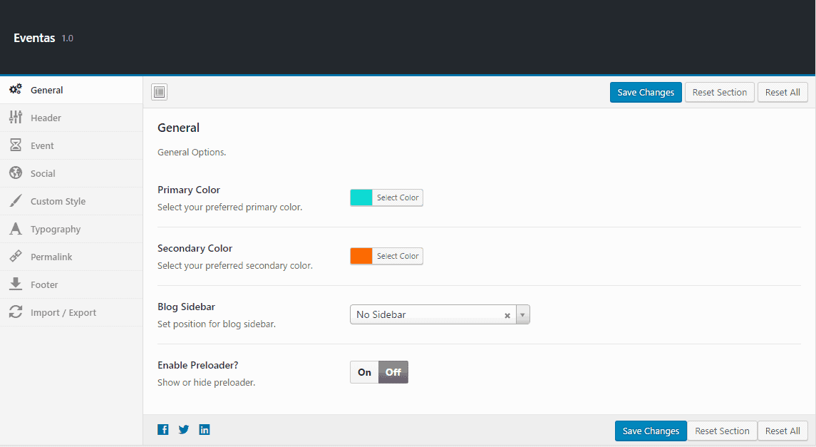
- Primary Color : Choose your preferred color to set as the theme primary color.
- Secondary Color : Choose your preferred color to set as the theme secondary color.
- Blog Sidebar : Set a position for the blog sidebar.
- Enable Preloader? : Allows you to enable or disable preloader animation.
Header
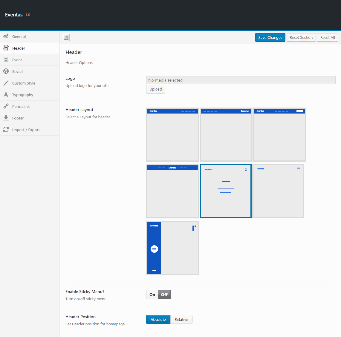
- Logo : Upload a logo for your site branding.
- Header Layout : Choose a header layout style from the previews.
- Enable Sticky Menu : Allows you to either enable or disable sticky menu.
- Header Position : Define the position for the header.
Event
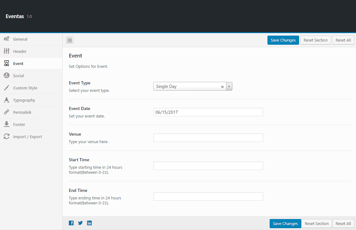
- Event Type : Select your event type, Single Day or Multiple Days.
- Event Date : If you select “Single Day” in event type you will find this option to set the event date with a date picker.
- Venue : Write your event venue address to show in Countdown Add-on.
- Start Time : Set starting time of your event in 24 hours format(Between 0-23).
If you select “Multiple Days” in event type you will find this option to set starting date of your event with a date picker.
- End Time : Set ending time of your event in 24 hours format(Between 0-23).
If you select “Multiple Days” in event type you will find this option to set ending date of your event with a date picker.
Social
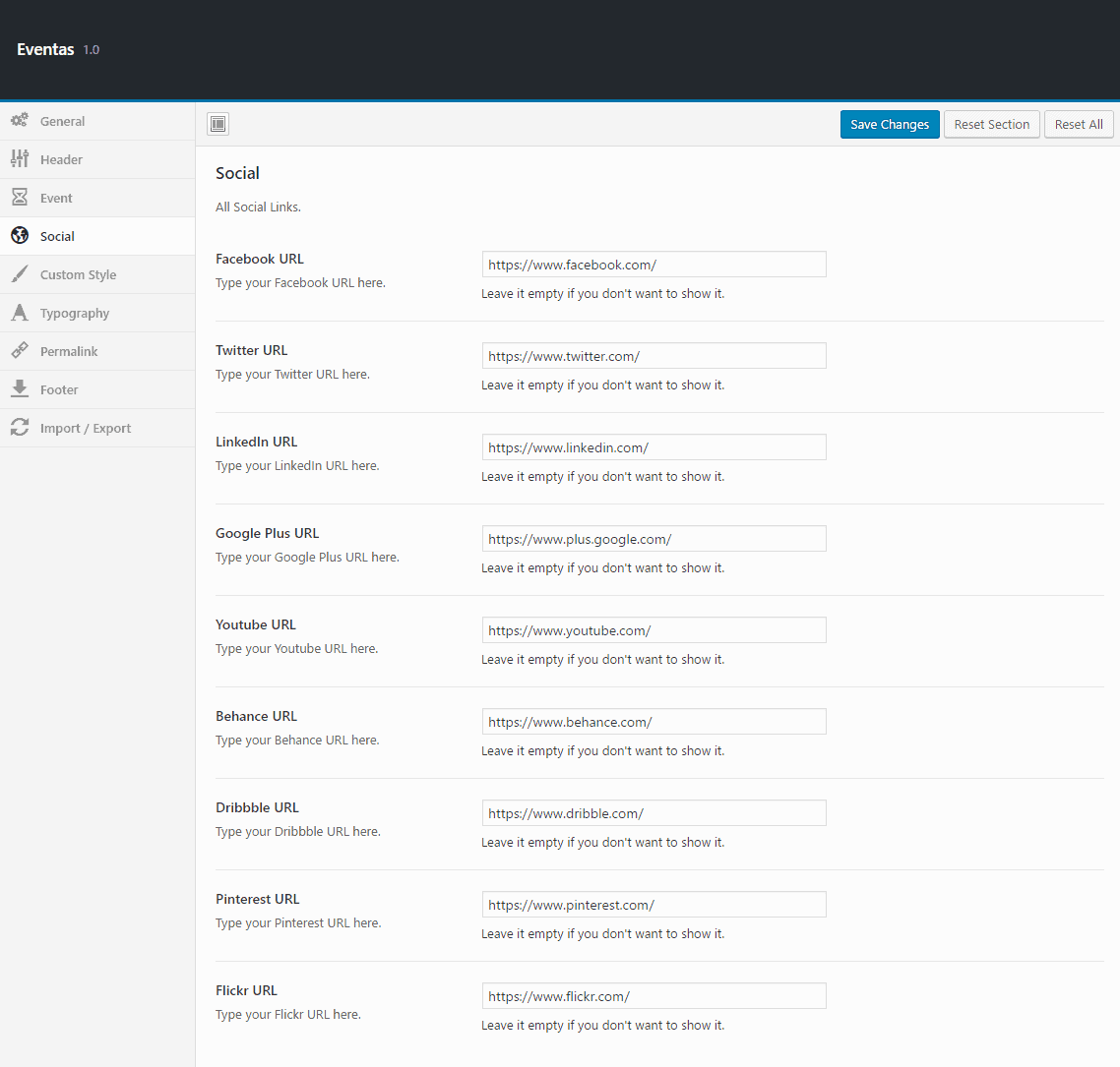
You will find empty text boxes to put all the common social media links. Just put the corresponding link in their particular field.
- Facebook URL : Put your Facebook profile URL here.
- Twitter URL : Put your Twitter profile URL here.
- LinkedIn URL : Put your Linkedin profile URL here.
- Google Plus URL : Put your Google Plus profile URL here.
- Youtube URL : Put your Youtube profile URL here.
- Behance URL : Put your Behance profile URL here.
- Dribble URL : Put your Dribble profile URL here.
- Pinterest URL : Put your Pinterest profile URL here.
- Flickr URL : Put your Flickr profile URL here.
Custom Style
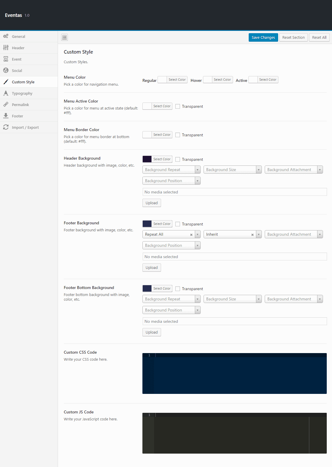
- Menu Color : Choose your preferred color for the navigation menu.
- Menu Active Color : Pick a color for menu active state.
- Menu Border Color : Change menu bottom border color which you can see on active and hover.
- Header Background : Set custom background in Header. You can set color or image.
- Footer Background : Set custom background in Footer. You can set color or image.
- Footer Bottom Background : Set custom background in footer bottom area. You can set color or image.
- Custom CSS Code : Write your custom CSS code here.
- Custom JS Code : Write your custom JavaScript code here. If you want to use jQuery, please write “jQuery” instead of “$” sign.
Typography
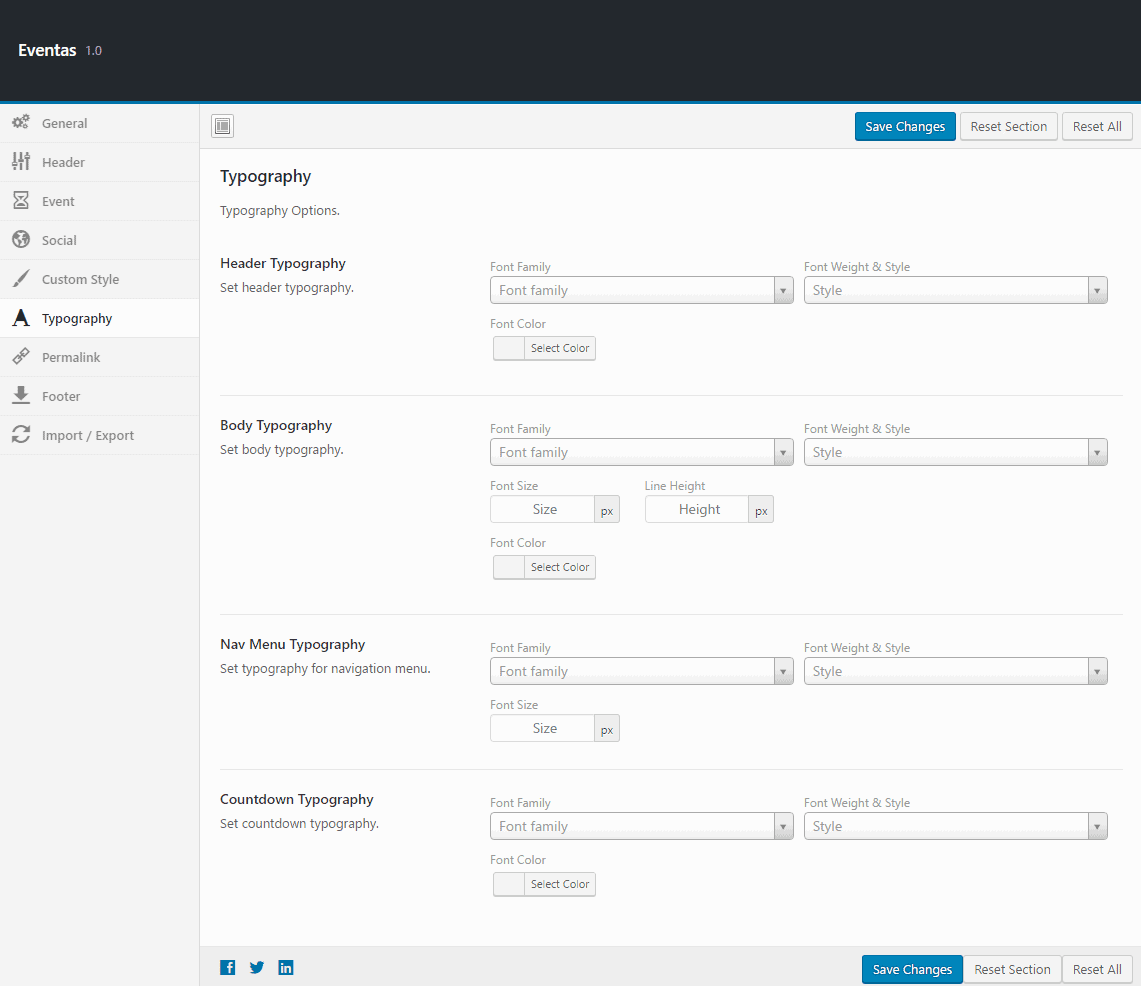
- Header Typography : Set your own typography for header (h1, h2, h3, h4, h5, h6). You can use any Font Family from google fonts. You can also set Font Weight and Font Color.
- Body Typography : Set your own typography for site (css rule will apply to ‘body’). You can use any Font Family from google fonts. You can also set Font Weight, Font Color, Font Size and Line Height.
- Nav Menu Typography : Set your own typography for menu. You can use any Font Family from google fonts. You can also set Font Weight and Font Size.
- Countdown Typography : Set your own typography for event countdown. You can use any Font Family from google fonts. You can also set Font Weight and Font Color.
Permalink
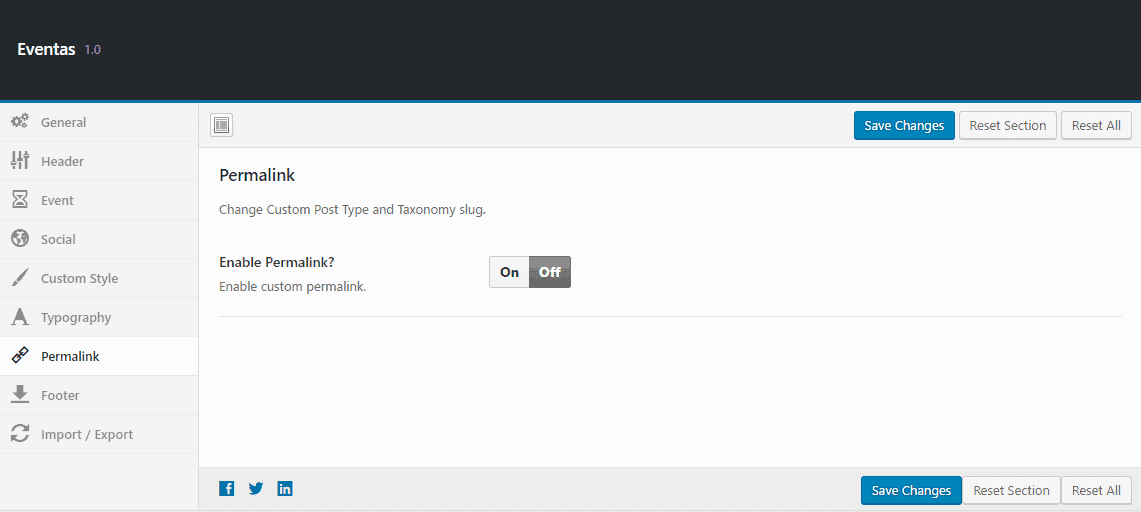
- Enable Custom Permalink : Allows you to enable or disable permalink option.
- Schedule Slug : Define your preferred slug for the schedule post type.
- Speaker Slug : Define your preferred slug for the speaker post type.
Those above two option only can be found when the Enable Custom Permalink option is set on.
Footer
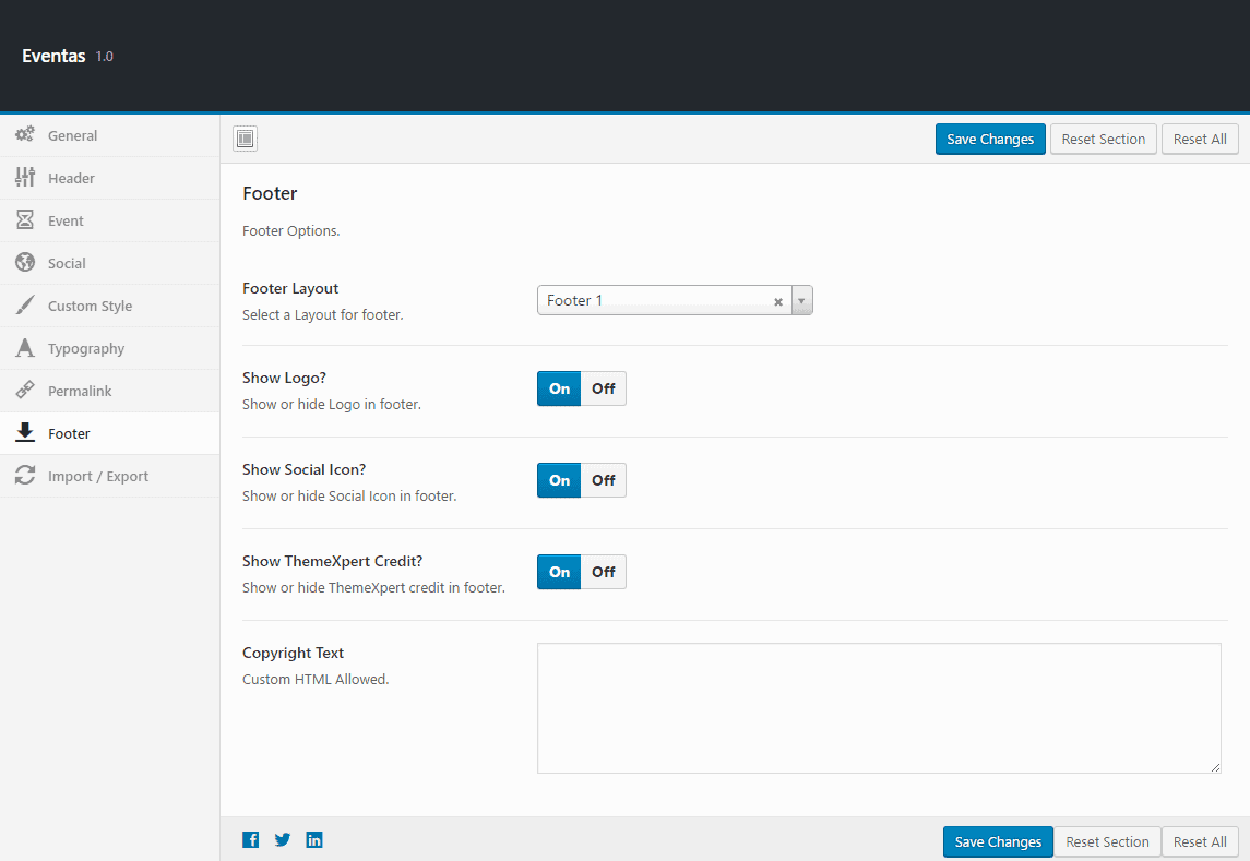
- Footer Layout : Select your preferred layout style for footer.
- Footer Logo? : Allows you to enable or disable footer logo.
- Social Icon? : Allows you to enable or disable social icons.
- Show TemeXpert Credit : Allows you to enable or disable showing ThemeXpert Credit.
- Copyright Text : Write your copyright text here.
Import/ Export
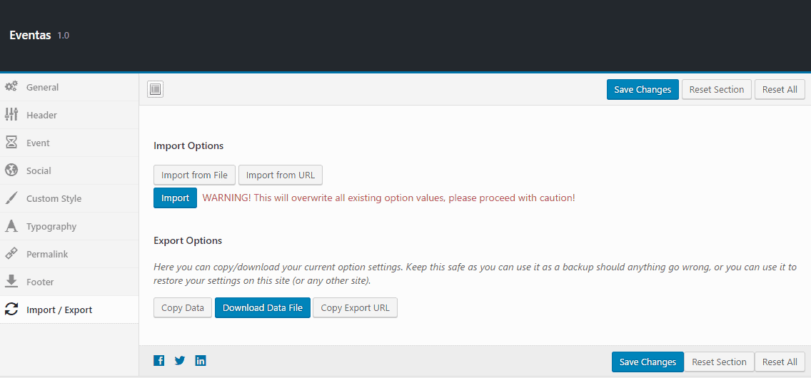
You can always make a backup and/or restore your settings here. So you can freely experiment with all of Eventas options without having fear to loose some of them.
How To's
Setup Homepage
- Go to
Settings > Reading - Select A Static page on Front page displays option.
- Choose Home from the Front-page drop-down menu.
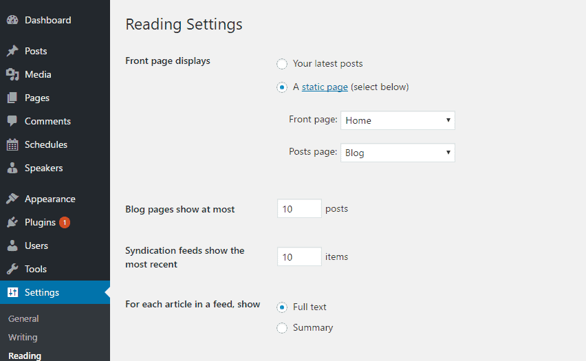
To set Home 2 as your default Homepage, just select Home 2 under the front-page drop-down menu. Similarly for Homepage 3, 4, 5, 6 and 7 select Home 3, Home 4, Home 5, Home 6 or Home 7.
- Select Blog from the Post page drop-down menu.
- Use the left-bottom Save Changes button to save the settings.
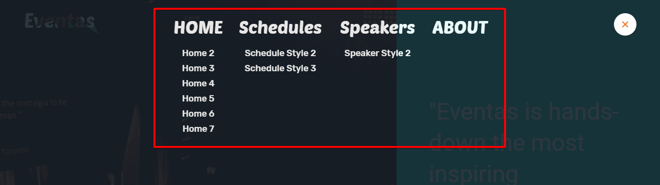
Creating Dropdown Menu
- Go to
Appearance> Menus - Select the main menu and drag the submenu items right below the main menu.
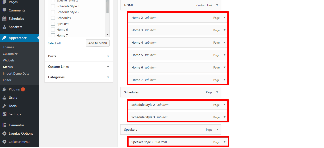
- Put a tick check mark on the display location Primary and click on Save Menu on the right-bottom side of the module and you are done.
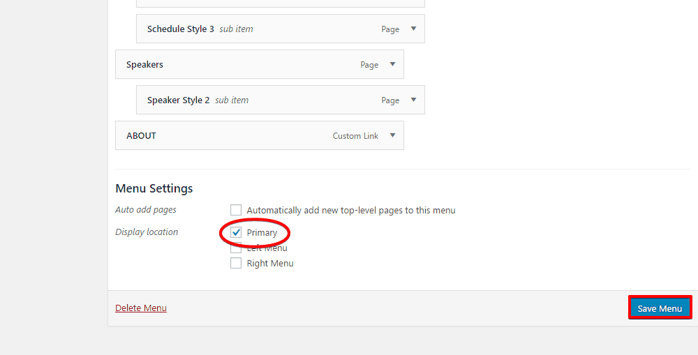
The fron-end appearance should be like below:
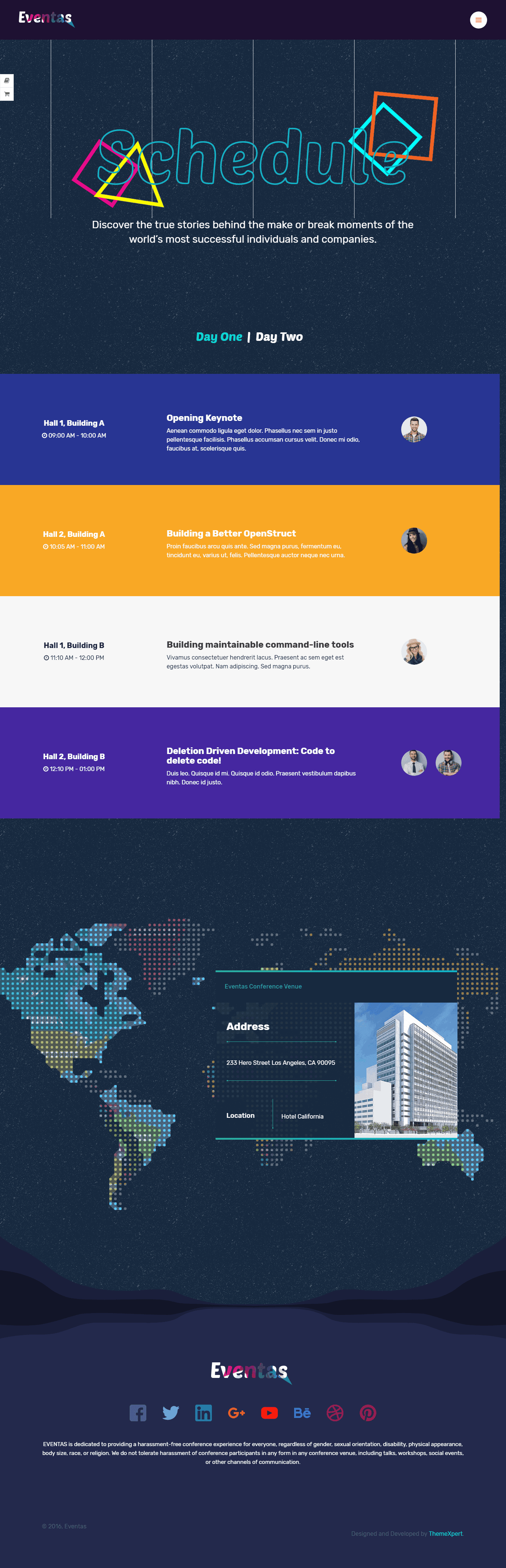
Creating Schedule
Creating Schedule might be tricky. But don’t worry. We will guide you. You have to create a schedule for each day for your event. Suppose your event is 3 days long. So you will create 3 schedules. In schedule, you will create your sessions for that day with repeatable fields.
- Go to
Schedules> Add New
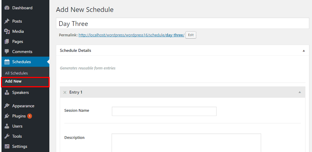
- Fill up the required all fields for the session.
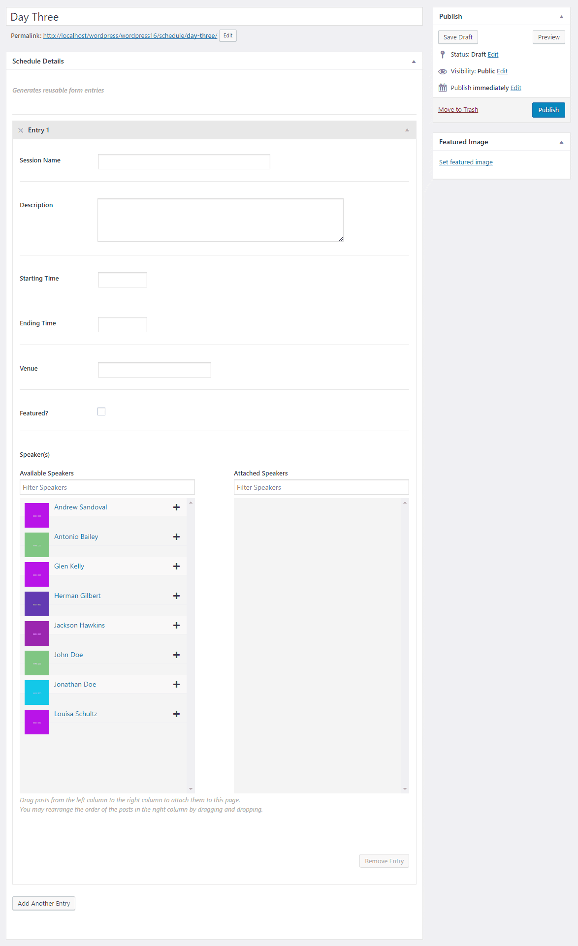
Session Name : Write session name from here. Description : Write some description for this session like what is this session about. Date : This is optional field. Set the date of that day. Starting Time : Set starting time of this session. Ending Time : Set ending time of this session. Venue : You might have multiple session at same time. So write venue of this session here like Hall A, Hall B etc. Featured? : Check this field if this session is keynote or featured. Speakers : Just click the “+” sign of speaker you want to set for this session. You can create speaker from Dashboard -> Speakers. Available Speakers : The existing speakers you created so far.
You can add multiple session just by clicking onAdd Another Entry button.
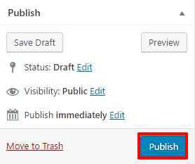
- Finally, Save the settings. Click on the Publish button from the right-top of the module.
Front-end appearance:
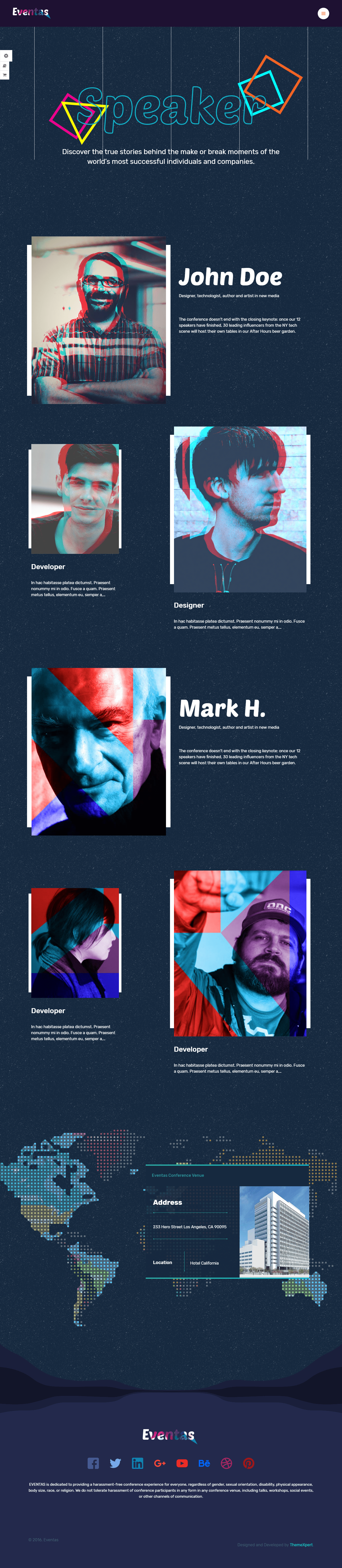
Creating Speakers
Creating speakers is also simple with a few straightforward steps to be maintained. All the fields are pre-explained so nothing is to be confused with there. To add new speakers,-
- Go to
Speakers> Add New
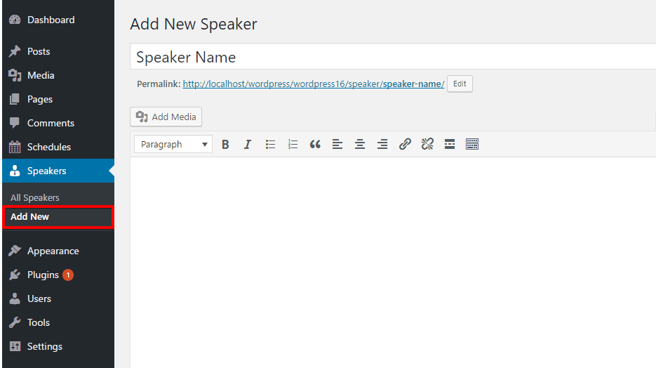
- Fill the all required information of the speaker.
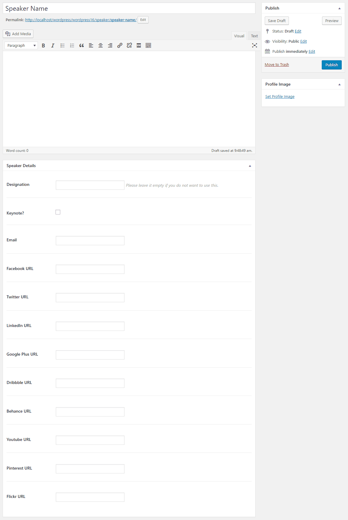
- Finally, Save the settings. Click on the Publish button from the right-top of the module.
Front-end appearance:
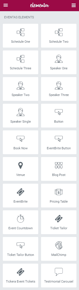
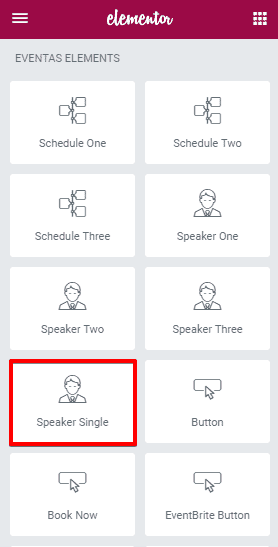
Elements / Shortcodes
You can simply add an element on a page. All you need to do, just drag the element you want to add and drop it in a page then customize its setting as your preferences. You will have plenty of default elements to add or you can add our developed elements those are only for Eventas theme from the Eventas Elements tab on the elementor.
Elementor
Elementor is the one of the best Drag and Drop visual editor for building pages, posts etc. in a WordPress site. If you are not familiar with Elementor, we recommend you to take a look at the following videos:
-
Getting Started with Elementor: Getting Started With Elementor - YouTube
-
Sections & Columns Part 1 : Learn How to Build Your Page Layout on Elementor
-
Sections & Columns Part 2 : Style Options for Sections and Columns
- Sections & Columns Part 3 : Padding, Margin, Responsive and Other Settings in the Advanced Tab
Under https://docs.elementor.com/ you can find see the complete documentation of elementor page builder.
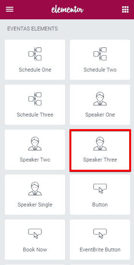
Our developed elements those are only for Eventas theme can be found in Eventas tab under Elementor.
Schedule One
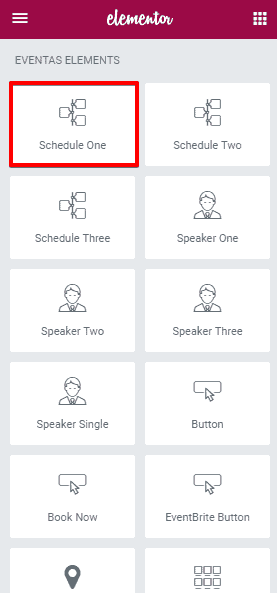
To add Schedule One element on a page, first-
- Go to
Pages - Click on Edit With Elementor
- Drag the Schedule One from the left Eventas Elements section and drop on your page.
- Click on Save to save the settings.
Content

- Order By : Allows you to order the schedules by Date, Time or Random.
- Order : You can organize in ascending order descending order.
Stye
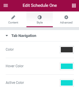
- Color : Choose your preferred color for the tab navigation text.
- Hover Color : Set a hover color.
- Active Color : Select an active color.
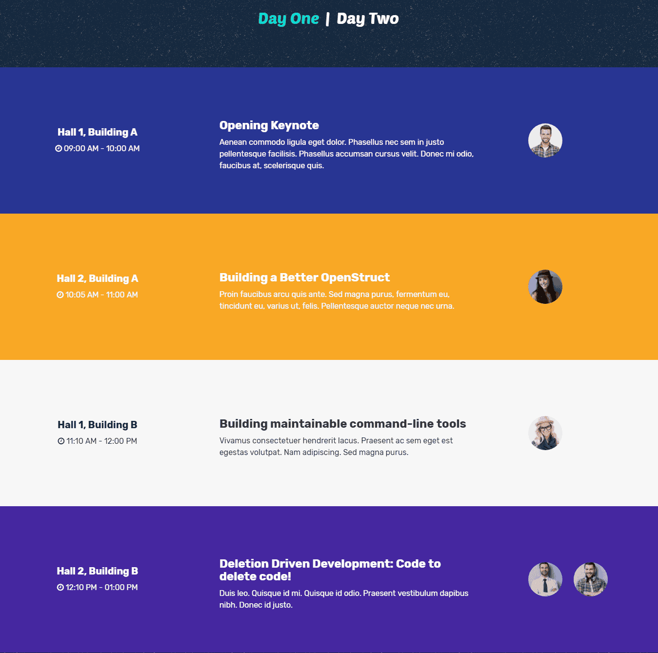
The Frontt-end appearance:
Schedule Two
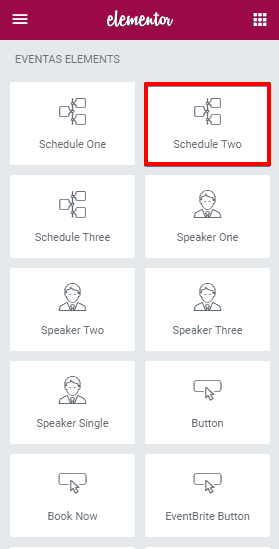
To add Schedule Two element on a page, first-
- Go to
Pages - Click on Edit With Elementor
- Drag the Schedule Two from the left Eventas Elements section and drop on your page.
- Click on Save to save the settings.
Content
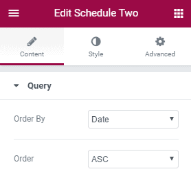
- Order By : Allows you to order the schedules by Date, Time or Random.
- Order : You can organize in ascending order descending order.
Stye
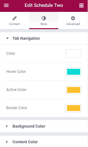
Tab Navigation
- Color : Choose your preferred color for the tab navigation text.
- Hover Color : Set a hover color.
- Active Color : Select an active color.
- Border Color : Select a color for the border.
Background Color
- Tab Background : Set a background color for the tab.
- Tab Item Background : Set a background color for the tab items.
- Tab Navigation Background : Set a background color for the tab navigations.
- Tab Duration Background : Set a background color for the tab durations.
Content Color
- Title Color : Choose a title color.
- Title Hover Color : Choose title hover color.
- Content Color : Choose a color for contents.
- Duration Color : Define duration color.
- Speaker Color : Choose a color for the speakers.
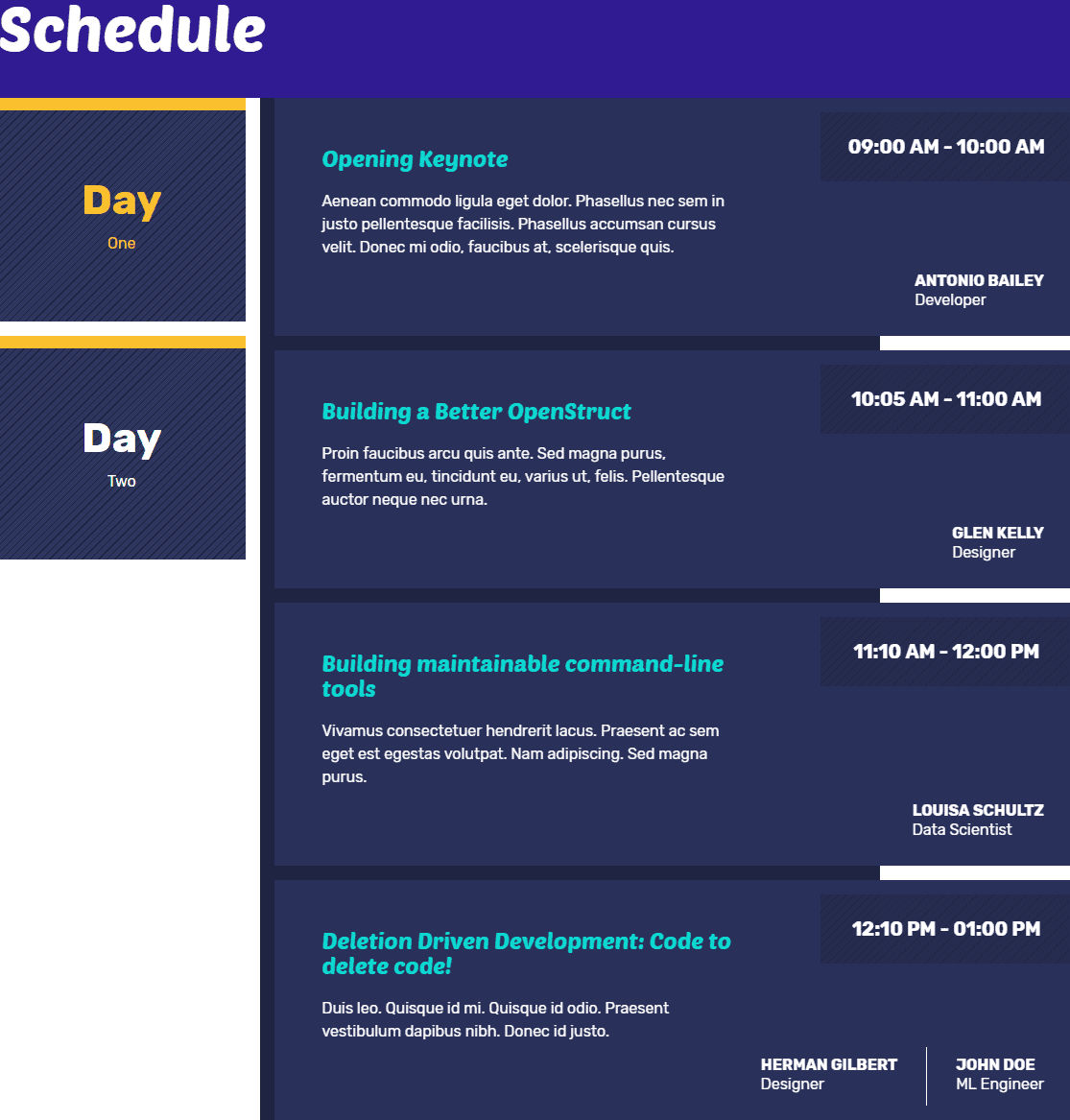
The front-end appearance:
Schedule Three
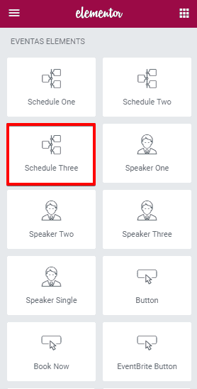
To add Schedule Three element on a page, first-
- Go to
Pages - Click on Edit With Elementor
- Drag the Schedule Three from the left Eventas Elements section and drop on your page.
- Click on Save to save the settings.
Content
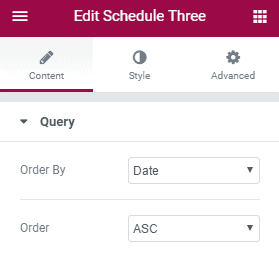
- Order By : Allows you to order the schedules by Date, Time or Random.
- Order : You can organize in ascending order descending order.
Stye
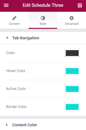
Tab Navigation
- Color : Choose your preferred color for the tab navigation text.
- Hover Color : Set a hover color.
- Active Color : Select an active color.
- Border Color : Select a color for the border.
Content Color
- Title Color : Choose a title color.
- Title Hover Color : Choose title hover color.
- Content Color : Choose a color for contents.
- Duration Color : Define duration color.
- Speaker Color : Choose a color for the speakers.
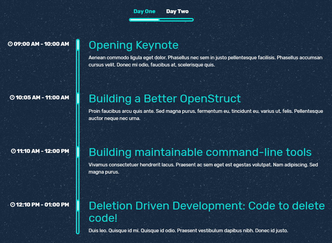
The front-end appearance:
Speaker One
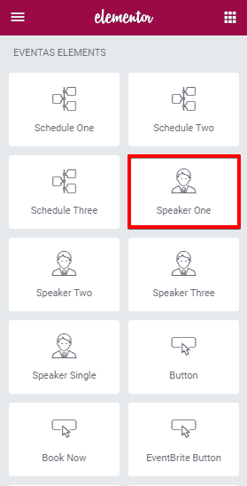
To add Speaker One element on a page, first-
- Go to
Pages - Click on Edit With Elementor
- Drag the Speaker One from the left Eventas Elements section and drop on your page.
- Click on Save to save the settings.
Content
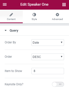
- Order By : Allows you to order the Speakers by Date, Time or Random.
- Order : You can organize in ascending order descending order.
- Item To Show : Define the number of items to show at a time.
Stye
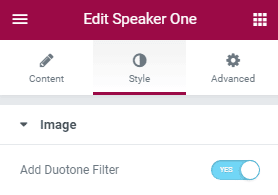
- Add Duotone Filter : Allows you to enable or disable duotone filter on the speaker images.
The front-end appearance:

Speaker Two
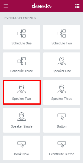
To add Speaker Two element on a page, first-
- Go to
Pages - Click on Edit With Elementor
- Drag the Speaker Two from the left Eventas Elements section and drop on your page.
- Click on Save to save the settings.
Content
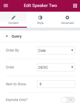
- Order By : Allows you to order the schedules by Date, Time or Random.
- Order : You can organize in ascending order descending order.
- Item To Show : Define the number of items to show at a time.
- Keynote Only : Define that you want to show only the keynote speakers or want to show all.
Stye
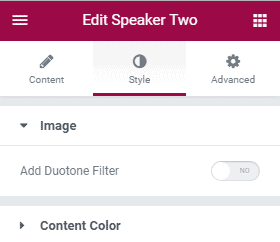
Image
- Add Duotone Filter : Allows you to enable or disable duotone filter on the speaker images.
Content
- Background Color : Choose a color for the background.
- Designation Color : Choose a color for the designation text.
- Description Color : Choose a color for the description text.
The front-end appearance:

Speaker Three
To add Speaker Three element on a page, first-
- Go to
Pages - Click on Edit With Elementor
- Drag the Speaker Three from the left Eventas Elements section and drop on your page.
- Click on Save to save the settings.
Content
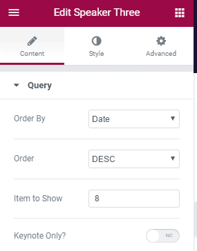
- Order By : Allows you to order the Speakers by Date, Time or Random.
- Order : You can organize in ascending order descending order.
- Item To Show : Define the number of items to show at a time.
- Keynote Only : Define that you want to show only the keynote speakers or want to show all.
Stye
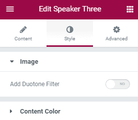
Image
- Add Duotone Filter : Allows you to enable or disable duotone filter on the speaker images.
Content Color
- Title Color : Choose a color for the title text.
- Title Hover Color : Choose a color for the title text hover.
- Social Color : Choose a color for the social icons.
- Social Hover Color : Choose a color for the social icons hover.
- Designation Color : Choose a color for the designation text.
The front-end appearance:

Speaker Single
To add Speaker Single element on a page, first-
- Go to
Pages - Click on Edit With Elementor
- Drag the Speaker Single from the left Eventas Elements section and drop on your page.
- Click on Save to save the settings.
Content
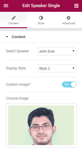
- Select Speaker : Allows you to select a speaker.
- Display Style : Select a style to display the speaker information.
- Custom Image? : Allows you to use a custom image for the speaker.
Stye
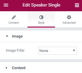
Image
- Image Filter : Allows you to apply a filter effect to the image.
The front-end appearance:

Button
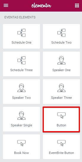
To add Button element on a page, first-
- Go to
Pages - Click on Edit With Elementor
- Drag the Button from the left Eventas Elements section and drop on your page.
- Click on Save to save the settings.
Content
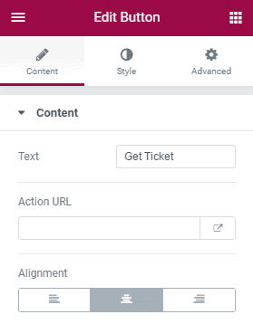
- Text : Write the button text here.
- Action URL : Put the URL where to redirect user when they click on the button.
- Alignment : Select button alignment/ position.
Stye
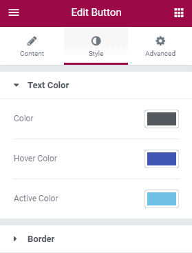
Text Color
- Color : Choose a color for the button text.
- Hover Color : Choose a color for the button text hover.
- Active Color : Choose a color for the button active state.
Border
- Border One Color : Choose a color for border one.
- Border Two Color : Choose a color for border two.
- Border Width : Specify the border width.
- Border Spacing : Define the amount of space between two borders.
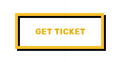
The front-end appearance:
Book Now
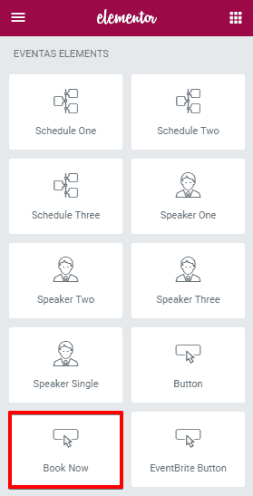
To add Book Now element on a page, first-
- Go to
Pages - Click on Edit With Elementor
- Drag the Book Now from the left Eventas Elements section and drop on your page.
- Click on Save to save the settings.
Content
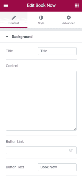
- Title : Write Title text here.
- Content : Write the content text here.
- Button Link : Put the button URL.
- Button Text : Write the button text here.
- Redirect Message : Write the redirect message.
Stye
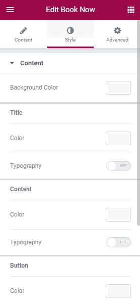
- Background Color :
Title
- Color : Set the color for the title text.
- Typography : Use custom typography for the title text including font-family, size, weight, line-height, letter-spacing, style, etc.
Content
- Color : Set the color for the content text.
- Typography : Use custom typography for the content text including font-family, size, weight, line-height, letter-spacing, style, etc.
Button
- Color : Set the color for the button text.
- Typography : Use custom typography for the button text including font-family, size, weight, line-height, letter-spacing, style, etc.
Redirect Message
- Color : Set the color for the redirect message.
- Typography : Use custom typography for the redirect message including font-family, size, weight, line-height, letter-spacing, style, etc.
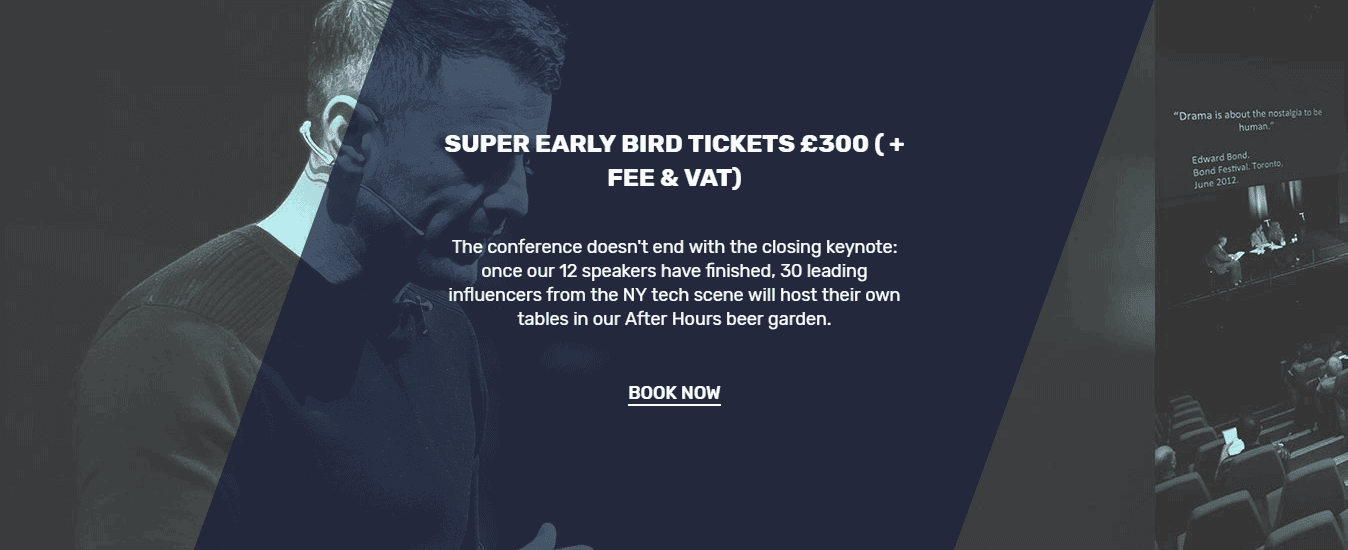
The front-end appearance:
EventBrite Button
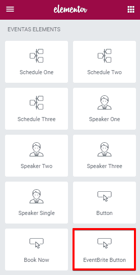
To add EventBrite Button element on a page, first-
- Go to
Pages - Click on Edit With Elementor
- Drag the EventBrite Button from the left Eventas Elements section and drop on your page.
- Click on Save to save the settings.
Content
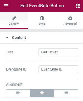
- Text : Write the button text.
- EventBrite ID : Put the EventBrite ID here.
- Alignment : Define the button position.
Stye
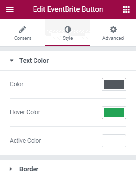
Text Color
- Color : Set the color for the button text.
- Hover Color : Set the hover color for the button.
- Active Color : Set the active color for the button.
Border
- Border One Color : Set the color for border 1.
- Border Two Color : Set the color for border 2.
- Border Width : Define the border width.
- Border Spacing : Define the amount of space between two borders.
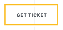
The front-end appearance:
Venue
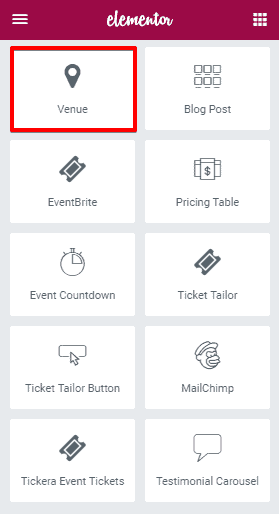
To add Venue element on a page, first-
- Go to
Pages - Click on Edit With Elementor
- Drag the Venue from the left Eventas Elements section and drop on your page.
- Click on Save to save the settings.
Content
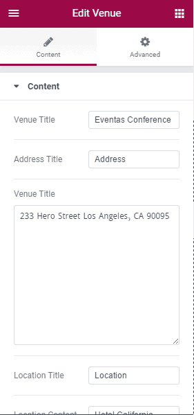
- Venue Title : Write the name of the venue.
- Address Title : Write the address title here.
- Venue Title : Write the venue address here.
- Location Title : Write the location title.
- Location Content : Write the venue location.
- Choose Image** : Allows you to choose an image for the venue.
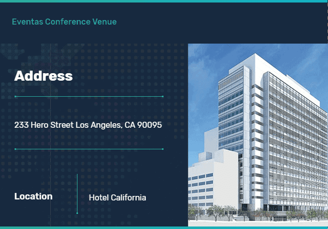
The front-end appearance:
Blog Post
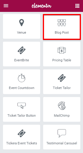
To add Blog Post element on a page, first-
- Go to
Pages - Click on Edit With Elementor
- Drag the Blog Post from the left Eventas Elements section and drop on your page.
- Click on Save to save the settings.
Content
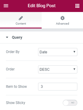
Query
- Order By : Order Blog Posts by Date, Title or Random.
- Order : Order in Descending order or Ascending order.
- Item To Show : Define the number of items to show.
- Show Sticky : Allows you to enable or disable sticky option.
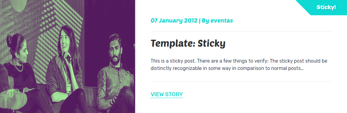
The front-end appearance:
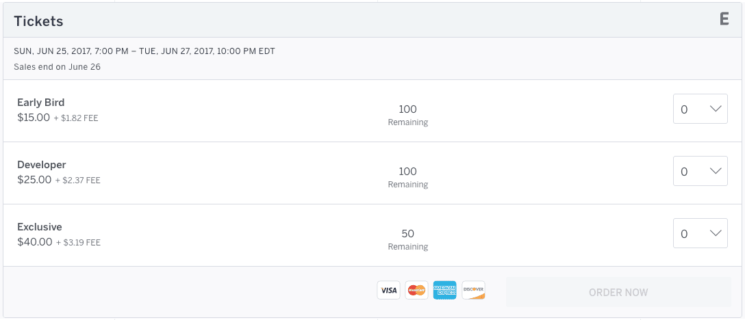
EventBrite
To add EventBrite element on a page, first-
- Go to
Pages - Click on Edit With Elementor
- Drag the EventBrite from the left Eventas Elements section and drop on your page.
- Click on Save to save the settings.
Content
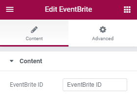
- EventBrite ID : Put the EventBrite ID here.
The front-end appearance:
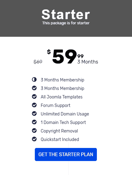
Pricing Table
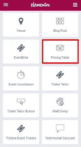
To add Pricing Table element on a page, first-
- Go to
Pages - Click on Edit With Elementor
- Drag the Pricing Table from the left Eventas Elements section and drop on your page.
- Click on Save to save the settings.
Content
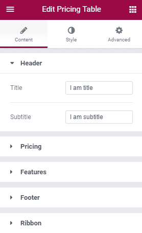
Header
- Title : Write the title text here.
- Subtitle : Write subtitle text here.
Pricing
- Currency Symbol : Choose the currency symbol from the drop down.
- Price : Define the price.
- Sale : To enable this option, you can add the old price of your product in scratch text style.
- Period : Define the pricing valid for Days, Months, or Years.
Features
- List Item : Configure for feature 1 including title, icon, and icon color.
Footer
- Button Text : Write the button text.
- Link : Put the button link.
- Additional Info : Provide the additional information.
Ribbon
- Show : Allows you to enable or disable showing ribbon.
- Title : Ribbon title.
- Horizontal Position : Select the position either left or right.
Stye
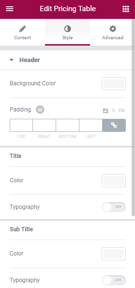
Header
- Background Color : Set a background color.
- Padding : Define the amount of padding on header.
- Title Color : Set the title color.
- Typography : Customize the typography options for title text.
- Subtitle Color : Set the subtitle color.
- Typography : Customize the typography options for subtitle text.
Pricing
- Background Color : Set a background color.
- Padding : Define the amount of padding on header.
- Color : Set the text color.
- Typography : Customize the typography options for the text. Currency Symbol
- Size : Define the size of the currency symbol.
- Vertical position : Define the position of the currency symbol.
Fractional Part
- Size : Define the size of the fractional part.
- Vertical position : Define the position of the fractional part.
Period
- Color : Choose the color for the period text.
- Typography : Customize the typography options for the text.
- Position : Define its position.
Features
- Background Color : Set the background color for the features section.
- Padding : Define the amount of padding you want to add.
- Color : Set the color.
- Typography : Customize the typography options for the text.
- Alignment : Define the position.
- Width : Define the width for the features area.
- Divider : Allows you to enable or disable showing divider.
- Style : Choose the style for the divider.
- Color : Choose the color for the divider.
- Width : Set the width for the divider.
- Height : Set the height for the divider.
- Gap : Define the amount of gap between two items.
Footer
- Background Color : Set the background color for the footer section.
- Padding : Define the amount of padding you want to add.
- Button : Allows you to choose button style either Normal or Hover.
- Text Color : Set the color of the texts.
- Typography : Customize the typography options for the button text.
- Background Color : Set the background color for the button.
- Border Type : Choose the type of the border.
- Border Radius : Define the border radius.
- Text Padding : Define the amount of padding for the footer texts.
Additional Info
- Color : Choose the color for additional texts.
- Typography : Customize the typography options for additional texts.
- Margin : Define the amount of margin for the section.
Ribbon
- Background Color : Set the background color for the ribbon section.
- Distance : Define the distance of the ribbon from the corner.
- Text Color : Set a color for the text.
- Typography : Customize the typography options for ribbon text.
- Box Shadow : Enable and customize box shadow options.
The front-end appearance:
Event Countdown
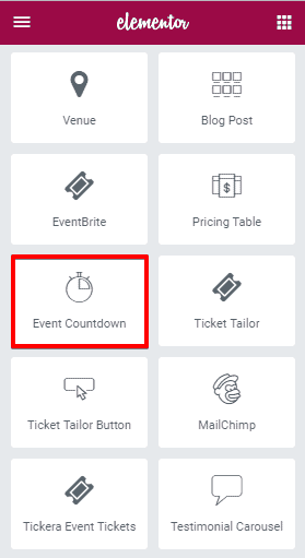
To add Event Countdown element on a page, first-
- Go to
Pages - Click on Edit With Elementor
- Drag the Event Countdown from the left Eventas Elements section and drop on your page.
- Click on Save to save the settings.
Content
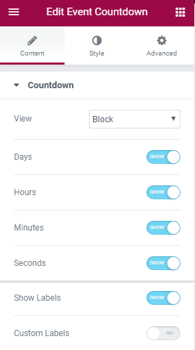
- View : Choose countdown display type. You can either show countdown inline or block style.
- Days : Allows you to show or hide days.
- Hours : Allows you to show or hide hours.
- Minutes : Allows you to show or hide minutes.
- Seconds : Allows you to show or hide seconds.
- Show Labels : Enable or disable showing labels.
- Custom Labels : To enable this option let you use your custom labels for Days, Hours, Minutes, and Seconds.
Style
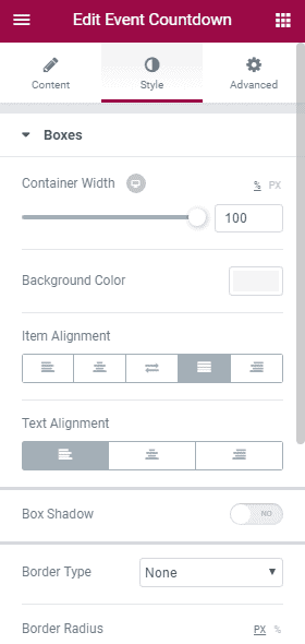
- Container Width : Define the width of the countdown section.
- Background Color : Choose a background Color.
- Item Alignment : Define the countdown timer alignment.
- Text Alignment : Define the numbers and texts alignment on countdown.
- Box Shadow : Allows you to enable or disable box shadow.
- Border Type : Select border type.
- Border Radius : Define amount of border radius.
- Space Between : Define the amount of space between Days, Hours, Minutes, and Seconds.
- Padding : Add amount of padding value on the numbers and label texts.
Digits
- Individual Color : Enable and set individual colors for the digits.
- Color : Set a common color for the digits.
- Typography : Customize the typography options for digit texts.
Label
- Individual Color : Enable and set individual colors for the labels.
- Color : Set a common color for the labels.
- Typography : Customize the typography options for label texts.
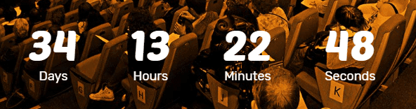
The front-end appearance:
Ticket Tailor
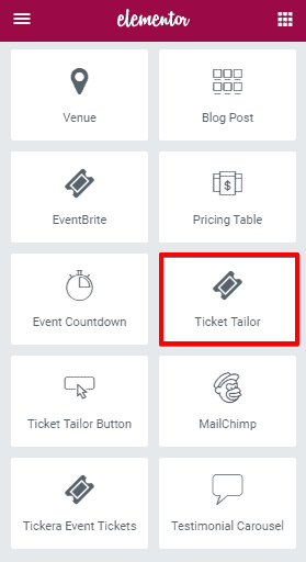
To add Ticket Tailor on your website page and make it work requires a few simple procedures, that I’m going to explain one by one.
Step : 1
- Download and Install Ticket Tailor WordPress plugin.
- Enable that plugin from the WordPress admin panel. (
Plugins> Install Plugins)
Step : 2
- Go to Ticket Tailor website and login with your valid username and password.
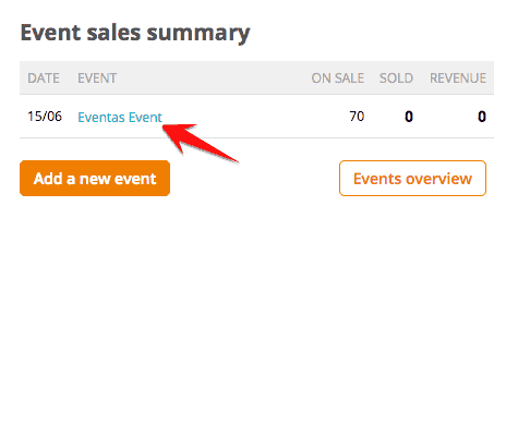
- Go to Dashboard
- Add a new event and click on the just created event.
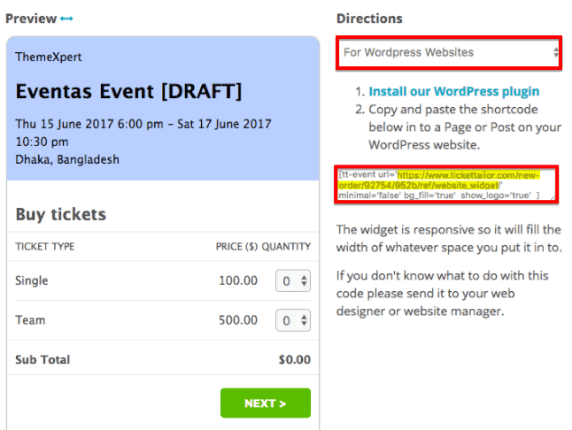
Step : 3
- Click on the Website embed codes like pointed on the screenshot below.
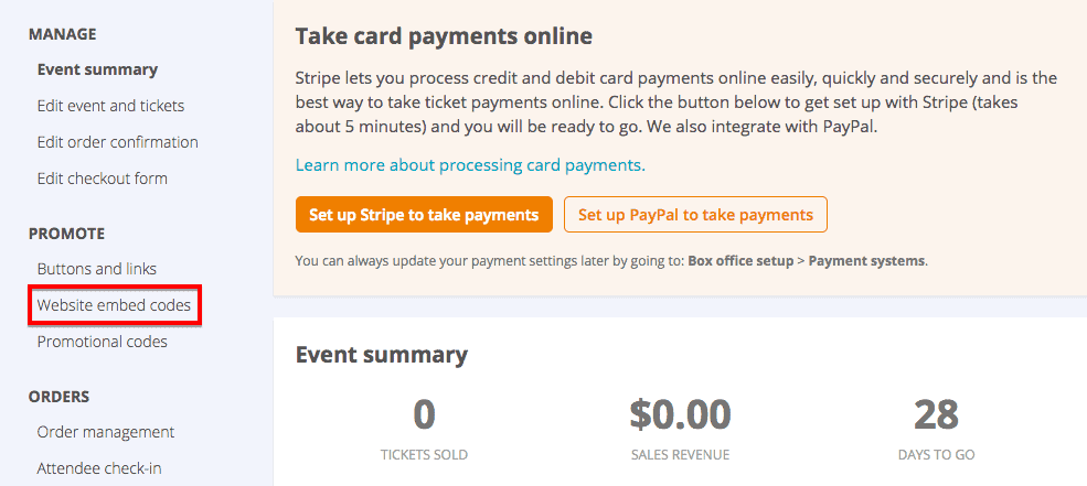
- Now select the direction For WordPress websites
- Copy and preserve the URL that pointed by yellow color on the screenshot below.
Step : 4
- Now, go to
Pages, where to place Ticket Tailor element. - Click on Edit With Elementor
- Drag the Ticket Tailor from the left Eventas Elements section and drop on your page.
Step : 5
- Paste the copied URL on the Event Widget URL text box and finally
- Click on Save to save the settings.
Content
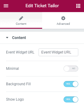
- Event Widget URL : Put the event widget URL here.
- Minimal : Allows you to enable or disable switching minimal or not.
- Background Fill : Allows you to enable or disable background fill option.
- Show Logo : Allows you to enable or disable showing logo.
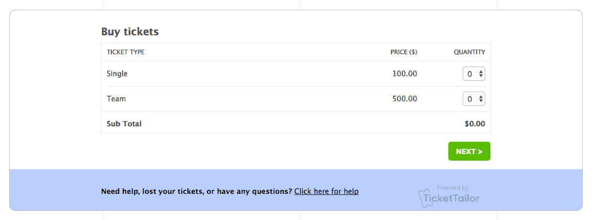
The front-end appearance:
Ticket Tailor Button
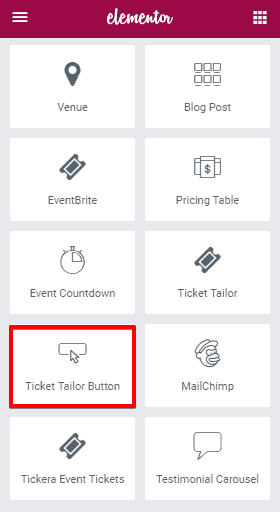
To add Ticket Tailor Button element on a page, first-
- Go to
Pages - Click on Edit With Elementor
- Drag the Ticket Tailor Button from the left Eventas Elements section and drop on your page.
- Click on Save to save the settings.
Content
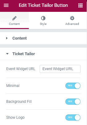
Content
- Text : Write the button text here.
- Alignment : Define the button alignment.
Ticket Tailor
- Event Widget URL : Put the event widget URL here.
- Minimal : Allows you to enable or disable switching minimal or not.
- Background Fill : Allows you to enable or disable background fill option.
- Show Logo : Allows you to enable or disable showing logo.
Style
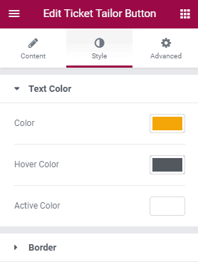
Text Color
- Color : Set the text color.
- Hover Color : Choose a color for hover effect.
- Active Color : Define a color for the active state.
Border
- Border One Color : Choose border one color.
- Border Two Color : Choose border two color.
- Border Width : Define border width.
- Border Spacing : Set border spacing.
The front-end appearance:

MailChimp
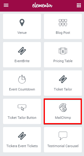
To add MailChimp element on a page, first-
- Go to
Pages - Click on Edit With Elementor
- Drag the MailChimp from the left Eventas Elements section and drop on your page.
- Click on Save to save the settings.
Content
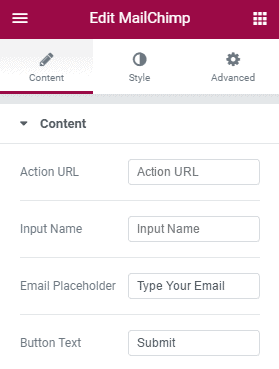
- Action URL : Put the URL to redirect at the submit button click event.
- Input Name : Write your custom name of the element.
- Email Placeholder : Write the placeholder text.
- Button Text : Specify the button text.
Style
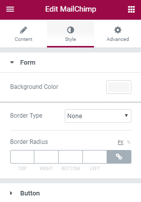
Form
- Background Color : Choose a background color.
- Border Type : Define the type of border.
- Border Radius : Specify the amount of border radius.
Button : Configure the custom button settings.
The front-end appearance:

Tickera Event Tickets
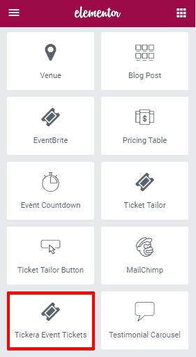
To add Tickera Event Tickets element on a page, first-
- Go to
Pages - Click on Edit With Elementor
- Drag the Tickera Event Tickets from the left Eventas Elements section and drop on your page.
- Click on Save to save the settings.
Content
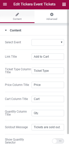
- Select Event : Select an event from the drop-down.
- Link Title : Write the title of the Link.
- Ticket Type Column Title : Define the “Ticket Type” column title.
- Price Column Title : Define the “Price” column title.
- Cart Column Title : Define the “Cart” column title.
- Quantity Column Title : Define the “Quantity” column title.
- Soldout Message : Write the soldout message as you wish.
- Show Quantity Selector : Allows you to enable or disable showing quantity selector.
- Link Type : Allows you to select link type either Cart or Buy Now.
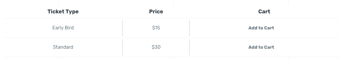
The front-end appearance:
Testimonial Carousel
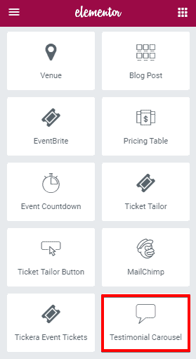
To add Testimonial Carousel element on a page, first-
- Go to
Pages - Click on Edit With Elementor
- Drag the Testimonial Carousel from the left Eventas Elements section and drop on your page.
- Click on Save to save the settings.
Content
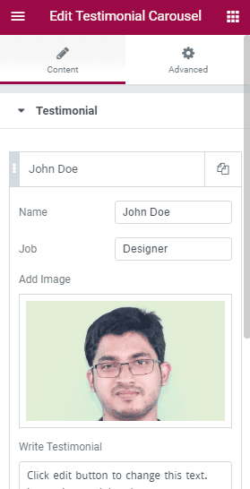
- Name : Write the name of the person.
- Job : Write the profession of the person.
- Add Image : Add the image of the person.
- Write Testimonial : Write his testimonial text here.
See our other WordPress template with detailed documentation.
Grow rapidly with our Joomla SEO service done by the veterans
With over 12 years of business and a vast array of Joomla templates and extensions, we know Joomla SEO better than anyone you could possiblly hire.
Improve my ranking