How to Override Template Color by ThemeMagic
Making a customized theme using ThemeMagic is not that much tedious task as many people think. Let's see how cool is that.
- First, go to
Extensions> Templatesand click on your current selected template. - Now, from the top of the module, click on the ThemeMagic button to configure according to your wants.

- Choose Default from the Theme drop-down box then click on the down arrow icon next to the Preview button and select Save As.
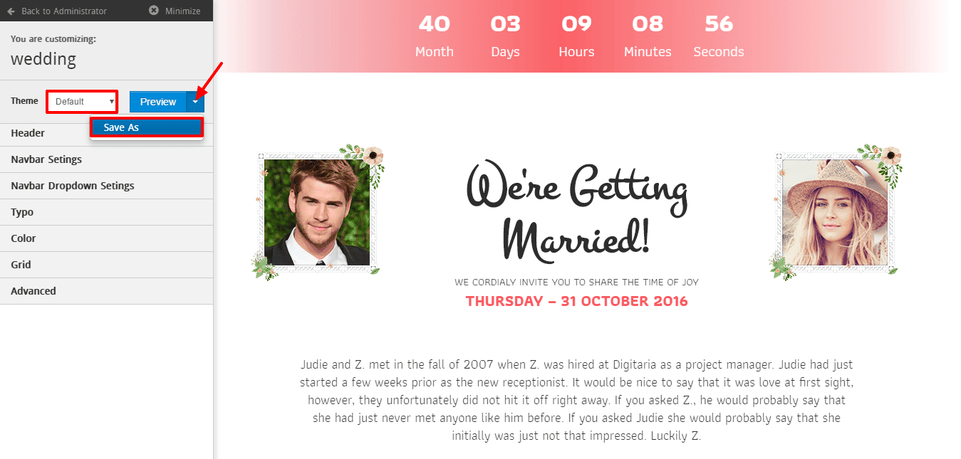
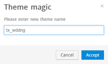
A module to give the name of your custom theme will be appeared then.
- Write the name of your new custom theme on the empty text box and click on Accept.
There will be two sections. On the left section, there is a customization settings module and on the right section, there is a live preview window.
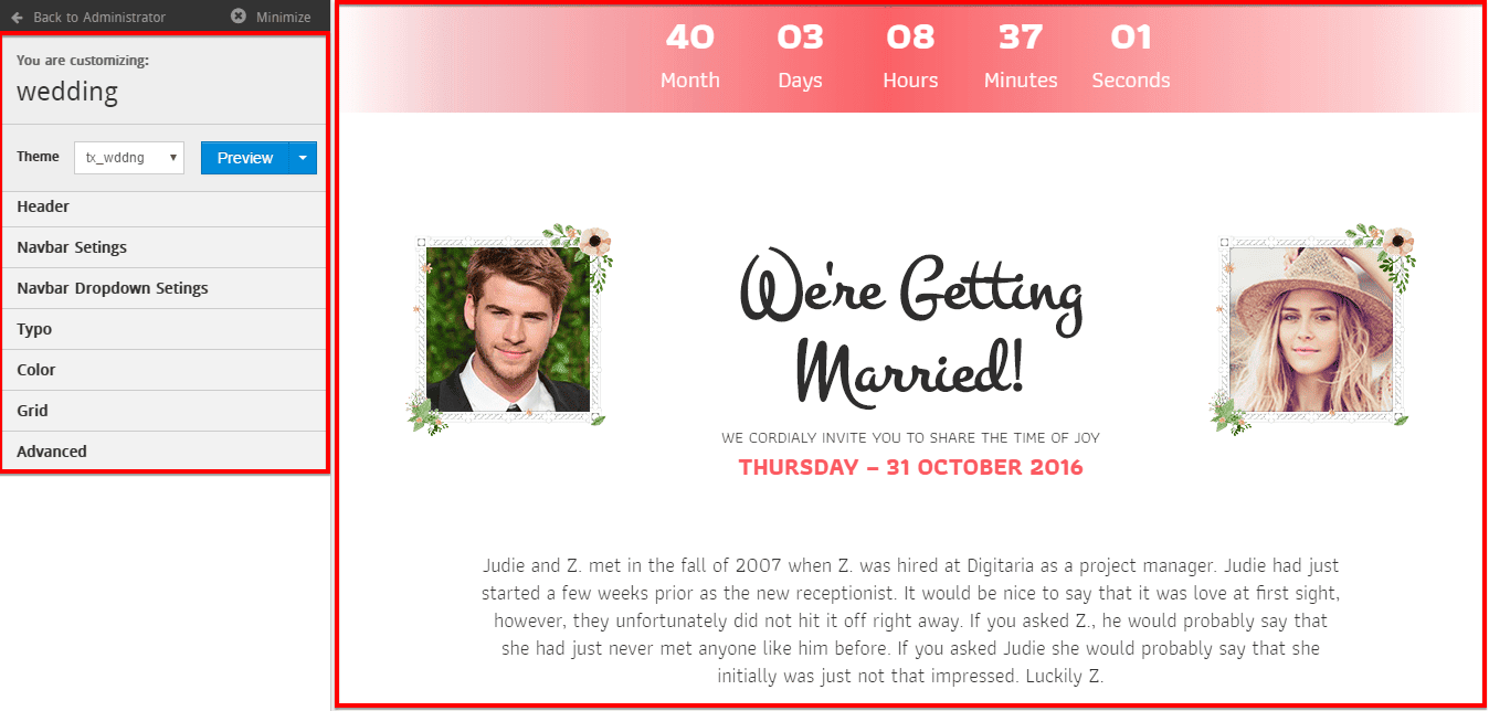
Now, let's know about the customization setting options and their functionality.
Theme

- Dropdown : From the drop-down menu, you can select a theme to customize and override the settings or save as a new theme.
- Preview : A button to see the live preview instantly according to the current changes on selected theme.
Header
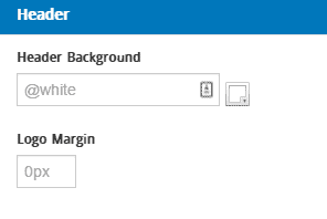
Header Background : Choose a background color for the header. Logo Margin : Define some margin space in pixel for the logo. Margin will be applied on top, right, bottom as well as left at a time. Don't forget to write px after inputting a numeric value in the box.
Navbar Settings
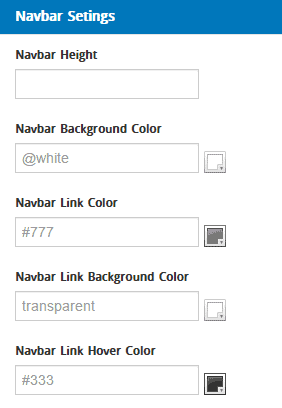
- Navbar Height : Define the navigation menu height in numeric value and write px after the value. px defines pixels.
- Navbar Background Color : Choose navigation bar background color.
- Navbar Link Color : Choose navigation bar link color.
- Navbar Link Background Color : Choose navigation bar link background color.
- Navbar Link Hover Color : Choose navigation bar link hover color.
- Navbar Link Hover Background Color : Choose navigation bar hover background link color.
- Font Size : Select a font size.
- Text Transform : Define a transform method for the text.
- Font Weight : Define font weight.
Navbar Dropdown Settings
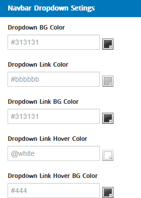
- Dropdown BG Color : Choose a color for the dropdown background.
- Dropdown Link Color : Select a color for the dropdown links.
- Dropdown Link BG Color : Select a color for the dropdown links background.
- Dropdown Link Hover Color : Select a color for the dropdown links hover.
- Dropdown Link Hover BG Color : Select a color for the dropdown links hover background.
- Text Transform : Define a transform method for the text.
- List Border Color : Choose a color for the dropdown list border.
- Dropdown Item Padding : Define some padding space in pixel for the dropdown item. Padding will be applied on top, right, bottom as well as left at a time. Don't forget to write px after inputting a numeric value in the box.
Typo
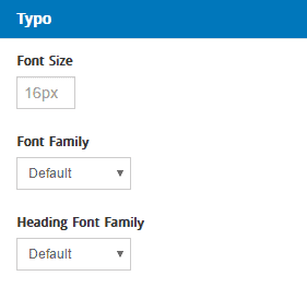
- Font Size : Select a font size.
- Font Family : Choose a font family.
- Heading Font Family : Choose a font family for the heading.
Color
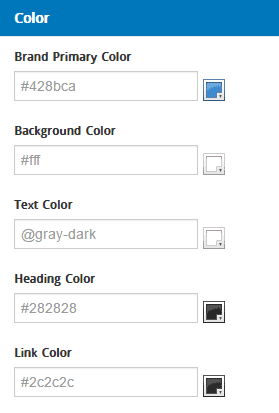
- Brand Primary Color : Select a primary color for your custom theme.
- Background Color : Choose a background color.
- Text Color : Choose a default color for the texts.
- Heading Color : Choose a default color for the heading.
- Link Color : Choose a deafult color for the links.
Grid
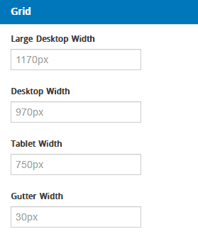
- Large Desktop Width : Set a width value in pixels for the Large Desktops.
- Desktop Width : Set a default width value in pixels for Desktops.
- Tablet Width : Set a width value in pixels for the Tablets.
- Gutter Width : Set a width value in pixels for Gutter.
Advanced
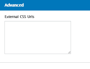
External CSS Urls : Put external CSS urls here, if you use any.

