An Overview Of The Builder
We designed and developed Quix from the ground up, and it is the most advanced page builder for Joomla in the market. Using Quix’s drag and drop builder interface, you can create beautiful layouts without writing any code.
There are three main building blocks: Sections, Rows, and Elements. Using these things in unison allows you to create a countless amount of page layouts. The basic hierarchy of these elements is as follows:
Sections
Sections are used to create the top-level areas on your website. Sections are made up of rows and columns. See more about rows and elements below.
Rows
Rows sit inside of Sections, and you can place any number of rows in a section. You can add any number of columns in a row and resize the column size. Once you define a Row and created column structure, you can then place elements into the column. There is no limit to the number of elements you can put in a column.
Elements
Elements are the main visual block that makes up your website. Every element that Quix has can fit into any column width, and they are all full responsive in nature.
Getting Started
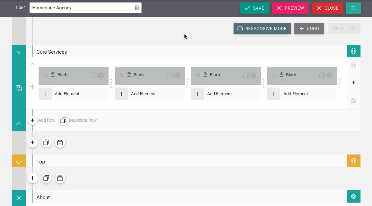
Upon clicking New button on Quix list pages, you will be, presented with the main Quix Builder interface.

Title - You must provide a title for your page. You cannot save the page unless you provide any page title.
Save - You can save the page by clicking save button, or you can use Quix keyboard shortcuts to save the page.
Close - Close the page and get back to the list page.
Preview - This button will only visible when you save the page. By clicking this button, a new browser tab will open with the preview of this page.
Menu - By clicking menu button, you will see 3 options:
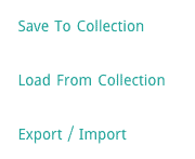
Save To Collection - At any time you can save a layout that you have built to your Quix Collection to be used at a later time. This option is great for using a layout on another page, section of a page, or even another website built with Quix. Collection provide shortcode that can use inside 3pd component as well. For more information about using the Quix Collection, be sure to check out our detailed tutorial on the subject.
Load From Collection - You can also load a layout that you have saved in the past. Quix comes with a lots of pre-made layout, could be a great choice when you first building a website with Quix.
Export/Import - Quix portability system allow you to export your layout and import them to another website built with Quix. Theme developer could ship many page layout with their themes with Quix export option.
Section Options
Every time you add a section you will need to define its properties. By clicking the section setting icon at the top right corner you will be taken to the Section Settings.
Container Mode - Container ensure proper alignment and padding of grid system.
- Stretch With Container- Section stretched to browser width and add container(fixed-width) class.
- Stretch Without Container- Section stretched to browser width and container(full-width) class.
- Add Container - Add container(fixed-width) class into the section.
- No Container - No container class added.
Background Image - If defined, this image will be used as the background for this Section. To remove a background image, simply delete the URL from the settings field.
- Image Repeat - The background-repeat property sets if/how a background image will be repeated.
- Image Position - The background-position property sets the starting position of a background image.
- Image Size - The background-size property specifies the size of the background images.
Background Color - If you would simply like to use a solid or transparent color background for your section, use the color picker to define a background color.
Parallax Effect - Enabling this option will give your background images a fixed position as you scroll. Keep in mind that when this setting is enabled, your images will scale to the browser height.
NOTE: if you enable the parallax effect, we recommend that your images are at least the size of a standard screen size since your images will take on the width or height of the browser window (i.e. 1280px by 768px)
Custom Padding - Adjust padding to specific values, or leave blank to use the default padding.
Label - Help you to indentify your section in backend. Give a meaningful label so you can understand later.
Id - An automatic ID already assigned for the section. An ID can be used to create custom CSS styling, or to create links to particular sections of your page.
Class - Enter optional CSS classes to be used for this module. A CSS class can be used to create custom CSS styling. You can add multiple classes, separated with a space.
Adding Row and Adjusting Column
After saving your section settings you will need to define column structure for row. You can add as many row with different column structure in a section. By clicking ‘Add Columns’ you will be able to choose from a selection of row types. Rows also have lots of options that you can use to customize their appearance and alter the structure of the layout. You can change row type anytime by click Change Layout icon bottom right of the row.
Columns are based on 12 grid system and you can adjust column grid by dragging the column divider icon.
Grow rapidly with our Joomla SEO service done by the veterans
With over 12 years of business and a vast array of Joomla templates and extensions, we know Joomla SEO better than anyone you could possiblly hire.
Improve my ranking