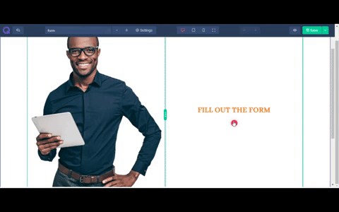
Form Builder
One of the most demanding element is Form builder. This element will help you to build any type of form including contact form, registration form, questionnaire etc. To add form to your site follow these steps.
Select Add New Element from column to open elements list modal
From there select Form element
 A popup will appear showing three tabs - General, Styles ,& Advanced. These tabs will help you to modify the form in your way. You can add new fields, change the color and font, change button settings etc. The details are given below.
General Tab
The general tab holds the basic setting of a form. You’ll find the following editing options here.
- Fields Group - Fields group holds various form fields.
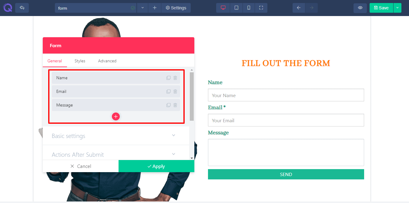 A few fields are given in fields group.
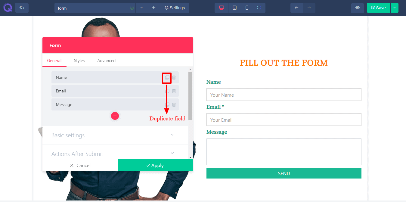 You can duplicate an existed field using this square icon.
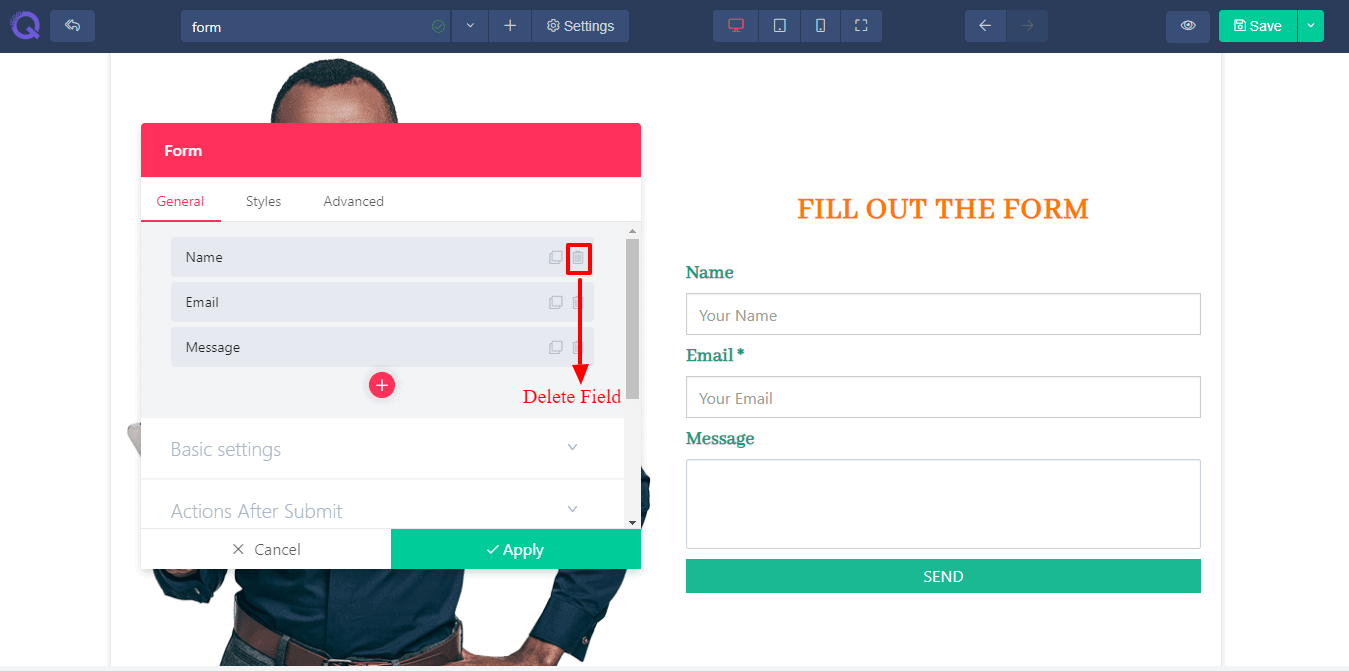 You can delete an unnecessary field by clicking this basket icon.
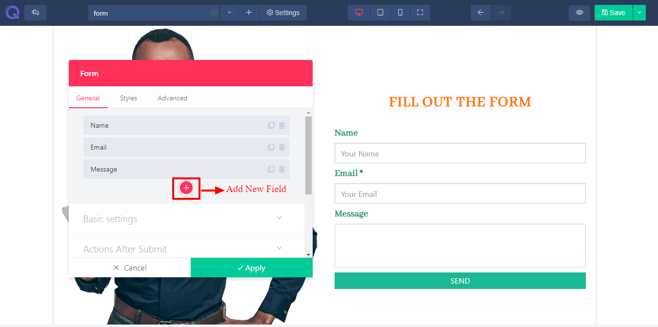 You can add a new field under existing field using this red + plus button.
You’ll find a few settings of each field of fields group given below.
You can add a new field under existing field using this red + plus button.
You’ll find a few settings of each field of fields group given below.
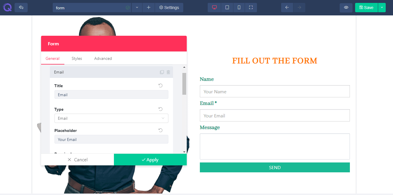
- Title - Title field will help you to add a new title in form. Without a title a user will not understand what to write in it.
- Type - A type field will help you to set what type of answer you need to know of your user. Is it a text type, email type or html code type etc. The input field will response according to its provided type.
- Placeholder - Placeholder field is a faded text provided in the input field for users knowledge. This field will help a user to know what type of information to be provided in that specific field.
- Required - Enabling required option will allow the user to provide a must information. Without filling the required option a user cannot submit the form.
- Column Width - You can set the width of the column using this field. If you need a short input you can provide a short width input field. In case of long input, you can provide a broad input field.
- Help Text - Help text field will help your user to know more about the input field. You can set a note or warning for your user.
- Form Name - In the basic setting, you’ll find a form name field. If you have multiple forms then this field will be helpful for you. You can provide name to each form. This field is required in case you need to collect data from different forms.
- Actons After Submit - This field is given so that you can choose data destination after submission. You can receive user data via email or any other extension. After extension installation, you’ll find it available in this field.
- Email Options - Here you’ll find all the setting options related to email. Set the receiver email, provide an email subject to know what type of data the email contains, provide an email content, control the reply option, provide cc (carbon copy) or bcc (blind carbon copy) in need etc.
- Button Option - In the form you’ll find a given button. To edit this button you’ll find all the editing options here. You can edit the text of the button, set the size, set full width, set alignment, or even set an image.
- Additional Message Option - This field will help you to add addition message for your user like a note or a warning. You can add a message after the mail was successfully sent or if the mail was failed to sent.
Styles Tab
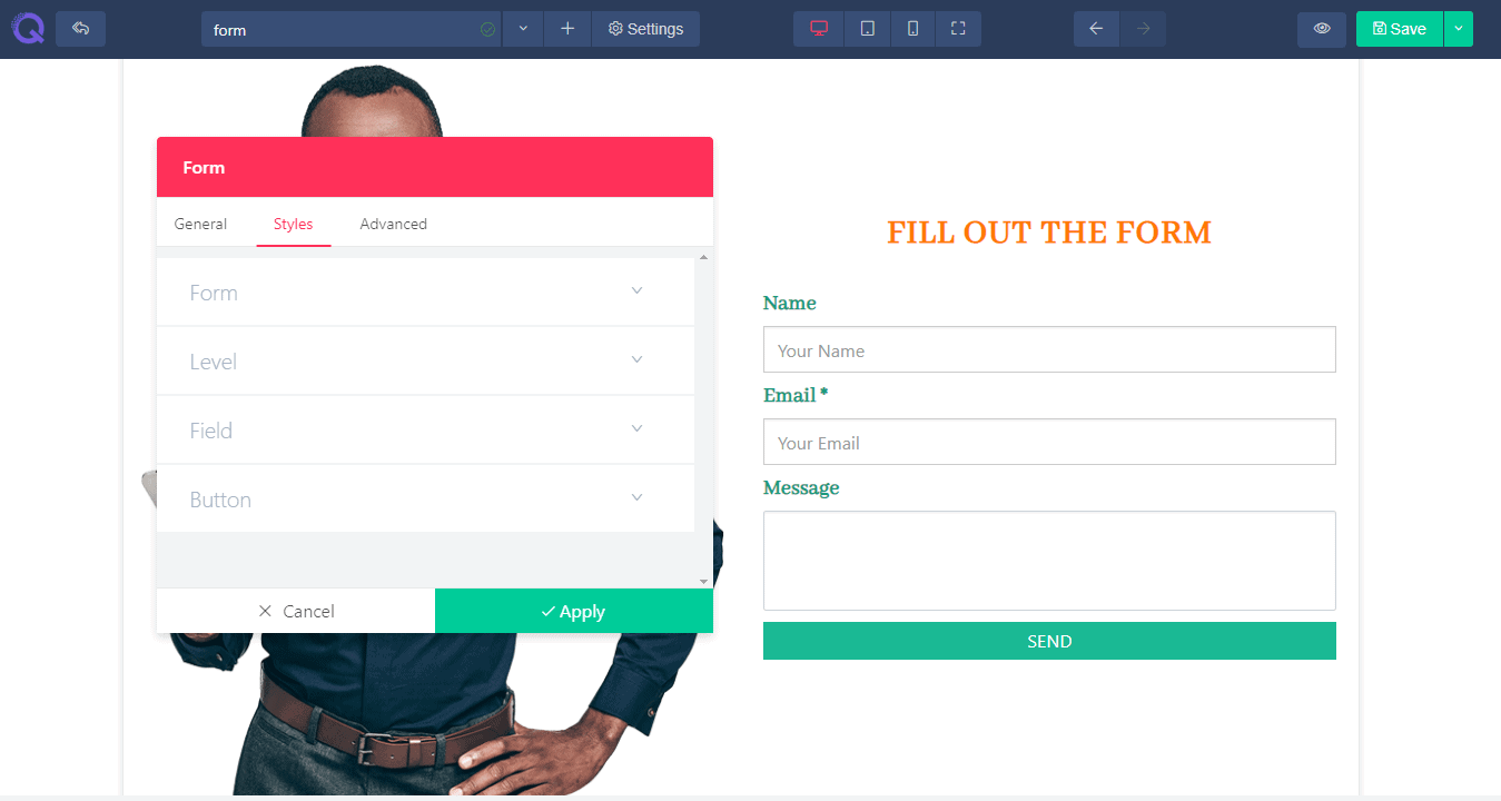 Styles tab will help you style up the form. Here you’ll find four editing fields : Form, Label, Field and Button. The editing options are provided according to each field.
- Column Gap - Column gap will help you to increase or decrease the gap of form between the columns in horizontal.
- Row Gap- Row gap will help you to increase or decrease the gap between the fields in vertical.
- Color - A few color picker is provided for different operations. You’ll find color setting options for text field, background of input box, setting a border color, button option etc.
- Font - Font option will help you to change the font of text. There are thousands of google font provided in a dropdown option. You can go for any of them. You can change the font of label and text field.
- Size - You can control the size of text and digits of both label and input field. Just scroll the slider and set the size. Or just provide a digit value for it in the value box situated right next to the slider.
- Line Height - Line height option will help you to set the height of each and every line. This will insert space between the lines.
- Letter Spacing -Letter spacing option will help you to set space between each and every letter. This will help you to avoid the collision between the letters.
- Text Shadow - Text shadow effect will help you to add a shadow under the text to give a 3D look. Or you can blur the effect to show your text clearly.
- Border Width - Border width will help you to set the width of the border. You can give a fine line to it or just bold it out, whatever you want.
- Padding - In the field option and button option you’ll find a padding option. This padding will control the padding inside the input field and button, in case you want to insert a few space.
- Button- This field will allow you to style up the button in your way. You can add an image to it or a solid color or just leave it with a plain text. You can provide a hover effect to it which gives a splendid look. You can set a border of the button along with a radius. You can even give your button a floating look by adding a box shadow effect to it.
Advanced Tab
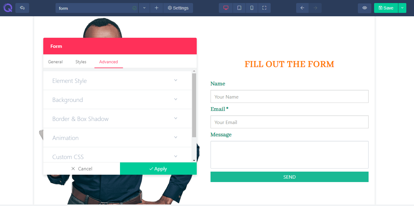 The advanced tab has the advanced level of settings. You can edit then if you find it necessary or just leave it they way it is. Here you’ll find six fields : Element styles, Background, Border & Box Shadow, Animation, Custom CSS, and Identifier. These fields are described below in details.
- Element style - Here you’ll find the margin, padding and z-index option. Margin will help you to add space in accordance with page. Padding will help you to add space in accordance with the column. Z-index will work if you have 2 elements overlapping and you want to display the below element on top. Increment the z-index value and the below element will appear on top.
- Background - Background field will allow you to set a background in the column. You can set an image, a solid color or gradient effect of multiple color.
- Border & Box Shadow - You can give a nice designed border and box shadow to your column. Set a border type, border radius if you want a bit of round shape in the corner. And box shadow effect will give your column a floating effect. You can set color to it, spread the color or add blur it.
- Animation - Animation field will allow you to add a transition effect to the element. Select the entrance animation from the given effects, set the delay time and enable the repeat option (this is optional).
- Custom CSS - This field is available only on PRO version If you are a developer then you can add CSS code of your own to the site by using this operation. Just write the code and click the apply button. You’re CSS code will be added to the content and it won't affect the existing css effect..
- Identifier - This field holds the CSS id of every specific content. This will help you to edit the CSS section if you want to bring any changes in css style.
Grow rapidly with our Joomla SEO service done by the veterans
With over 12 years of business and a vast array of Joomla templates and extensions, we know Joomla SEO better than anyone you could possiblly hire.
Improve my ranking