Ever thought about how every little detail of your online store can make or break your e-commerce success? Take fonts as an example—yes, fonts! They are not just there to make things look pretty; they shape first impressions and play a role in the aesthetics of your product presentations.
In this article, we’ll explore how fonts enhance product appeal and dive into the details of how to select and apply them effectively to really capture your audience’s attention. Read on!
Importance of Typography in Brand Identity
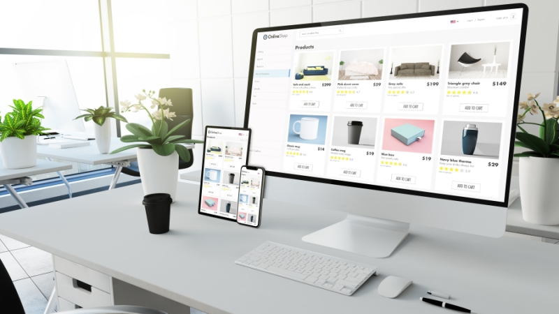
Did you know that your choice of fonts shows off what your brand is all about—its personality and its core values? This is why choosing the right typography in your mockup design is crucial; the perfect font can make your product look sophisticated, reliable, or fun, depending on who you’re trying to reach. This kind of alignment boosts your brand recognition and builds trust.
Another crucial consideration is consistency; a consistent font style across all your marketing materials and e-commerce mockups creates a unified brand experience. More than just streamlining your message, consistent typography clarifies your values for your customers, reinforcing what your brand stands for every time they see your content. All these make your brand more memorable.
Well-chosen typography not only makes information easier to read and understand but also directs a viewer's attention to the essential features of your product. This strategic placement is key in swaying your customer’s decision-making process, subtly steering them toward a purchase.
Choosing the Right Font for Your Audience
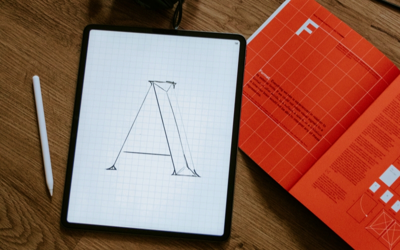
Choosing the right fonts for your e-commerce mockup starts with knowing your target audience; after all, different fonts appeal to different demographics, so you need to pick one that speaks directly to the customers you aim to attract.
So, who is your audience? According to HubSpot, a target audience comprises consumers grouped by specific behaviors, interests, buying history, and demographic traits. Understanding them is crucial as it guides key business decisions—from where to invest in advertising to how to craft messages that resonate with potential customers and even what new products to introduce.
For example, a tech gadget website might opt for a sleek, modern sans-serif to catch the eye of tech-savvy consumers, while a luxury brand could choose a serif font to highlight elegance and a timeless appeal.
To really nail it, try testing various fonts with your audience; you can use A/B testing on your digital mockups to find out which fonts engage your audience more and boost sales. This data-driven strategy ensures that your chosen font not only looks good but also helps you meet your business goals effectively.
The Psychological Effects of Font Choices
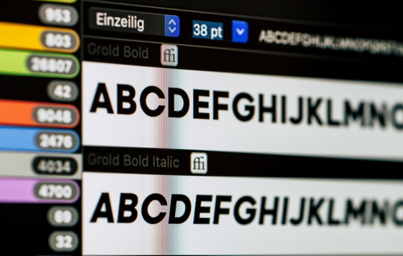
Did you know fonts have the power to evoke specific psychological responses, which can significantly influence purchasing decisions? For example, a font that appears strong and bold may instill a sense of confidence in a product, while a handwritten-style font might evoke feelings of warmth and personal touch.
By understanding the emotions different fonts can evoke, you can better tailor your product presentation to meet the emotional expectations of your target market. This careful alignment can make your e-commerce mockups more relatable and appealing. Considering that as much as 85% of purchasing decisions occur subconsciously, influenced by emotional triggers, leveraging the right fonts can significantly enhance the effectiveness of your marketing efforts.
Ultimately, using font psychology is more than just making things look nice—it’s about creating an emotional shopping experience that connects with your audience. This deeper connection can boost engagement rates and build a more loyal customer base.
Font Readability and its Impact on Conversion Rates
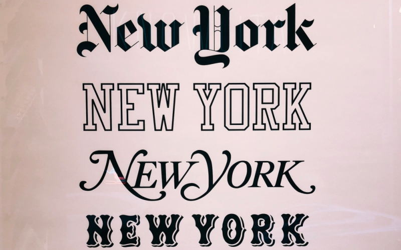
Readability is paramount in e-commerce. If potential customers cannot read your product descriptions and key information at a glance, the likelihood of conversion drops significantly. That said, clear, legible fonts ensure that all the vital details of your products are easily accessible, encouraging users to proceed to checkout.
The size and spacing of your fonts also play a big role in how readable your content is. If the font is too small, your audience might find it hard to read without zooming in; if it's too large, the layout could feel overwhelming. Finding the optimal font size and maintaining appropriate line spacing can make your text blocks look inviting and easy to digest at a glance.
Beyond basic readability, consider how the overall font presentation can affect the user's mood and willingness to buy. For example, a cluttered, hard-to-read font could frustrate users, while a clean, spacious font layout can enhance the shopping experience and boost satisfaction rates.
Optimizing Fonts for Mobile Users

Did you know that in 2022, global spending on mobile advertising hit $327 billion? What’s more, it's expected to approach $400 billion by 2024. These just show that more people shop on their mobile devices, making it essential to ensure your e-commerce mockups look great on smaller screens. Looking ahead, the mobile marketing sector could also grow five times bigger by 2030, indicating how mobile tech has become a fundamental part of the digital world.
That said, when you’re choosing fonts, remember they need to be both legible and visually appealing, even on those tiny screens. Mobile users should be able to read product descriptions and navigate your site with ease, regardless of the device they use. Responsive design principles should guide your typography choices, ensuring that font sizes scale appropriately across devices.
Additionally, consider the load times associated with different fonts. Some fonts, especially those that are more decorative or detailed, can slow down your site on mobile devices. So, opt for fonts that strike a balance between aesthetic appeal and technical performance to keep your mobile site fast and user-friendly.
Integrating Fonts with Other Design Elements

The interplay between fonts and other design elements like color, imagery, and layout defines the overall effectiveness of your e-commerce mockups. For one, a harmonious design invites customers to engage more deeply with your content, while a disjointed presentation can detract from the user experience.
Don't forget contrast; color contrast between the font and background not only affects legibility but also plays a critical role in drawing attention to key areas. High-contrast combinations, for instance, ensure that important information stands out, effectively guiding the user’s journey through your mockup.
Multilingual Fonts for Global Markets
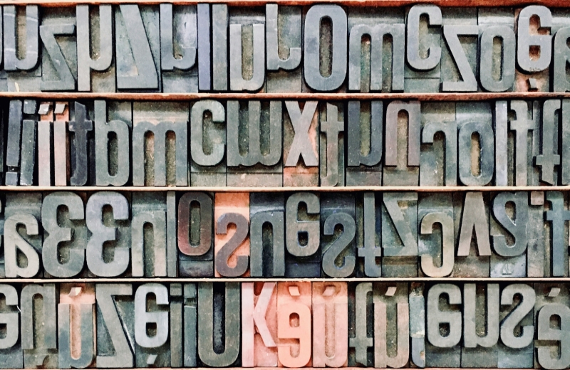
If you're aiming to reach a global audience, it's crucial that your choice of fonts can handle multiple languages. So, choose a font family that provides extensive linguistic support to ensure your e-commerce mockups communicate effectively across different regions. This inclusivity can expand your market reach and boost the global appeal of your products.
Also, be mindful of the cultural connotations of certain fonts in different regions. A font that's well-received in one cultural context might not resonate or even be appropriate in another. Doing your research and showing sensitivity to these nuances is key when designing for a diverse global audience.
Font Trends in E-Commerce
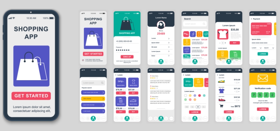
Staying updated on current font trends can give your online store a modern, up-to-date look. But remember, it's crucial to strike a balance between being trendy and appropriate. While a trendy font might catch the eye, it should still fit well with your brand identity and not compromise the readability or functionality of your e-commerce mockups.
One way to get a sense of what might work for you is to see how major brands in your industry are using fonts. These trends can provide great inspiration and show you what's currently hitting the mark with consumers.
However, be cautious about jumping on a font trend just because it's in style. Trends can guide your choices, but they shouldn't dictate them. Always put clarity and brand consistency first; this approach helps maintain a professional and accessible online presence, ensuring that your design choices support your business goals effectively.
Balancing Font Aesthetics with SEO Considerations
While aesthetics are crucial, your e-commerce site’s typography must also be optimized for search engines. Search engines prioritize content that is not only relevant but also user-friendly, which includes the readability and accessibility of your fonts.
Make sure your text is in HTML and not just part of images because search engines can't read text from pictures. This boosts your site's SEO and makes sure that your content is accessible to screen readers and other assistive technologies; this can then broaden your reach and improve the usability of your site.
Moreover, the strategic use of keywords within your text can be bolstered by your font choices. Highlighting key phrases or calls to action with distinct, readable fonts can draw attention and improve the effectiveness of your SEO efforts.
Wrapping Up
n the competitive landscape of e-commerce, carefully integrating fonts into your e-commerce mockups can significantly impact how customers perceive and interact with your brand. From boosting readability to strengthening your brand identity, the strategic use of typography goes beyond mere style—it's about crafting an effective communication tool that connects with your audience.
By applying the principles discussed, you can give your business the nuanced insight needed to fully leverage the potential of fonts in your digital storefronts. Most importantly, remember that in the online sales environment, the clarity, emotion, and consistency of your typographic choices can be just as impactful as the quality of your products themselves.


