
Would you refer someone to visit a website that loads slowly? Or, would you recommend any landing page that doesn't load entirely on different platfor...
Would you refer someone to visit a website that loads slowly? Or, would you recommend any landing page that doesn't load entirely on different platforms? I know, your answer is, NO. Because no one likes to visit an unresponsive page, the demand for the responsive page is high both to the users and developers.
So, when you are building a website, you must need an online testing tool so that you can see your website responsive test alongside speed, and other functionalities of your project. But, it isn't an easy task to check these issues if you don't have the right tools, like, having different platforms to test your website.
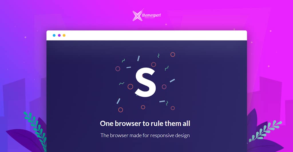
To give relief from these issues, Kitze has brought an online testing tool named Sizzy. This tool has some brilliant cool features that will disappear your panic about testing your website on multiple platforms.
So, let's check it out.
Sizzy- The Game Changer
Imagine, you are a web developer, and you have developed a project. After developing, you have successfully tested that project on your device.
But, you have received negative feedback from your users as they are using your project on different devices. That means you didn't test your project on different types of platform.
How can you solve this issue? Does it mean that you need to purchase different types of devices for testing? No! That'd be extremely expensive, and would even be more than expensive when it's time to upgrade the devices.
This is where an online testing tool can help you. There are several tools available on the internet those are being used to test the responsiveness of websites like BrowserStack, Sauce Labs, and ResponsiveDesign. These all are helpful but with some limitations. Here comes Sizzy- the game changer!
Sizzy is such a tool that will allow you to preview multiple screens at once while you're testing out your responsive web apps. It is a responsive web tester. You can test website on mobile devices online.
It will allow you to see all the changes simultaneously, making it much quicker and easier to spot and fix layout bugs.
Things You Can Do With Sizzy
The main goal of Sizzy is to save time and enhance the productivity of developers and designers. It will enable you to work on your website and instantly preview the changes to the different type of devices at once.
It is a responsive website tester. Sizzy is developed with lots of amazing features. The most important features of them are listed below;
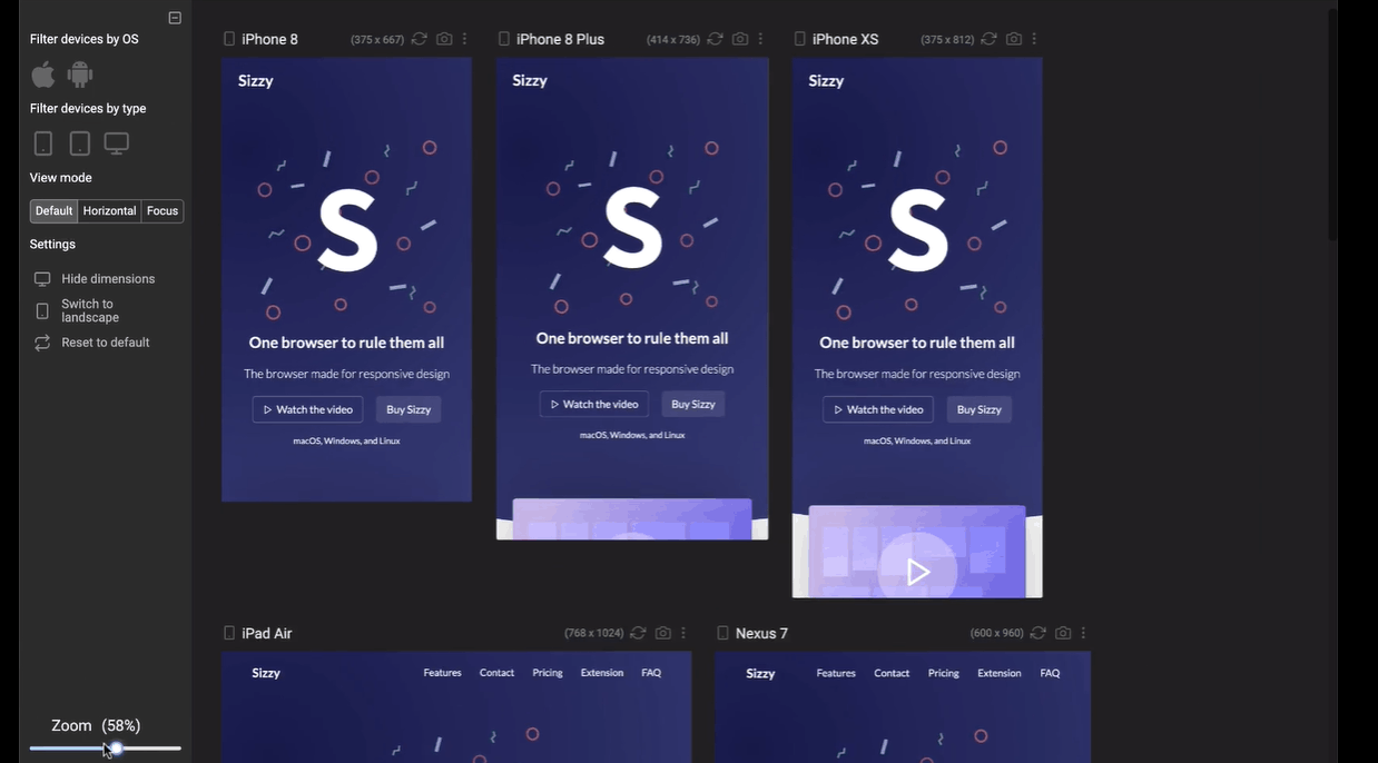
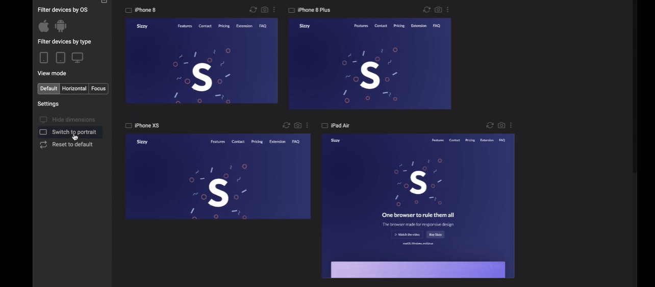
- Rotate screen of the virtual device from portrait to landscape and vice-versa.
- Import a keypad to on the virtual devices.
- Filter devices by OS
- Filter devices by type
- Hide dimensions
- Switch themes
- Reset all settings.
- Taking screenshots of the devices
- Automatically sync scroll and actions on each device
- Scrolling the devices to take a full page screenshot
- Manually show or hide a device's scrollbars
- Features like: Plugins, Presets, Custom User Themes
The main aim of anyone who wants to use this tool is to test a website's responsiveness. The number one uniqueness of Sizzy is its ability to rotate devices. This feature can easily be enabled by clicking on the rotate button on the website.
Another exciting thing about Sizzy is that it provides all its features on top of the site, and at the left sidebar of the website as well. This will definitely give easy access to the users to those features.
Sizzy VS Other Available Tool
The similarities between any online web testing tool for websites is that they display the result on the different screens of the virtual devices.
But, the developer of Sizzy has added more functionalities to his project like letting it rotate the virtual device as well as filter the devices, which isn't possible on most of the available websites.
It will allow you to filter the devices by OS and type. Apart from these, you will be able to zoom in or out as your demand. So, clearly, it is visible that Sizzy is the winner in this race.
Reasons to Choose Sizzy
Sizzy simulates the viewport and user agent of each device, so the results should be the same as what you would see on a real device.
However, Sizzy cannot simulate different browser rendering engines, so there's a chance that there might be some minor differences when testing on a real device.
Take a screenshot of the current viewport or the entire device. You can also screenshot all devices at once.
You can add new devices with custom dimensions and User Agents. Clone, hide, and reorder devices to make Sizzy your own.
Sizzy includes Chrome's dev tools so you can easily inspect what's going on with any device.
Stay focused while working on a specific section of your app. Just write a selector for an element, and all devices will scroll to it even after you refresh the page.
Scroll, click, or navigate to a different URL, and all the devices will follow. If you don't like this behavior, you can quickly turn it off from the settings.
Final Words
It's a common aim to every developer to satisfy every person who uses their project, no matter what platform they're running the project on.
Sizzy is considering as one of the top most powerful web tools for checking website responsiveness with a massive number of features and functionalities. Try Sizzy and let us know your feedback through the comment box.