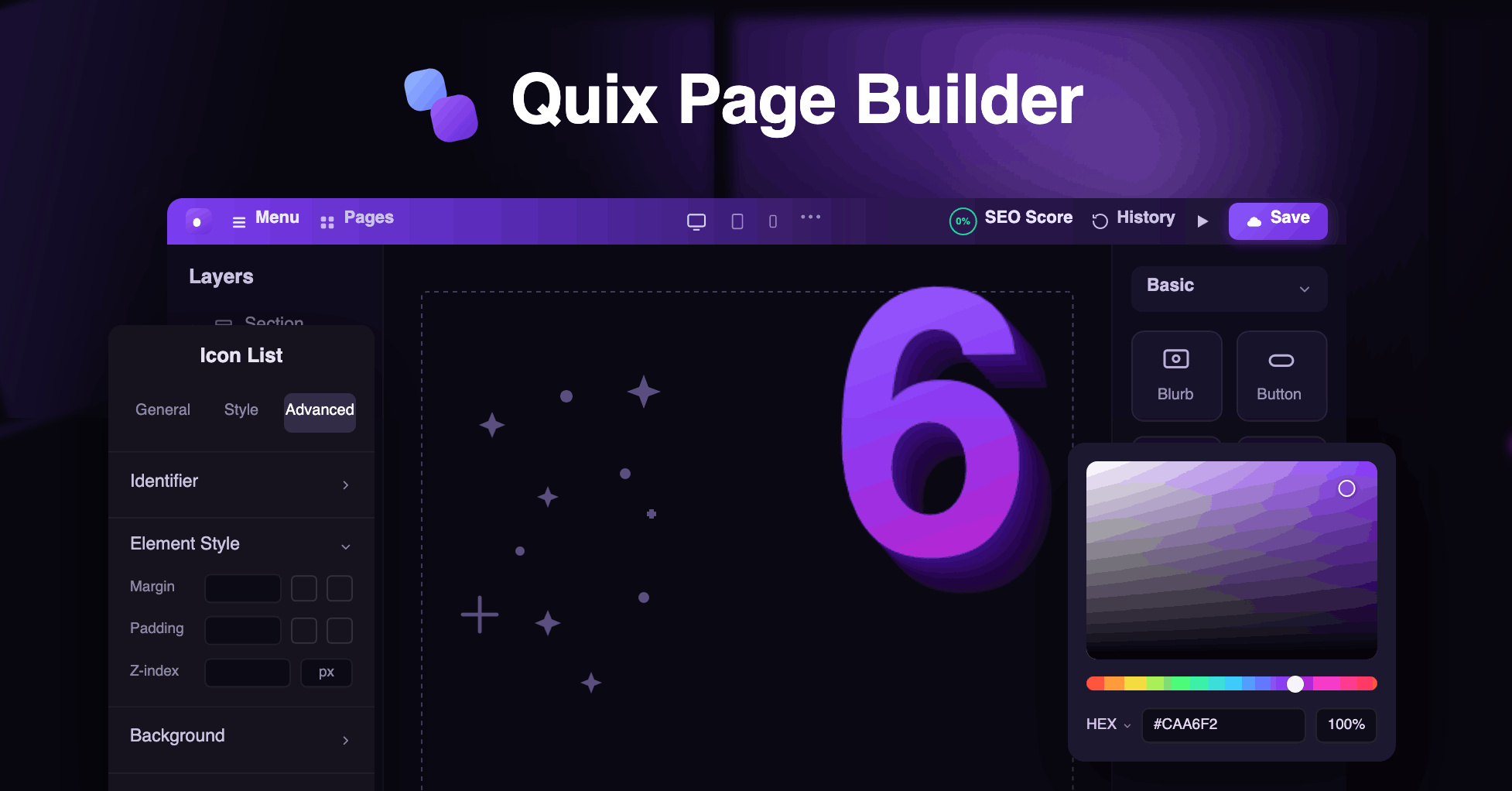
We ship updates to Quix Page Builder pretty often. Most of the time, it's small stuff, the kind of thing you'd never notice unless you went looking. This update is different.
We added four full elements, and honestly, a few of them fix problems we'd been quietly annoyed by for a long time.
So instead of a dry feature list, I'll just tell you about each one the way I'd explain it to a friend who builds sites.
Instagram Feed Now Available
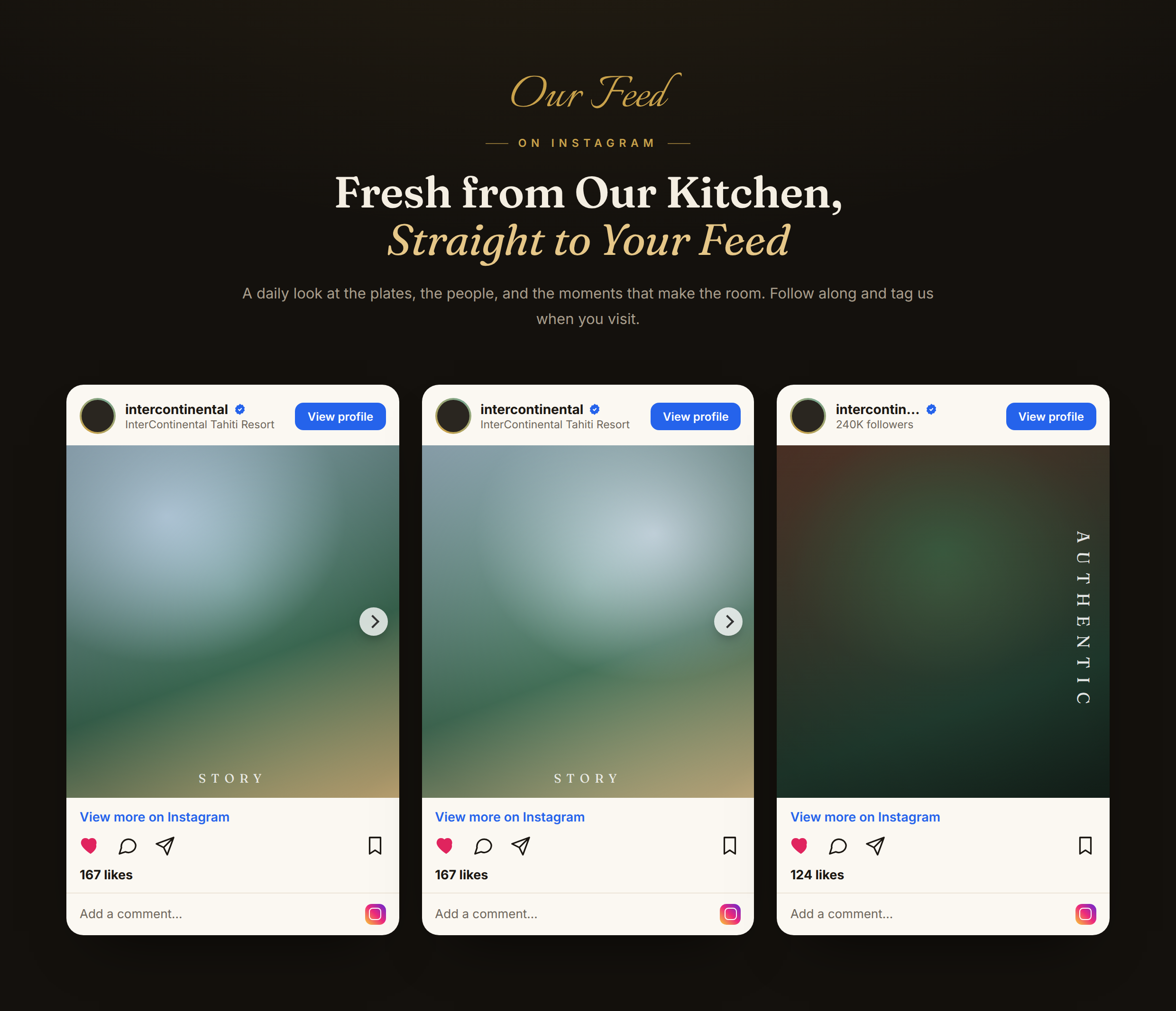
You know the worst part about putting Instagram on a website? The setup. API keys, account connections, and tokens that mysteriously stop working three months later.
People would email us about it. We were tired of it, too.
So this new Instagram Feed element skips all of that. Want a post on your page?
Copy the link. Paste it into the repeater. It's there. Reels, videos, regular posts, all the same way. No keys, no logins, nothing to break later.
Users can select from four different appearance options, which include Plain and Card and Gradient Ring and Elevated styles, to avoid creating an unattractive design.
You can display your posts through grid layouts that support between one and six columns, or you can choose to show them as an automatic sliding carousel.
Users can select to reveal or hide the captions that appear on screen. Posts can sit left, center, or right.
Why bother with all this? People tend to believe what they can observe directly.
Visitors will understand your brand operates actively through genuine posts, which you should display instead of using written explanations.
You should display it on your homepage exactly where your follow button exists and at all other locations that need to attract attention from visitors.
Block Number is small, but it pulls its weight

Here's a thing about people online: they don't read, they scan.
You can write the most helpful three steps in the world, but if it's a gray block of text, half your visitors slide right past it.
A big bold number fixes that. Your eye lands on the "01," and suddenly you're reading. That's the whole idea behind Block Number.

It's simple. A large styled number sits next to a heading and some text. Type whatever you want as the number, usually "01," "02," and so on.
You pick the HTML tags for the number and heading, which matters if you care about clean structure and search ranking.
The body copy runs through a rich editor, so you can bold things, add links, whatever you need. Want the number on the left? On top?
Off to the right? Your call, and you can nudge the vertical alignment until it sits right.
Use it for "how it works" sections, process steps, feature counts, or a row of stats. Anywhere a number helps the reader follow along, this earns its spot.
Image Content: the layout you build a hundred times
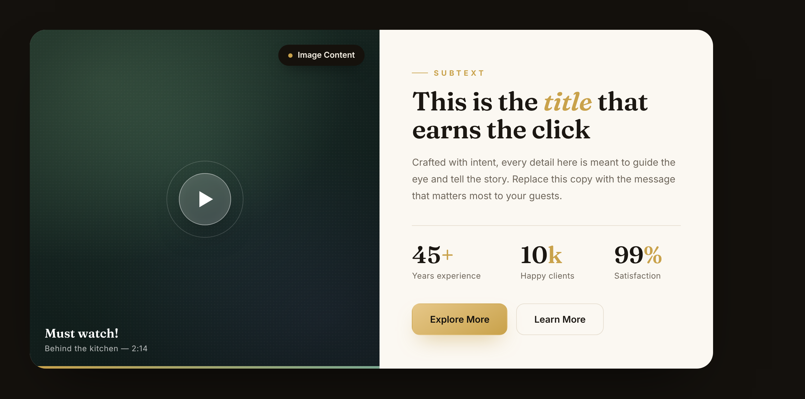
Picture on one side, words on the other. You've built this layout before. Everyone has. It's everywhere because it just works.
The catch is that getting it to look good always takes more fiddling than it should.
You want the image on the right, a little badge in the corner, a small label above your title, and even spacing all around. That's a lot of lining up by hand.
Image Content does the lining up for you. Put the image left, right, top, or bottom.
Drop an optional badge over it, something like "45+ Years" or "New," and decide where that badge sits.
That tiny badge is a sneaky-good way to show off experience or flag a fresh launch.
On the text side, you get an eyebrow label (that small line above a title), a main title with your choice of HTML tag, and body text underneath.
There's also an aria label field for the image, which keeps things readable for screen readers.
Good for your visitors, good for accessibility, no extra work from you.
Clients: borrow a little trust
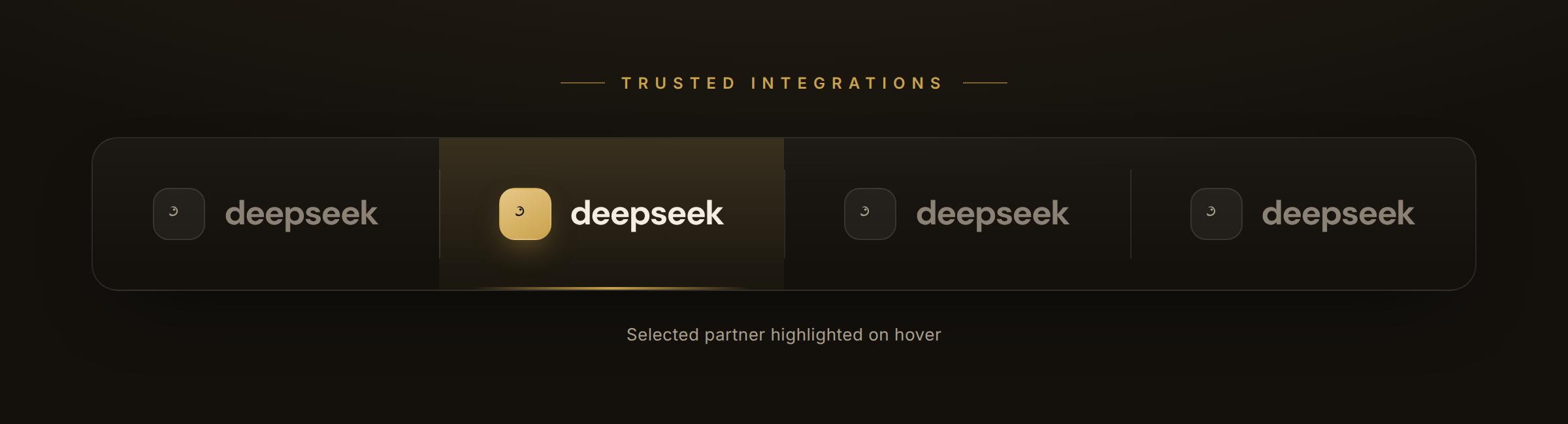
The method appears to be basic, yet it produces successful outcomes in every case. People feel safer when they see that other people went first.
Show a visitor that real brands already work with you, and they fill in the rest themselves: "Okay, these folks must know what they're doing.
The Clients element gives you a clean row of logos without the usual mess.
Each logo exists as a repeater item, which includes a title, an image, alt text, and a link that enables users to click on every logo for direct access to the corresponding client's website.
The package includes example logos that display Client 1 through Client 4 to help you visualize the final product instead of facing an empty screen.
Keep it as a still grid, or flip the "Use As Carousel" switch and let the logos drift across the screen.
Control how many sit per row, turn on autoplay for the carousel, and align the whole thing left, center, or right.
Who is this actually for?
Fair question. New features sound nice, but they only matter if they save you time. So here's who'll get the most out of these four.
Freelancers and web designers. You build pages for clients all day. An about section here, a logo wall there, a "how it works" block on every other site.
These elements are the exact pieces you keep rebuilding from scratch. Now they're one drag away, so you ship faster and bill the same.
Small business and shop owners. You don't have a developer on call, and you shouldn't need one. Want to show your Instagram, list your steps, or prove that real brands trust you?
You can do all of it yourself in a few minutes.
Marketers and content folks. Landing pages live and die on trust and clarity. Social proof, clean stats, strong image-and-text storytelling.
That's your whole job, and these elements hand it to you ready to go.
Agencies. You're building dozens of pages a month. Anything that cuts setup time and kills your reliance on extra plugins pays off fast across a whole team.
And honestly, if you build pages in Quix at all, at least one of these is going to make your next project easier. That's kind of the point.
So why these four?
Look at what they add up to. Instagram brings social proof. Block Number makes your steps and stats actually get read.
Image Content tells your story with a face next to it. Clients borrow trust from the brands you already work with.
None of that is random. Those are the pieces that turn a flat page into one that quietly nudges people toward doing something.
And before this update, you'd have cobbled them together from spare blocks or leaned on extra plugins. Now they're sitting right inside Quix, ready to drag in.
Best move? Stop reading and go poke at them.
Open Quix Page Builder, drop one onto a page, mess with the settings for five minutes. You'll find a use for each one faster than you'd think.
That's the update. Go build something good with it, and tell us what you make. We genuinely like seeing it.