
Quix Joomla Page Builder is much more upgraded and sorted than it was ever before. Cause now Bootstrap 4 has been included in Quix making Quix page builder unstoppable.
Today I'll talk about the Layout System of Quix. Earlier, we used Bootstrap 3 for layout system. It consists the basics of HTML, CSS, and JavaScript. The preprocessor of Bootstrap 3 is LESS which is written in JavaScript. The popularity of LESS among developers is 13.4%. It uses 4 grid tiers and they are xs(phones), sm(tablets), md(desktops) and lg(larger desktops). And many more things.
You might have got a question, "What's the need of moving to Bootstrap 4?" Right?
Why lack behind when you can work with latest features of Bootstrap. Latest version of Bootstrap is Bootstrap 4. It has new components, more flexibility, and more responsiveness. It supports the latest, stable release of all major browsers and platform except Internet Explorer 9.
Bootstrap 4 offers many new flexible features and it appeared to be the better than the best. So, not delaying further we used Bootstrap 4 for Quix 2.0 page builder.
Reason behind migration to BS4
As you know, bootstrap is the world's most popular framework for building responsive, mobile-first sites, and applications. It has high quality HTML, CSS, and JavaScript to make any project easier than ever.
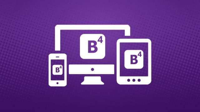
Bootstrap includes a powerful mobile-first flexbox grid system for building layouts of all shapes and sizes. It is based on a 12 column layout and has 5 tiers i.e. xs (extra small), sm (small), md (medium), lg (large) & xl (extra large) breakpoints. Now, these breakpoints are fixed as the pixels are specified. These breakpoints make sure not to break the websites as the changes appear in different devices. Now you don't have to worry about fitting to the screen. It will adjust by default.
Moreover, we choose Bootstrap 4 over Bootstrap 3 for these reasons:
- Popularity
- Flexibility
- Responsiveness
Let's get into a little bit deep. Shall we?
1) Popularity
Bootstrap 4 got its popularity just after arrival. A Bootstrap team made a survey in Tweeter about Bootstrap 4 and they got a very high response. Most of the developers loved it because of its exclusive features.
Around 3.5% of the entire internet uses Bootstrap. Because of its flexbox, form control, appearance & look, mobile-first, and most importantly, the migration from BS3 to BS4 is really very simple.
2) Flexibility
Bootstrap 4 is way more flexible than ever.
The Grid System consists of 3 main parts. Container, Row, and Columns. A fixed container is set by default. Inside the container, rows are set and all you need to do is set the column. And moreover, you can change the size of columns just the way you want.
3) Responsiveness
When it comes to BS4 nothing can beat its responsiveness.
The Grid system consists of 5 grid tiers. The 12 column layout is developed with percentage which makes the drag and drop more easy and smooth. The 12 columns are not a must. You can use 2,3,4,6, and max 12. You can set different column numbers for different devices and make the websites more flexible in display screen of any device. It can adjust from extra small to extra large device screens.
Now that's what I call a revolution…
Quix Joomla Page Builder is much more upgraded and sorted than it was ever before. Cause now Bootstrap 4 has been included in Quix making Quix page builder unstoppable.
Today I'll talk about the Layout System of Quix. Earlier, we used Bootstrap 3 for layout system. It consists the basics of HTML, CSS, and JavaScript. The preprocessor of Bootstrap 3 is LESS which is written in JavaScript. The popularity of LESS among developers is 13.4%. It uses 4 grid tiers and they are xs(phones), sm(tablets), md(desktops) and lg(larger desktops). And many more things.
You might have got a question, "What's the need of moving to Bootstrap 4?" Right?
Why lack behind when you can work with latest features of Bootstrap. Latest version of Bootstrap is Bootstrap 4. It has new components, more flexibility, and more responsiveness. It supports the latest, stable release of all major browsers and platform except Internet Explorer 9.
Bootstrap 4 offers many new flexible features and it appeared to be the better than the best. So, not delaying further we used Bootstrap 4 for Quix 2.0 page builder.
Reason behind migration to BS4
As you know, bootstrap is the world's most popular framework for building responsive, mobile-first sites, and applications. It has high quality HTML, CSS, and JavaScript to make any project easier than ever.
Bootstrap includes a powerful mobile-first flexbox grid system for building layouts of all shapes and sizes. It is based on a 12 column layout and has 5 tiers i.e. xs (extra small), sm (small), md (medium), lg (large) & xl (extra large) breakpoints. Now, these breakpoints are fixed as the pixels are specified. These breakpoints make sure not to break the websites as the changes appear in different devices. Now you don't have to worry about fitting to the screen. It will adjust by default.
Moreover, we choose Bootstrap 4 over Bootstrap 3 for these reasons:
- Popularity
- Flexibility
- Responsiveness
Let's get into a little bit deep. Shall we?
1) Popularity
Bootstrap 4 got its popularity just after arrival. A Bootstrap team made a survey in Tweeter about Bootstrap 4 and they got a very high response. Most of the developers loved it because of its exclusive features.
Around 3.5% of the entire internet uses Bootstrap. Because of its flexbox, form control, appearance & look, mobile-first, and most importantly, the migration from BS3 to BS4 is really very simple.
2) Flexibility
Bootstrap 4 is way more flexible than ever.
The Grid System consists of 3 main parts. Container, Row, and Columns. A fixed container is set by default. Inside the container, rows are set and all you need to do is set the column. And moreover, you can change the size of columns just the way you want.
3) Responsiveness
When it comes to BS4 nothing can beat its responsiveness.
The Grid system consists of 5 grid tiers. The 12 column layout is developed with percentage which makes the drag and drop more easy and smooth. The 12 columns are not a must. You can use 2,3,4,6, and max 12. You can set different column numbers for different devices and make the websites more flexible in display screen of any device. It can adjust from extra small to extra large device screens.
Now that's what I call a revolution…
Benefits of BS4
The developers of Bootstrap decided to take it to a next level. So to make a progress they implemented many cool new features which makes BS4 really special framework.
- Adopted SASS: SASS (preprocessor programming language) is much popular among frontend developers as it is easier to use and offers more possibilities. Libsass Sass compiler is written in C/C++ which allows BS4 to compile much faster.
- Relative CSS Units: BS4 dropped the support of Internet Explorer 9 which made them got rid of annoying polyfills, and convert to Relative CSS Unit Instead of pixels, REMs (Font-size of the root element) and EMs (length unit in layout) to implement more responsive typography on Bootstrap sites. And it will also increase readability, and make the site more accessible for disabled users.
- Added New Tier: BS3 already had 4 tiers but still, something looked like missing a pinpoint. So to clarify and intensify, BS developers added another tier in BS4. They added xs for extra small screen which has 480px viewport width.
- Unboxing Cards: The development team decided to unite some previous elements of BS's user interface, so they introduced a new UI called Cards (flexible and extensible content container). These Cards include options for contextual background colors, wide variety of content, header, footer, and powerful display options. The Cards will replace the wells, panels, and thumbnails providing more streamlined workflow.
- Flexbox: BS4 adopted Flexbox as it deals with the layout in one dimension at a time. It provides a container that either expands or shrinks itself to fill the available space in the best way. It can also be used to scale elements or apply advanced alignment capabilities both in horizontal & vertical.You can say, adopting flexbox is BS4's one major step.
- Reboot Module: BS4 adopted an enhanced version of Normalizes.css making it a Reboot Module. This step was taken to include all the generic all the CSS selectors and reset styles in a single easy-to-use SCSS file.
- Restructure JS Plugin: JavaScript plugins are refactored with ECMAScript 6 to improve the frontend experience. Other JS improvements are generic teardown method, option type checking, and UDM support, and will all work together making the most popular framework run more smoothly.
- Variable customization: All the SASS variables are stored in one single file called _variables.scss that will smoothly run the development process. In case of changing the default value, copy the _variables.scss to another file called _custom.scss. There are many things you can customize, such as spacing, typography, colors, column number, style links, tables, grid breakpoints and containers, and gutter width and many other things.
- Tooltips and Popovers by Tether: BS4 makes use of Tether Library, a positioning engine makes it possible to keep an absolute positioned element right next to another element on the same page. Meaning they will be automatically placed properly on BS4 websites. But you need to add it to the HTML before your bootstrap.js file as Tether is the third party JavaScript Library.
- Supportive Browsers: BS4 supports almost all the browser i.e., Chrome, Safari, Opera and other Internet Explorer versions except IE9. You can use BS3 for IE9.
- Added New Utility Classes: BS3 already had many Utility Classes for spacing but BS4 added more. BS4 allows the developers to quickly change paddings and margins on their site. And the syntax for new classes is very straightforward, such as, m-a-0class sets links a style rule that sets margin to 0 on all sides of the given element. While margin uses the m-prefix, padding uses the p-prefix. And some other additions like, responsive text alignment classes, responsive floats, and responsive embedding are also made.
- Navbar: The Navigation bar has been more simplified and some additions are made like nav-link class, nav-item class, and navigation bar styles etc.
Your Benefits
Now it's your turn to get the most benefit from Quix page builder. What are we offering you is, your migration from Quiz 1.0 to Quiz 2.0 where you'll get all the benefits you wished for. Let's make the lists of what will you get.
- Flexbox based grid
- Responsive mode for 5 tiers adjusting automatically
- Customization options for Navbar
- New Spacing Utilities
- More form control
- Auto Margins
- Responsive Sizing
- Bloat-free zone
- Vertical Centering
- Latest auto-layout grid
With all the benefits, your website will look much more alive and a dashing website always attracts more traffic.
Conclusion
All's well that ends well. With the latest features of Quix, we are offering you the best ever Quix 2.0 Joomla page builder that has all the features. Feed your craving with the dashing Quix 2.0 and let us know your experience.
We always lookup for your suggestions and advice. So if you got one, just let us know and we'll surely make it up to you.
Don't keep the emojis waiting. They love your attention. So click any one of them and we'll know how much helpful was this post for you. Till then take care and we'll be back later with much more exciting offers just for you.