

Accordions are very similar to tabs that allow for additional content to be shown below the heading upon mouse action, but the items are not displayed within a vertical list.
When a new item within the accordion list is opened, the previously-opened item is closed, and the new item's content is displayed.
Whether you are a Free or PRO user of Quix - the most advanced page builder for Joomla, you will get an accordion element includes with it.
In today's post, I am going to show you how to create an accordion with Quix page builder. Let's see the customization options of Quix Accordion.
How to Create an Accordion using Quix?
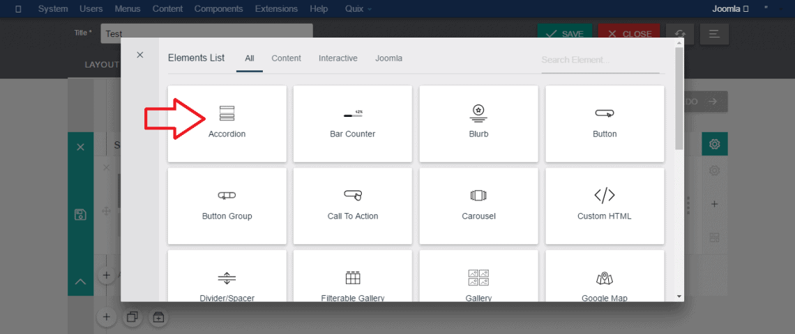
Insert Accordion Element:
To start, you have to insert an accordion element. So, choose a section of your website where you want to inject the accordion.
Configure General Settings:
You can see few following options inside general settings tab.
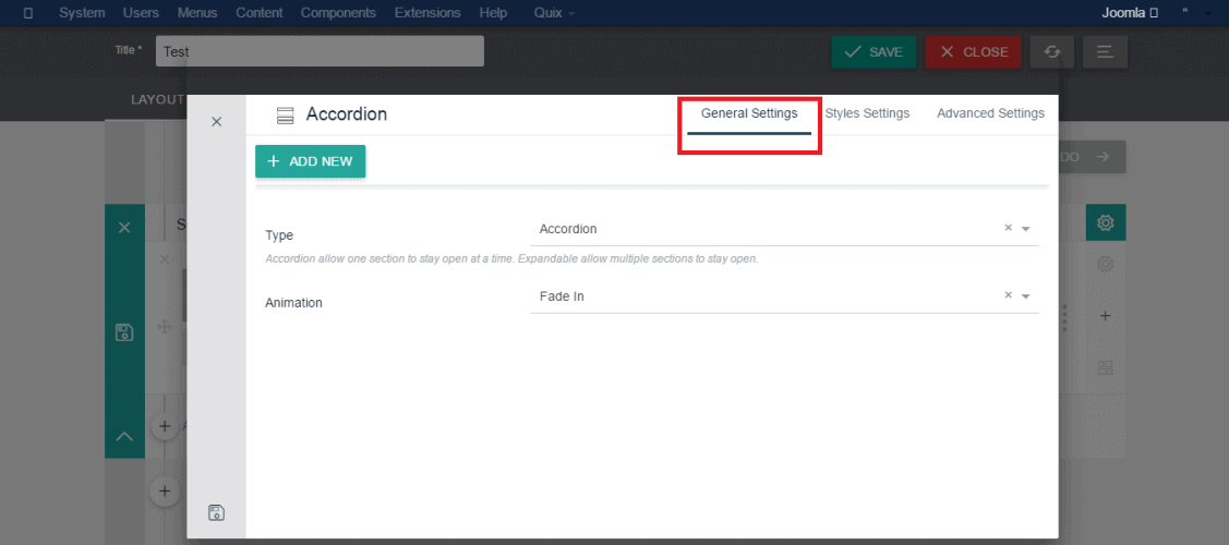
- Add New: When you click on this button, it will add a new content tab in the accordion.
- Type: There are two types of accordion you will see here. These are: Expandable and Accordion. 1.
- Accordion: This styling type defines the tab will expand when clicked on. It _allows you to hide content that is not immediately relevant to the user_. 2.
- Expandable: Differ from the accordion style type expandable style type also expand when clicked on, but it _does not hide content that is not immediately relevant to the user_.
- Animation: Quix Accordion element comes with total _six animations_. These are: Fade In, Zoom In, Left to Right, Right to Left, Bottom to Top & Top to Bottom. Choice one among them to fetch an animated style in your accordion tabs. If you don't like an animation, then you can also select "No Animation" option.
When you add a new item in the accordion, you will get another setting panel and can customize every item. Just click on anyone, it will take you to the configuration option.
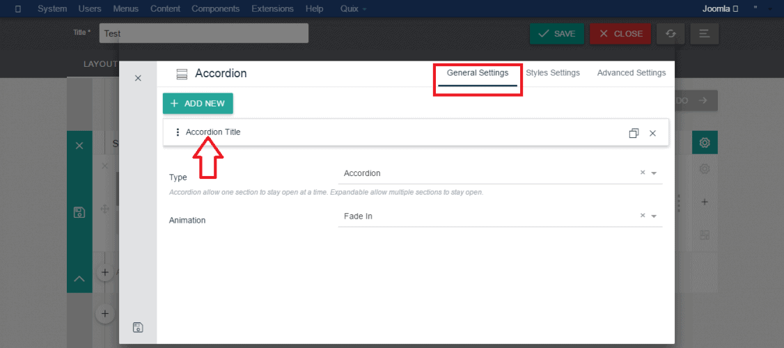
You'll get the following options among each item.
- Title: Keep the title of the accordion tab in this field.
- Content: The description of accordion tab goes here. You may fetch some styles in the text using the _TinyMCE_ editor.
- Enable Icon: This setting option allows you to add an icon to an accordion tab. If you want to add an icon you must enable this setting before choosing an icon.
- Search Icon: After enabling the previous option you can see the search option. Here you can search for an icon, or you can directly select an icon by mouse click.
Configure Style Settings:
You can see few following options inside styles settings tab.
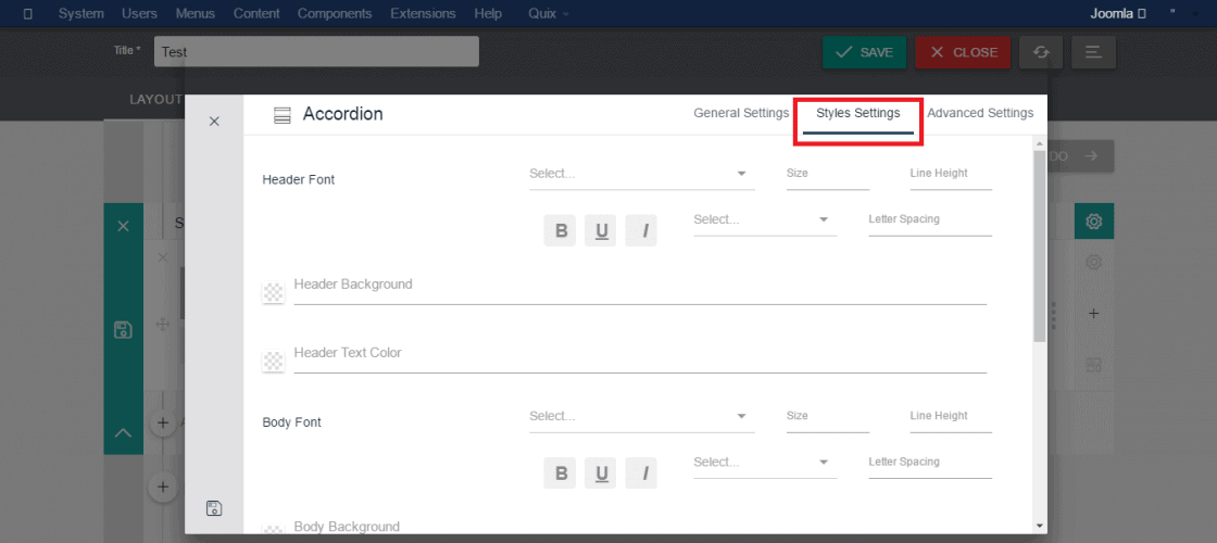
- Header Font: Choose the font of the title text from here. Here you can also define font size, line height, line spacing, and letter case also.
- Header Background: Choose the background color of the accordion tab from this field.
- Header Text Color: Choose the color of the title font.
- Body Font: This setting defines the font of the description of accordion tabs. Same as the title font, you can also define the font size, line height, line spacing, and letter case.
- Body Background: Choose the background color of the body of the accordion tab.
- Body Text Color: Here specify the text color.
- Border Color: When you define the border color it will appear on the outside of the accordion tab.
- Margin: When you need some space outside of the element specify it in this field with digits.
- Padding: If you need some space inside of the element specify it in this field with digits.
Configure Advanced Settings:
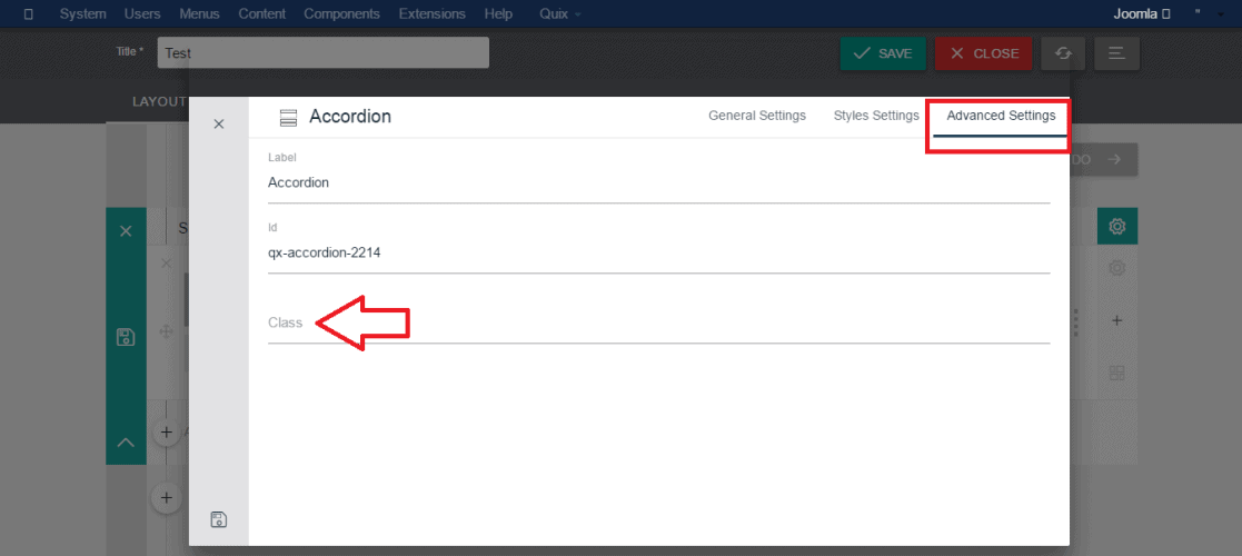
Quix also allows you to fetch some extra style using the Advanced settings panel. Just write your own attributes in a CSS class of your templates stylesheet and insert those class name here.
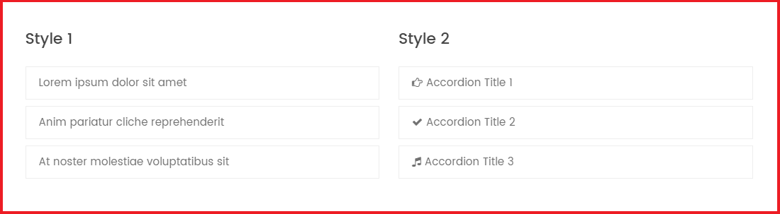
The image in below presents an example of accordion that we have used in our Joomla Templates.
Summary
I have tried to brief all setting options of the accordion element in above. Hope you got it and now able to create an excellent accordion on your own using the Quix page builder. You can also use our dedicated Joomla Extension Xpert Accordion.
Have any questions? Let us know through the comment section.