
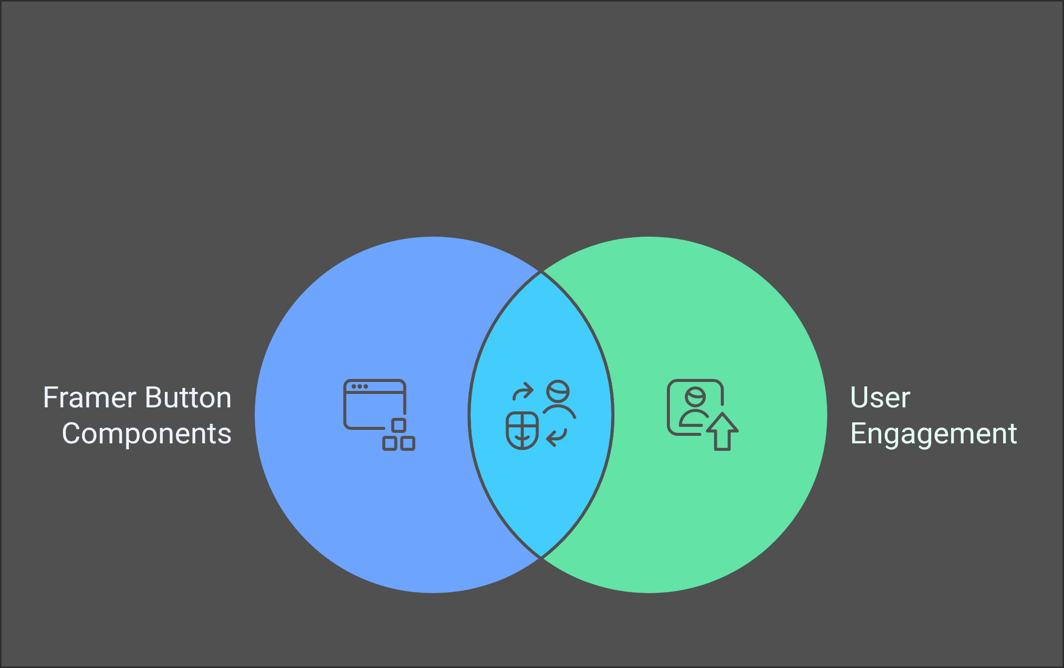
Buttons are the heartbeat of user interfaces—the small yet mighty elements that drive engagement and interaction. In the world of design, understanding how to create and customize button components in Framer can transform a basic layout into a stunning user experience. By mastering these components, designers can wield unparalleled control over functionality and aesthetics.
As we embark on this journey, we will explore everything from the foundational elements of button design to the complexities of integrating sophisticated features. Each section will unravel new skills, such as designing your first button, exploring options with variables and variants, and even crafting unique logo buttons that reflect your brand identity. With these tools, you’ll gain the confidence to innovate and optimize your designs like never before.
Join us as we delve into the art of Framer button components, uncover vital methodologies, and learn practical examples that elevate your design practice. For designers, this guide is not just about buttons; it’s about harnessing the potential to create impactful and memorable digital experiences.
Understanding Button Components
Understanding Button Components in Framer
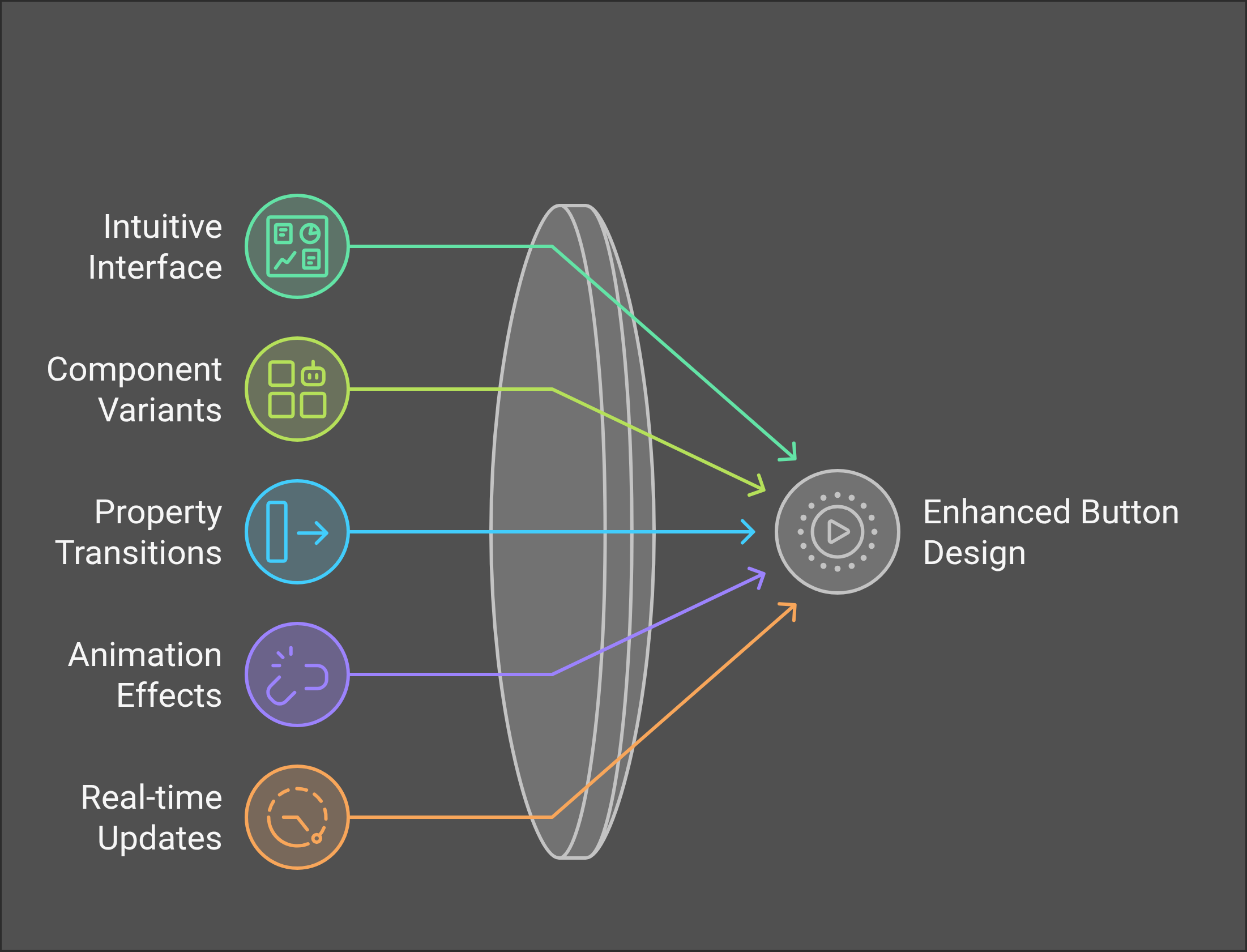
Button components in Framer are more than just simple UI elements; they are the epitome of innovation in design projects, serving as a real time-saver and a favorite among @framer creators. With Framer's intuitive interface, crafting interactive buttons with stunning effects—like hover and click animations—becomes an exhilarating experience.
The default display mode uses the HTML <button> element, allowing flexibility to transform it into a link, adapting to the needs of your project. Imagine the possibilities with defining distinct hover states, each providing a tailored user interaction experience! The customization doesn't stop there; button components in Framer come packed with predefined actions, expertly executed upon a user click.
Here's a quick glance at what makes these button components essential:
|
Feature |
Benefits |
|
Intuitive Interface |
Easy creation and customization |
|
Hover State Definition |
Enhanced user interaction |
|
Predefined Actions |
Extensive customization options |
|
Default HTML |
Flexible to function as a link |
Elevate your Framer projects with these interactive components, and let them be the base design that enhances both functionality and aesthetics with smooth, attention-grabbing animations. Experience the passion of design with button components as your top tool in the advanced component library.
Designing Your First Button Component
Designing your first button component in Framer is an exhilarating journey into the world of interactive design. With Framer, the creation of button components becomes a time-saver, revolutionizing your design projects through its streamlined process and advanced component library. Simply press command K to access a quick menu for seamless navigation and setup.
Framer provides an intuitive interface that transforms the daunting task of creating customized button components into an enjoyable experience. Each button component can feature multiple variants, allowing you to incorporate diverse styles, including hover and pressed states, all within a single unit. This flexibility enhances your visual projects while maintaining a consistent design language.
Enhancing these button components is as straightforward as adjusting property transitions and applying smooth animations. Imagine adding unique effects such as easing or spring options, and experimenting with border radius tweaks to add flair and sophistication to your button designs.
Embrace the future of design with Framer's interactive components, ensuring your creations stand out with their dynamic and engaging features. Let the wide selection of component variants inspire your next Framer project, and enjoy the convenience of real time-saver elements that evolve with constant and future updates.
Exploring Variables and Variants in Button Design
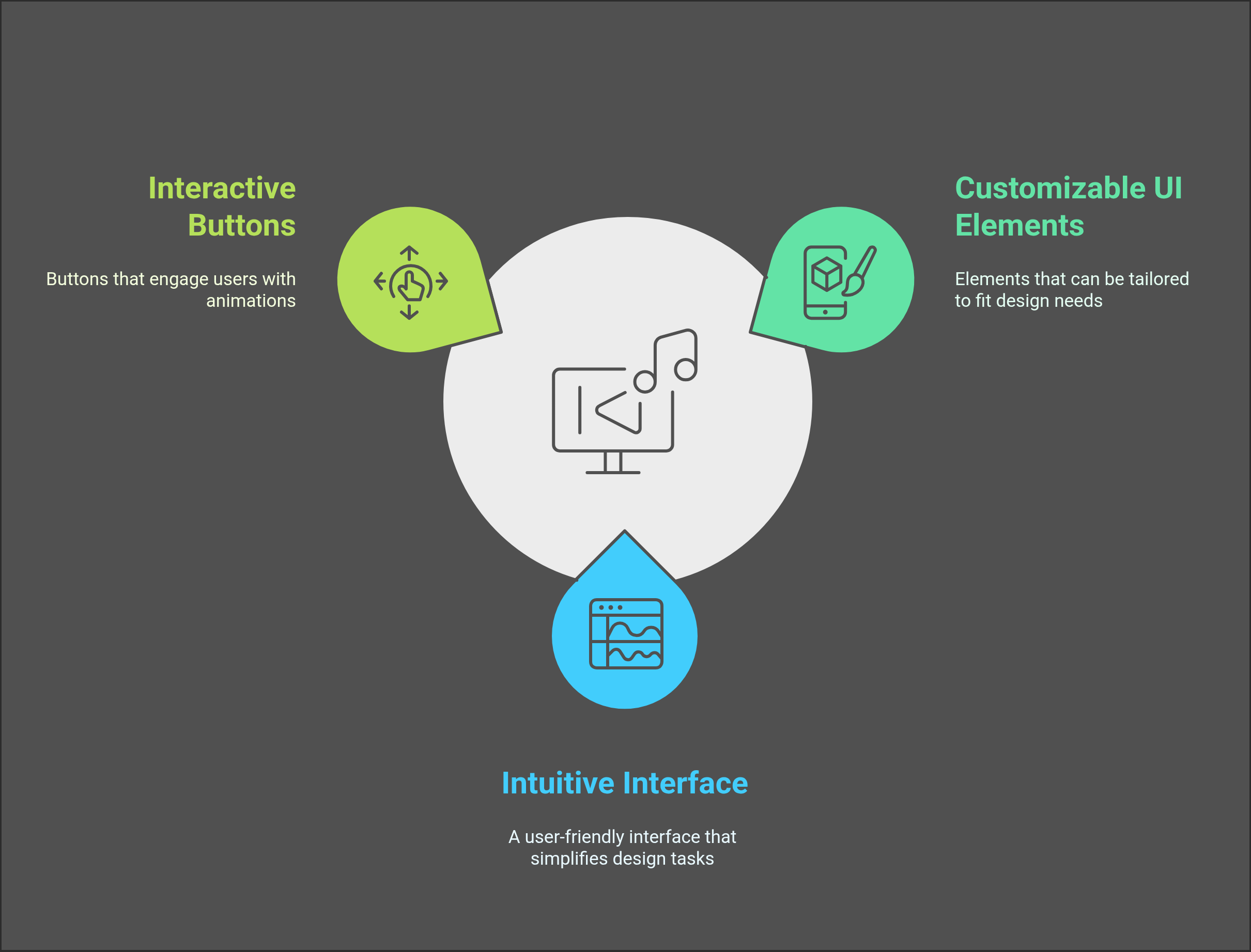
When it comes to crafting delightful digital experiences, button components in Framer stand out as an irreplaceable element of your design toolkit. These customizable UI elements allow designers to explore variables and variants, creating interactive buttons that captivate users with seamless hover and click animations.
One of Framer's most powerful features is its intuitive interface, which streamlines the creation and adjustment of button components. Designers can effortlessly modify button states—adding hover states and tweaking visual properties like shadow and border opacity to high-tail the aesthetic appeal and user engagement.
Benefits of Framer Button Components:
- Consistency & Reuse: Button components can be easily copied and pasted into projects, ensuring brand consistency across your design spectrum.
- React Environment Integration: With the Copy Import feature, you bring these dynamic buttons into any React environment, making them a real time-saver for developers.
- Interactive Design: Utilize component variants to vary button appearances within the same project, adapting to different user interactions with ease.
Step into the future of design projects where your visions are continually enhanced with Framer's constant updates and smooth animations. Dive deep, explore, and make every button press matter!
Integrating Nested Components into Button Functionality
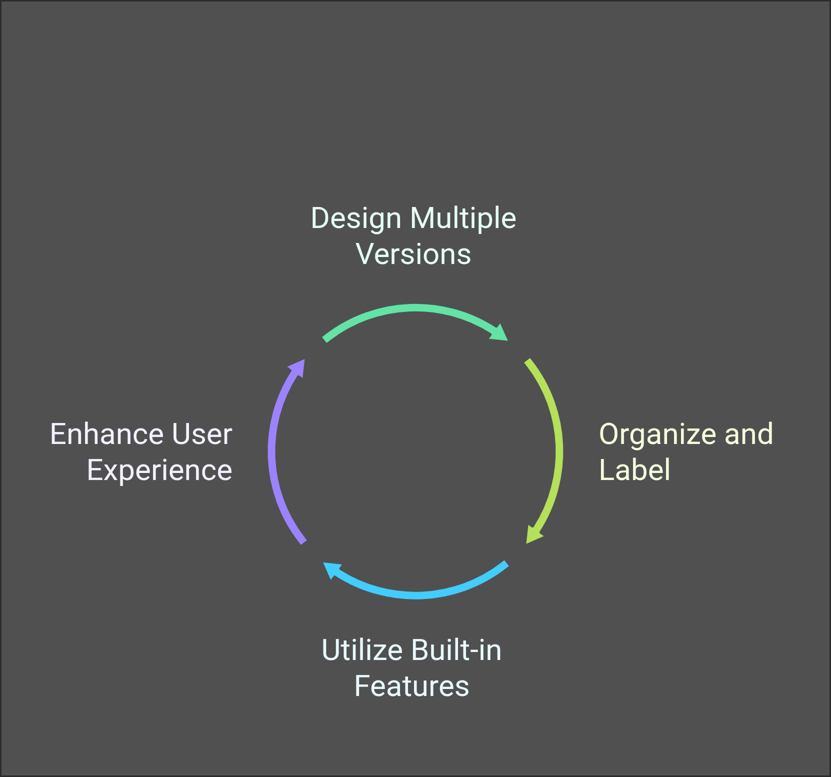
Integrating nested components into button functionality in Framer opens up a world of creative possibilities for designers. Leveraging button variants, you can design multiple button versions that seamlessly share text, icons, sizes, and styles. This feature enhances design versatility and ensures that every button component is optimized for function and aesthetics.
To maximize efficiency, it's essential to organize and label button variants clearly, particularly when managing nested components in complex designs. This practice simplifies navigation and enhances the coherence of your button components.
Utilizing Framer’s built-in features like states and interactions elevates the dynamism of your button variants. This ensures smoother transitions and more engaging user experiences. The Button Action interface further enhances this by requiring an actionName for method invocation, allowing for optional parameters that add layers of functionality.
When combined with UI elements like Listing and Form components, button integrations contribute to cohesive design interactions. Here’s a quick checklist:
- Organize and label variants clearly.
- Leverage states and interactions for dynamism.
- Integrate with Listing and Form components for enhanced coherence.
By mastering these techniques, Framer’s advanced component library becomes a real time-saver, consistently evolving with future updates and making every design project a breeze!
Creating a Logo Component for Your Button
Creating a logo component for your button in Framer is a designer's dream, effortlessly blending customization with dynamic design and user experience. The process is straightforward—just press Command + K to explore Framer's quick menu and launch your component-building journey. This intuitive approach is what makes creating components in Framer such a powerhouse for any design project.
The magic really happens with the reusability of Framer components. Imagine changing your logo button once, and seeing it beautifully synchronized across every page of your project. Yes, it’s that simple! And the possibilities don’t stop there. Framer's advanced component library allows for easy implementation of multiple variants—hover states, pressed actions, you name it.
Add to this the seamless integration of interactive components like animations and transitions. Framer's interface makes it a breeze to incorporate these stylish effects, elevating your design to the next level of professionalism and flair.
Here's a quick overview of what's possible:
|
Feature |
Benefit |
|
Reusability |
Consistent updates across all instances |
|
Multiple Variants |
Diverse styling options |
|
Smooth Animations |
Enhanced interactive experience |
|
Easy Customization |
Tailored designs fitting your needs |
Dive into Framer today, and watch your button components come to life!
Enhancing Button Functionality with Control Values
In the dynamic world of web design, optimizing user interaction is key, and Framer button components do just that. At the core of enhancing functionality is the ability to update control values, a feature that allows stunning flexibility in styling and the adaptability of button components. This powerful capability provides a seamless experience for users, driving engagement through intuitive design.
Framer's use of component variables further elevates button interaction by enabling precise control over appearance and behavior. This makes it easier than ever to tailor each button to suit various user actions, ensuring a personalized touch to each design project.
The default display, an HTML <button> element, offers a world of potential, from simple linking to more complex interactions. Designers can also assign custom classes to the components’ DOM block and the HTML button itself, ensuring that each button is not just functional but also visually striking.
Benefits of Enhancing Button Functionality:
- Greater flexibility in styling
- Increased interactivity and engagement
- Tailored design through custom classes
Incorporating these advanced features transforms basic buttons into powerful interactive components, making Framer a real time-saver and an invaluable asset to any design endeavor.
Using Detached Component Layers for Flexibility
In the dynamic world of design, achieving ultimate flexibility and control over design elements is paramount. Enter "Detached Component Layers" in Framer—a game-changer for creative autonomy. Unlike standard component instances, these layers can be inserted as separate entities, paving the way for unparalleled design placement and structure. Imagine the freedom to customize each component with user-defined attributes, such as titles, using the addDetachedComponentLayers method; creativity knows no bounds!
Here's why you might opt for detached layers:
- Customization: Retain the ability to modify attributes akin to component instances.
- Dynamic Integration: Seamlessly weave components with individual attributes for tailored solutions.
- Responsive Designs: Utilize the optional layout flag for aligning component variants with webpage breakpoints.
- Enhanced Organization: Optimize the organization of complex layouts and control individual components with finesse.
Incorporating detached layers into your Framer projects results not only in meticulously structured designs but also amplifies creative expression by offering flexibility that every designer craves. Welcome to a future of agile design creation, where you dictate every nuance with precision and flair.
The Importance of Component Instances in Framer
Component instances in Framer are a game-changer for design projects, offering a seamless way to integrate tailored UI elements with specific properties to boost design efficiency. These features, when paired with plugins, unlock the power of a comprehensive component library, allowing designers to create fully-featured external integrations. Imagine the possibilities: all of this means maximizing functionality while crafting the most engaging user experiences.
By utilizing dynamic properties, controlled by variables, designers infuse interactivity into their creations. Think about the excitement of hover states and toggled variants—they transform static components into interactive experiences that captivate users. Framer's intuitive tools streamline customization and ensure consistency, so every element flows seamlessly across various design projects, turning into a real time-saver.
The benefits don't end there. By incorporating constant updates and future updates, Framer keeps your designs fresh and in line with the latest trends. Plus, whether you're a novice or experienced designer, the tools offer endless possibilities for creation in Framer.
Key Benefits:
- Enhanced design efficiency
- Comprehensive component libraries
- Dynamic, interactive elements
- Consistent and streamlined workflow
In short, component instances in Framer serve as the backbone for sophisticated, reliable, and impressively creative digital designs.
Understanding Component Inheritance
Understanding component inheritance in Framer is a game-changer for any design project. This powerful feature allows you to make impactful changes swiftly, ensuring a seamless and consistent user interface. Imagine altering a primary button component, and having those changes automatically ripple through all its variants. It's an incredible time saver!
In Framer, primary components serve as the blueprint. When you customize these, the cascading effects are astonishing, influencing every derived instance without manual updates. This not only streamlines your workflow but also guarantees that your entire design stays cohesive, maintaining that perfect balance of form and function.
Here's a quick breakdown of benefits:
- Consistency Across Designs: Any modification to a primary component is immediately reflected across all related variants.
- Efficient Workflow: Speeds up updates and maintenance across large design projects.
- Complex UI Made Simple: Easily adapt and customize interfaces with minimal effort.
|
Benefit |
Description |
|
Consistency |
Related components reflect changes seamlessly. |
|
Workflow Efficiency |
Simplifies updates across the project. |
|
Design Flexibility |
Enables creation of complex and unique UI with ease. |
Embrace component inheritance in Framer, and transform your design process into a real time-saver!
Customizing Button Components for Unique Designs
Delving into the world of Framer opens a gateway to creating button components that are not just functional but also visually mesmerizing. In Framer, customizing button components breathes life into your designs, blending seamless interactions with aesthetic appeal.
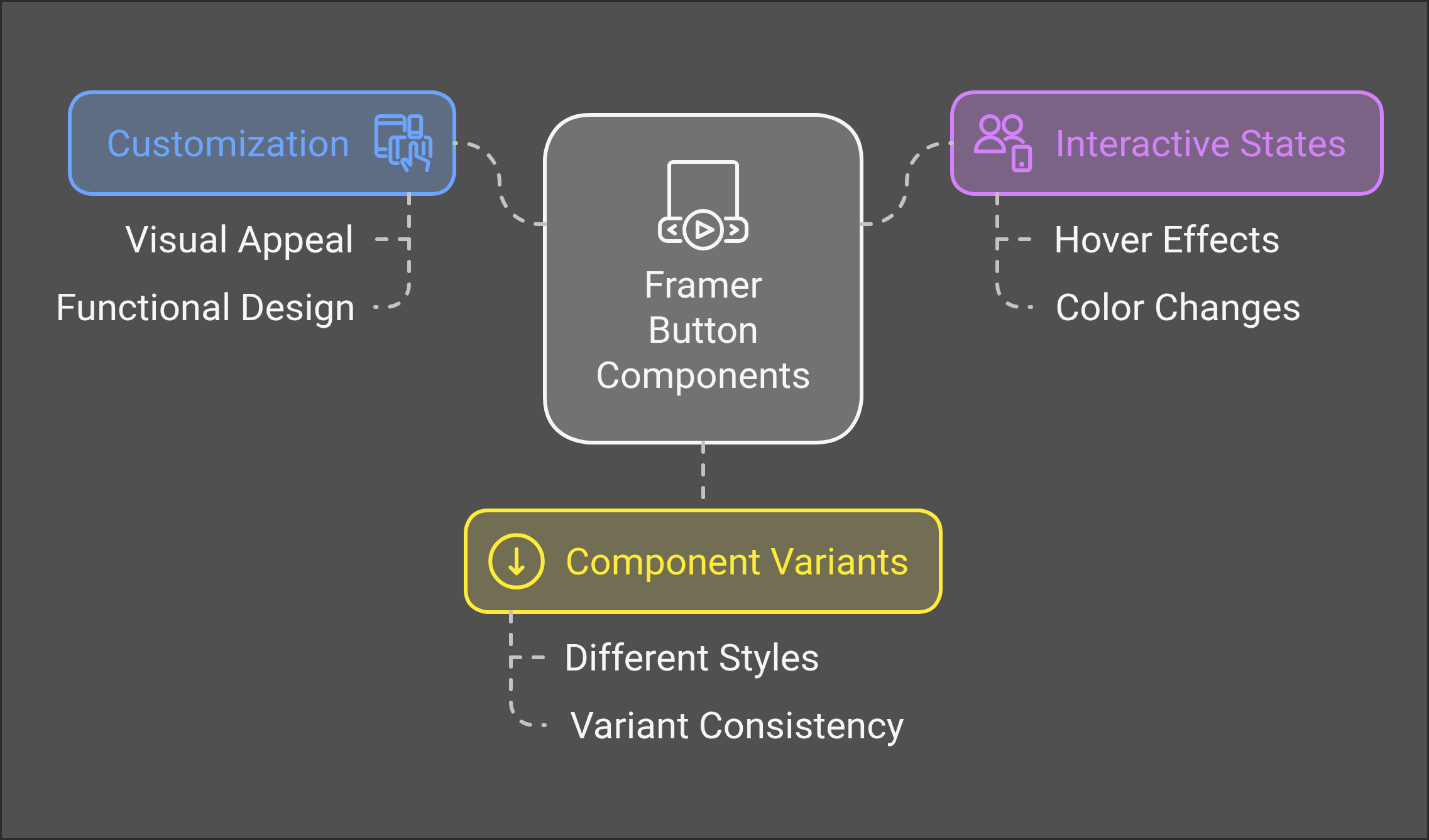
Picture a button that responds with a playful text movement upon hover or elegantly changes color, thanks to the customizable interactive states and diverse component variants. This is not just about a simple click—it's about creating an engaging user experience that captivates and retains attention.
Why Customize Button Components in Framer?
- Interactive States: Add hover and click effects.
- Component Variants: Diverse styling options within a single component.
- Design Consistency: Reuse and modify components across various projects.
|
Customizable Elements |
Interactive Options |
|
Shadow |
Hover effects |
|
Border Opacity |
Click reactions |
|
Label Color |
Text movements |
With Framer, you can effortlessly tweak shadows, borders, and labels, ensuring each button component is as unique as the design projects they inhabit. Whether you're building a base design or exploring advanced component libraries, these customizable buttons are not just elements—they are a creative expression, a real time-saver, and a testament to the innovative spirit of Framer.
Practical Examples of Button Functionalities
In the dynamic world of UI/UX design, the Button component in Framer stands as a powerhouse of interactivity and customization. Imagine a button that doesn't just perform actions but tailors the user journey through elegance and precision. With Framer, this isn't just possible—it's a reality.
Practical Functionalities of the Framer Button Component:
- Versatile Navigation: Seamlessly switch between operating as a <button> element or a navigational link, opening a world of intuitive navigation possibilities.
- Custom Styling: Apply unique custom classes to both the DOM block and the button element, crafting an appearance that fits perfectly within your design project's style.
- Dynamic Interactions: Leverage component variables to mold both behavior and visuals, creating smooth animations and highly interactive experiences tailored to specific user needs.
- React Compatibility: Deploy Framer buttons across any React environment, enhancing design projects with conditions driven by URL parameters or user location.
This integration not only enhances user interfaces but also acts as a real-time saver for designers looking to deliver quality templates and constant updates with ease. Let your creativity soar with Framer's advanced component library!
Sharing Methodologies for Design Components
Unlock the power of design with Framer's dynamic button components! Seamlessly integrate these interactive UI elements into your projects, streamlining your creative process. The magic lies in Framer’s component inheritance feature, which allows primary components to cascade their designs across all variants, maintaining a harmonious aesthetic.
Delve into the world of button customization where you can implement states like hover, click, and animations to captivate users. Framer’s sophisticated functionality enables the creation of toggle components and feature blocks that transition smoothly between variants, heightening user interaction.
Key Benefits:
- Interactive Experience: Elevate user engagement with vibrant animations and state transitions.
- Efficient Workflow: Save time with reusable components tailored for consistency.
- Flexible Design: Use detached component layers for precise customization and placement.
|
Benefit |
Description |
|
Time-Saver |
Speed up design with advanced pre-built components. |
|
Constant Updates |
Enjoy evolving tools with frequent and future updates. |
|
Quality Assurance |
Achieve stellar results with Framer’s quality templates. |
Revolutionize your design projects with the fluid functionalities of Framer button components—a true game-changer for any designer eager to innovate and engage!
Optimizing Button Components for Performance
When it comes to optimizing button components in Framer, the possibilities for enhancing performance and interactivity are thrilling! By tailoring these essential components with variables and variants, designers gain the power to seamlessly customize appearance and functionality. Imagine setting a hover tint color as a variable, which allows for effortless edits and consistent design experiences. 🔥
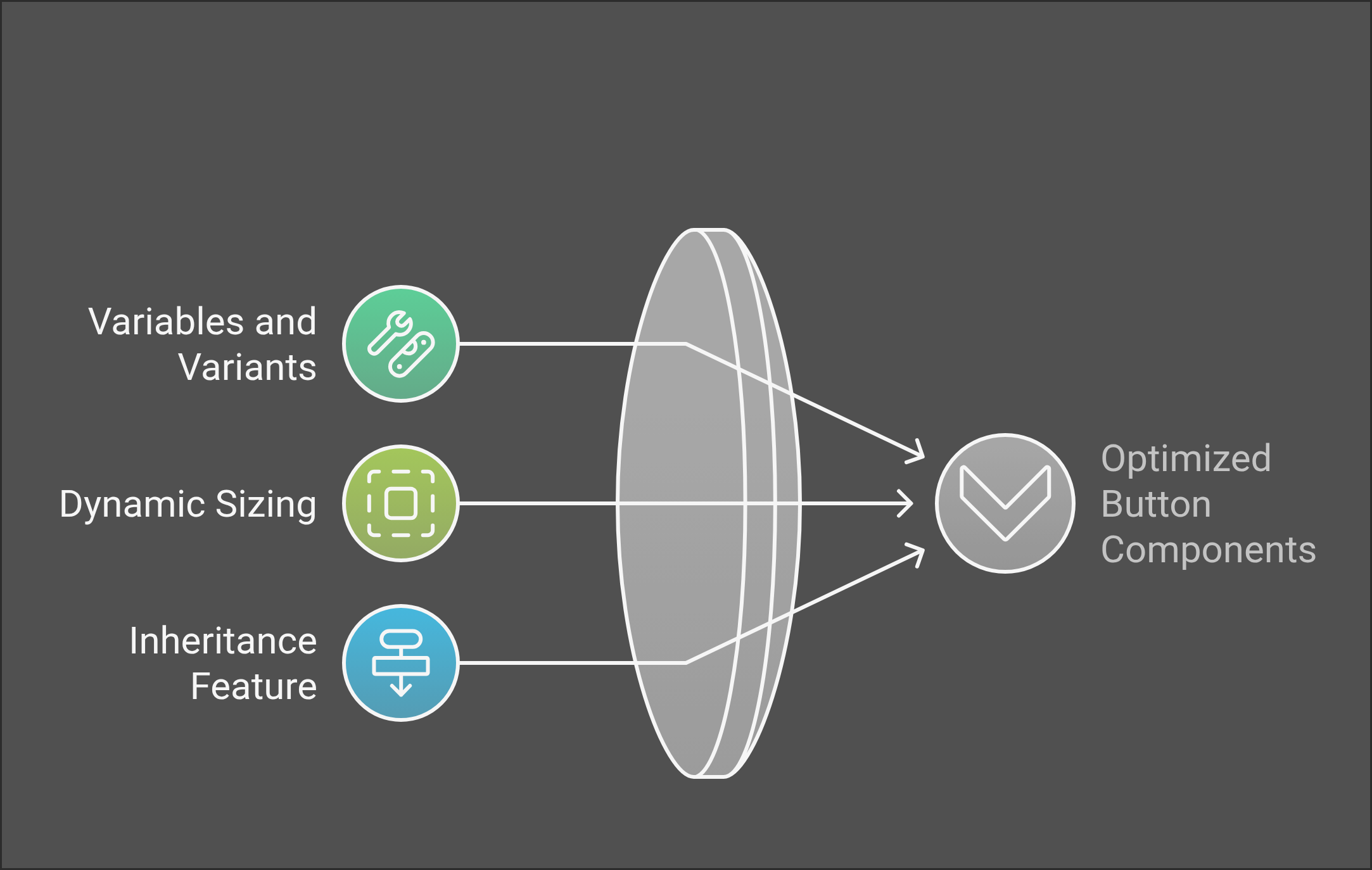
One standout feature is the dynamic sizing through the fit content option, where you have the liberty to adjust gaps and padding, ensuring your buttons fit perfectly within any design project. Enhanced user interaction is no longer just a dream!
The magic doesn’t stop there. Framer's inheritance feature in primary components means any customization trickles down automatically to all associated variants. This offers a significant time-saver by maintaining consistency across your Framer projects.
Here's a quick checklist to optimize your button components:
- Utilize component variables for easier customization.
- Adjust dynamic sizing with the fit content option.
- Leverage the inheritance feature for consistent updates.
Consistently keeping your components updated ensures you're always equipped with the latest design elements and bug fixes—keeping your design flowing and future-proof. Framer button components, truly, are an innovative dynamic for your interactive components! 🚀
Organizing Components Within a Design Library
Organizing your components within a design library in Framer is a game-changer for design consistency and efficiency. Imagine the power of customizing and reusing components across all your design projects effortlessly! Simply add them from the Assets panel into your library, ensuring they are available in every project within your Workspace.
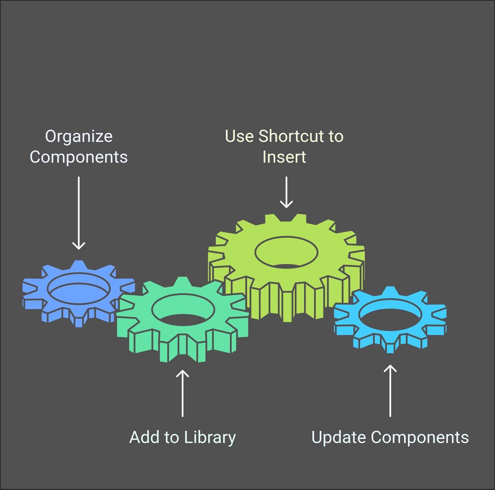
Here's where it gets even more amazing—use the shortcut ⌘ K (Ctrl + K on Windows) to easily insert these components into your projects via the Quick Actions menu. Plus, any updates you make to a primary component ripple through all instances, saving you from tedious manual republishing.
Here are the benefits in a nutshell:
- Customization: Tailor components to fit any project.
- Consistency: Maintain uniformity across designs.
- Efficiency: Update with changes automatically applied across instances.
- Easy Access: Use the library badge in the search bar to identify your Workspace.
With these tools, you're not just saving time; you're laying a foundation for stunning, cohesive design projects. Whether you're a design student or a seasoned professional, Framer's component organization is your ultimate secret weapon. Embrace the fluidity; embrace the future of design!
Accessing Source Files for Button Components
Dive into the world of Framer button components and unleash your creative prowess! With Framer, crafting and customizing button components becomes a seamless experience through the intuitive quick menu feature. This tool unlocks unprecedented ease, granting effortless access to component creation and modification.
One of the most remarkable aspects of Framer's button components is their astonishing reusability. Imagine making a change to a button on one page, and seeing that change ripple across all instances in your project. This interconnectedness is a real-time saver, turning your design projects into seamless masterpieces.
Enhance your buttons' interactivity by adding multiple variants, including hover and pressed states. Framer's advanced component library lets you infuse your designs with dynamic elements that engage users at every click.
Tailor your buttons with custom classes and actions. These properties grant you the freedom to inject specific functionality, ensuring each button serves its unique purpose.
Ready to share your creation? The Framer Download component makes sharing downloadable resources easy, harmonizing beautifully with other button components on your canvas.
Explore, create, and share like never before—and let Framer's button components elevate your design journey!
Conclusion: The Journey of Button Components
Button components have revolutionized user interface design, serving as vital elements for seamless user interaction. In Framer, the journey of crafting these components transforms design projects, thanks to the sophisticated use of variables and variants. These elements are not just fingerprints of customization but are also definitive in constructing interactive components that respond to user needs with agility.
Framer’s advanced component library allows designers to infuse their creations with smooth animations and engaging effects. The integration of nested components, such as icons, elevates the visual appeal, enhancing the user's journey through intuitive design. This rich tapestry of features makes Framer a real time-saver in the creation landscape.
Moreover, the constant and future updates ensure button components remain at the forefront of innovation, contributing to quality templates and a wide selection for Framer projects. Whether it's building with a kit in mind or leveraging custom code components, the possibilities are endless, fueling creativity and efficiency.
In conclusion, Framer button components are more than mere design tools; they are a dynamic playground for creativity, fostering designs that resonate deeply and function seamlessly within any digital canvas.
Further Learning Resources and Instructor Information
Dive into the world of Framer with an impressive 4-hour free course designed to transform beginners into proficient design creators! This course offers step-by-step guidance, covering everything from basic layouts to advanced glass designs and dark modes—everything you need to kickstart your design journey immediately.
Framer's AI-powered layout generator streamlines the process, making the creation of stunning websites effortless. By adding interactive elements, users can significantly boost user engagement on any web or app project. Learning resources extend even further, focusing on mastering the transition of UI design projects from Figma to Framer, optimizing workflows and effectively utilizing both powerful platforms.
Key Course Features:
- Basic to advanced layout creation
- Interactive components and elements
- Mastering transitions between Figma and Framer
- Real-time AI-powered design enhancements
Instructor Insight: Passionate educators guide you through every step, ensuring learners grasp complex concepts with ease. Discover how to harness the full potential of Framer to revolutionize your design projects effortlessly!
Embark on your Framer journey today—a real time-saver and an invaluable addition to your design toolkit. Get ready for constant updates and future innovations, keeping you at the forefront of contemporary design!
You Might Also Like
Best Framer Component Libraries
Features of Framer Motion in Carousel Development