Part 2
Setting Up Megamenu
Megamenu comes built-in with Edumodo wordpress education theme. To use mega menu
- Go to Edumodo Options.
- Click on Menu.
- Now, enable mega menu and click on save changes. Mega menu is now activated.
Without Enabling the mega menu, you cannot use any functionality of it.
- Now go to
Appearance > Menus - Move the menu item right for which you want to enable megamenu.
-
Tick on Enable megamenu
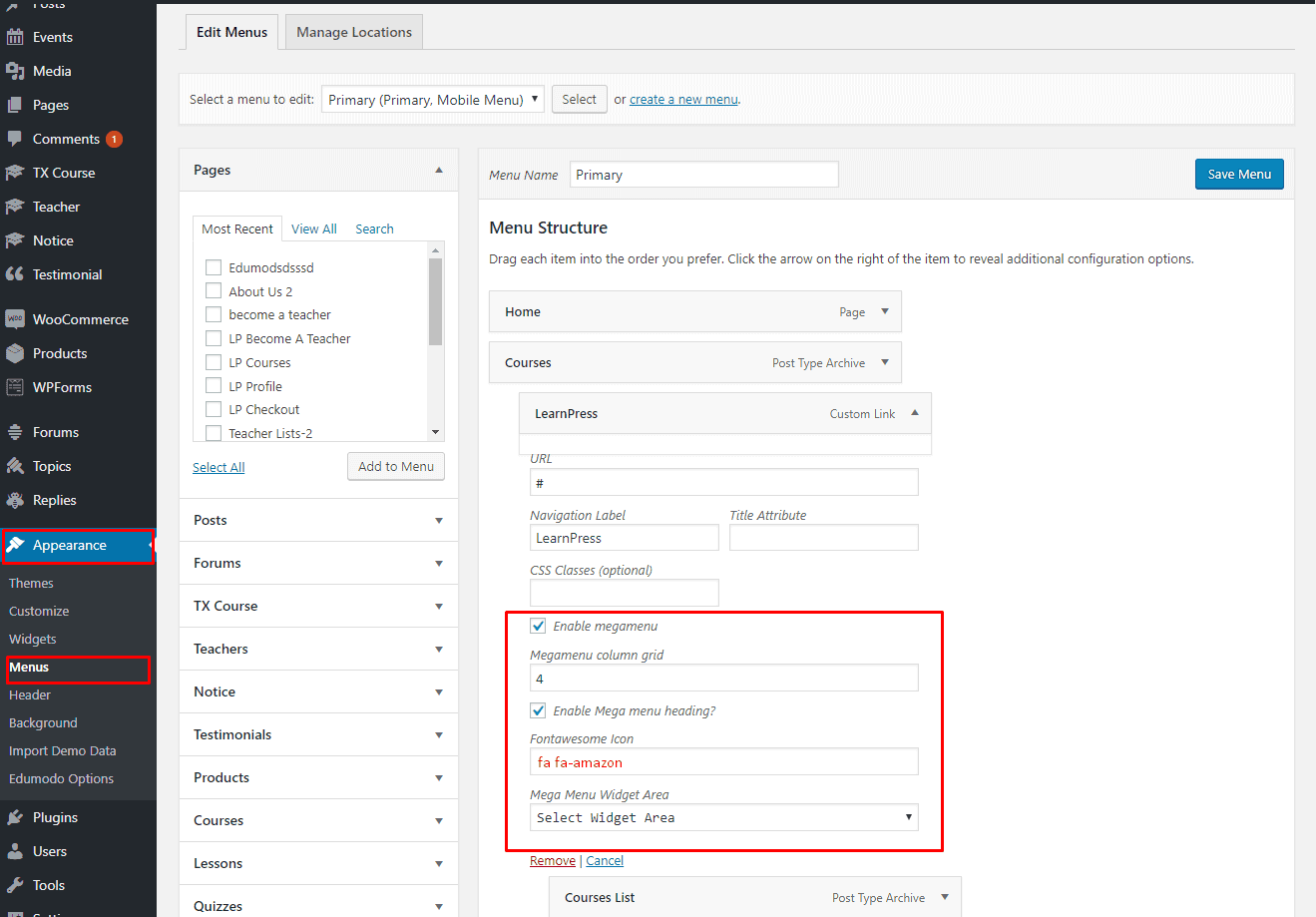
- Set the megamenu column grid size. (Grid size is a total of 12 columns, if you set column size to 4, there will be a total of 3 columns show in your megamenu.[size 4*3 columns = 12 grid])
- If you want to enable Mega menu heading, tick on Enable Mega menu heading
- If you want to show any fontawesome icon with your menu heading, just paste the fontawesome icon name at the field named Fontawesome Icon. You can copy the fontawesome icon code from this link. https://fontawesome.com/v4.7.0/icons/
(For example if you want to put icon named facebook in your megamenu heading, write fa fa-facebook[at here you must write fa fa- before any icone])
- If you want to show any widgets in your megamenu, just select the widget area and that widgets will be visible on the mega menu.
Setting Up Multilingual site
To make your site multilingual, we prefer you use one of this plugins 1. WPML & 2. GTranslate. Just install and activate any of this plugins and make your site multilingual in general way.
Setting up RTL
Edumodo education WordPress theme comes with RTL support. Before you start developing rtl layout,
- Download and install WPML or GTranslate (you can use any multilingual plugin).
- Activate it and after activating the plugin generate a link for your rtl layouts site.
- Copy links and go to `Edumodo Optoins > General Setting > RTL
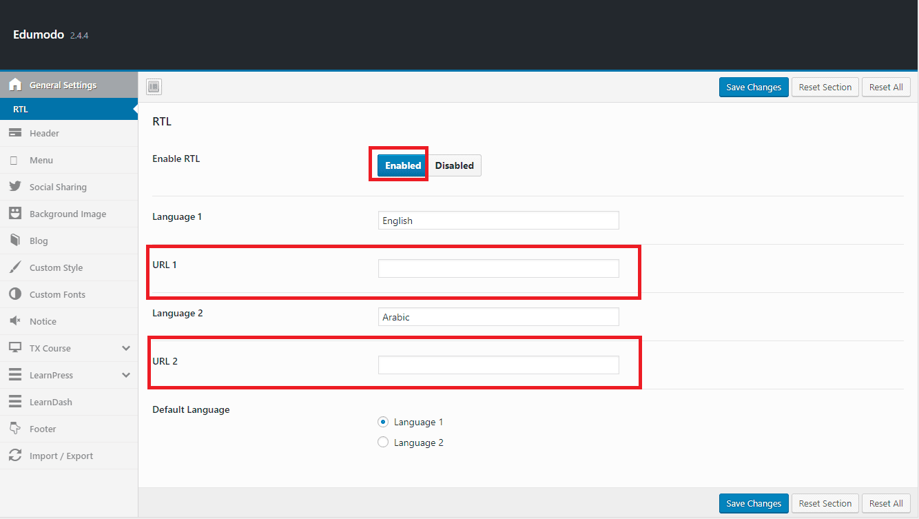
- Enable RTL option.
- Paste the links to URL1 and URL2 and type the name of languages.
- Select your language that you want to show by default.
- Save Changes.
Now you can develop your rtl site with ease. In RTL you must use one of this headers below, or else your header will not work properly. 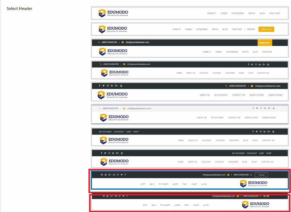
LMS: Learning Management System
Edumodo WordPress LMS theme comes with support for 3 most popular lms’s. These lms are - learnpress, sensei, and learndash.
You can use this theme with or without LMS functionality, it's totally up to you. TX courses will allow you to enjoy the full functionality of an LMS.
LearnPress LMS
At here we are using plugin LearnPress for LMS functionalities. You can check the plugin tutorials and documentation from the official website of plugin.
-
Plugin Link: https://wordpress.org/plugins/learnpress/
-
Official LearnPress Documentation Link: https://docs.thimpress.com/learnpress/
- Recommended Plugins: https://thimpress.com/product/learnpress-add-ons-bundle/
Sensei LMS
At here we are using plugin Sensei for LMS functionalities. You can check the plugin tutorials and documentation from the official website of plugin.
- Plugin Link: https://woocommerce.com/products/sensei/
- You can also download sensei LMS from here : https://github.com/Automattic/sensei
- Official Sensei Documentation Link: https://senseilms.com/documentation/
LearnDash LMS
At here we are using plugin LearnDash for LMS functionalities. You can check the plugin tutorials and documentation from the official website of plugin.
- Plugin Link: https://www.learndash.com/pricing-and-purchase/
- Official LearnPress tutorials Link: https://www.learndash.com/category/learndash-tips/
How To's
Setup Homepage
- Go to
Settings > Reading - Select A Static page on Front page displays option.
- Choose your preferred home variation from the Front-page drop-down menu.
- Select Blog from the Post page drop-down menu.(optional)
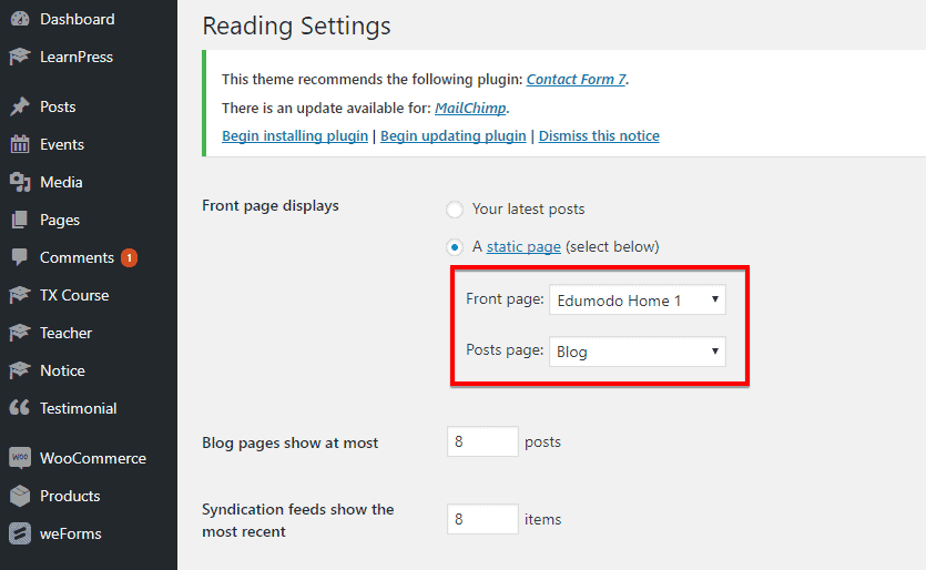
- Use the left-bottom Save Changes button to save the settings.
Import Edumodo Contact Forms with WPForms
Check this video tutorial for importing edumodo contact forms with WPForms.
Create Amazing Sliders with Slider Pro Element
If you do not know much use of slider pro element check this video out, and add amazing sliders to your site.
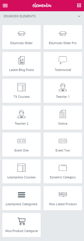
Elements
You can simply add an element on a page. All you need to do, just drag the element you want to add and drop it in a page then customize its setting as your preferences. You will have plenty of default elements to add or you can add our developed elements those are only for Edumodo theme from the Edumodo Elements tab on the elementor.
Elementor
Elementor is the one of the best Drag and Drop visual editor for building pages, posts etc. in a WordPress site. If you are not familiar with Elementor, we recommend you to take a look at the following videos:
-
Getting Started with Elementor: Getting Started With Elementor - YouTube
-
Sections & Columns Part 1 : Learn How to Build Your Page Layout on Elementor
-
Sections & Columns Part 2 : Style Options for Sections and Columns
- Sections & Columns Part 3 : Padding, Margin, Responsive and Other Settings in the Advanced Tab
Under https://docs.elementor.com/ you can find see the complete documentation of elementor page builder.
IMPORTANT: You have to disable Disable Global Colors and Disable Global Fonts options from
Elementor> Generalin order get your custom styles worked on any elements.Our theme specific elements can be found in Edumodo tab under Elementor.
Edumodo Slider

To add Edumodo Slider element on a page, first-
- Go to
Pages - Click on Edit With Elementor
- Drag the Edumodo Slider from the left EDUMODO ELEMENTS area and drop on your page.
- Customize the settings how you prefer and click on Save button to save the pages.
Content
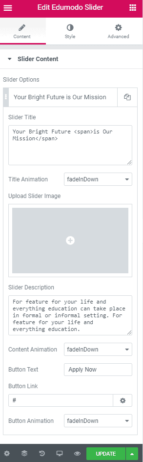
- ADD ITEM : This button allows you to create new slider items. Having created an item, just by a single mouse click- there are a couple of options will appear below this.
- Slider Title : Put the slider title here.
- Title Animation : Choose an animation for the title text.
- Upload Slider Image : This upload button lets you upload image for the current slider item.
- Slider Description : Put the description text here.
- Content Animation : Choose an animation effect for the content text.
- Button Text : Put the button text here.
- Button Link : Put the corresponding button URL here.
- Button Animation : Choose an animation effect for the button.
Style
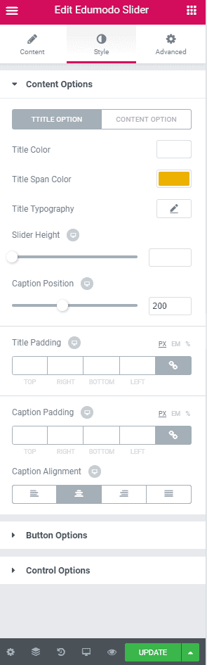
- Content Options : Customize the content options according to your need. You can customize typography, spacing, margin and so on.
- Button Options : Customize the button options as you want. This includes Button text, color, border, text size and so on.
- Control Options : This includes slider speed, background repetition, size and so on.
Advanced
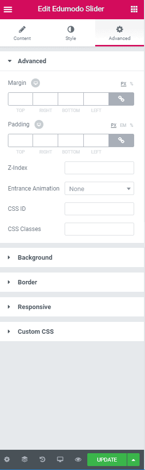
- Element Style : Control margin, padding, z-index, entrance animation and add additional id or class to apply your custom design to an element.
- Background : Control element background color, hover style and more.
- Border : Apply your custom border style configuring different options from this tab.
- Responsive : Control making this element to appear on various devices.
Edumodo Slider Pro

To add Edumodo Slider Pro element on a page, first-
- Go to
Pages - Click on Edit With Elementor
- Drag the Edumodo Slider Pro from the left EDUMODO ELEMENTS area and drop on your page.
- Customize the settings how you prefer and click on Save button to save the pages.
Content
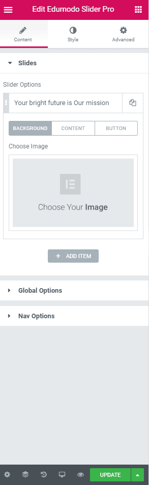 Under Slide you have this options.
-
ADD ITEM : This button allows you to create new slider items. Having created an item, just by a single mouse click- there are a couple of options will appear below this.
-
Slider Title : Put the slider title here.
- Title Animation : Choose an animation for the title text.
- Upload Slider Image : This upload button lets you upload image for the current slider item.
- Slider Description : Put the description text here.
- Content Animation : Choose an animation effect for the content text.
- Button Text : Put the button text here.
- Button Link : Put the corresponding button URL here.
- Button Animation : Choose an animation effect for the button.
Under Global Options you have this options.
- Slider Height: Define the height of the slider from here.
- Caption Position : Define caption for slider from here.
- Content Alignment : Choose the layout for your content from here.
- Slider Interval : Define the interval time between sliders.
- Background Overlay : Select the background overlay for slider from here.
- Background Repeat : Define if you want to repeat background.
- Background Size : Choose the background size from here.
- Background Position : Select the background position from here.
- Background Attachment : Two background option available - inherit & fixed.
Under Nav Options you have this options.
- Nav Enable/Disable : Toggle to enable or disable nav options.
- Arrow Enable/Disable : Toggle this option to enable or disable arrows.
- Nav & Arrow Icon Color : Choose the nav & arrow icon color from here.
- Nav & Arrow Bg Color : Choose the background color of nav & arrow from here.
Style
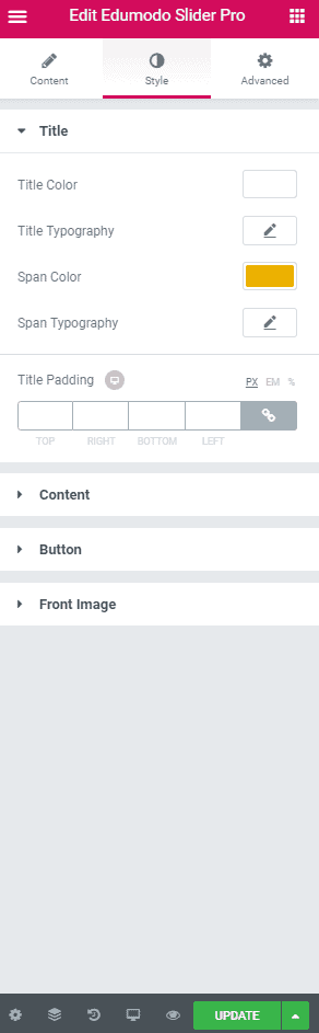
Under title you have this options.
- Title Color : Set the title color for slider from here.
- Title Typography : Create your own preferred typography for title text by changing different options according to your wish.
- Span Color : Select color for span text of title.
- Span Typography : Create your own preferred typography for span text of title by changing different options according to your wish.
- Title Padding : Apply any padding to your title, if needed.
Under Content you have this options.
- Content Color : Choose the color of content text from here.
- Content Typography : Create your own preferred typography for content text by changing different options according to your wish.
- Content Spacing : Manage content spacing from here.
- Description Padding : If you want to apply any padding to your description, add it from here.
Under Button you have this options.
- Typography : Create your own preferred typography for button text by changing different options according to your wish.
- Text Color : Choose the text color of button from here.
- Background Color : Select the background color for your button from here.
- Border Type : Choose the border type of the button from here.
- Border Radius : If you want to alter border radius, you can do it from here.
- Box Shadow : Apply any kind of box shadow from here.
- Text Padding : Apply any padding to your text from here.
- Padding : Apply padding for button from here.
Under Front Image you have this options.
- Front Image Position : Alter the front image position from here.
- Image Size : Modify the image size from here.
- Padding : Apply any padding to front image from here.
Advanced
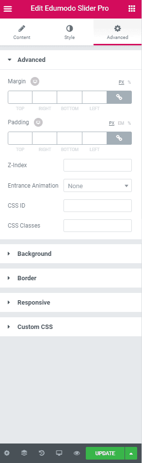
- Advanced : Control margin, padding, z-index, entrance animation and add additional id or class to apply your custom design to an element.
- Background : Control element background color, hover style and more.
- Border : Apply your custom border style configuring different options from this tab.
- Responsive : Control making this element to appear on various devices.
- Custom CSS : If you want to add any custom code, you can add it from here.
Latest Blog Posts
To add Latest Blog Posts element on a page, first-
- Go to
Pages - Click on Edit With Elementor
- Drag the Latest Blog Posts from the left EDUMODO ELEMENTS area and drop on your page.
- Customize the settings how you prefer and click on Save button to save the pages.
Content
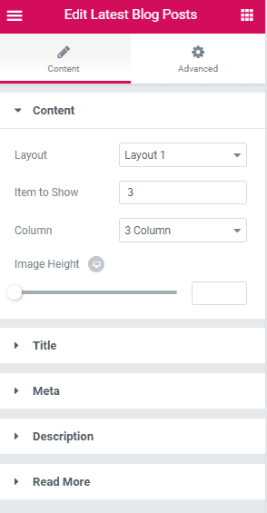 This options are available under content.
- Layout : There are a total of 2 layouts available with this element, choose the want that looks good on your site.
- Item to Show : Define how many item you want to show.
- Column : Define in how many columns you want to show the items into.
- Image Height : Define the height for the image of the blog posts from here.
This options are available under Title.
- Excerpt Word : Define the number of excerpt words.
- Typography : Create your own preferred typography for title text by changing different options according to your wish.
- Title Color : Choose the color of your title from here.
- Padding : Apply any padding to the title if you need.
This options are available under Meta.
- Date : Toggle this option off and on to show or hide date on your blog posts.
- Categories : Toggle this option on and off to show or hide categories of blog posts.
- Date Color : Choose the color that you want to apply on date.
- Typography : If you want to apply custom typography than apply it from here.
This options are available under Description.
- Excerpt Word : Define the number of excerpt words.
- Content Color : Apply any suitable color to your content from here.
- Typography : Create your own preferred typography for description text by changing different options according to your wish.
- Padding : Apply any padding to the description if you need.
- Margin : Apply any margin to the description if you need.
This options are available under Read More.
- Typography : Set custom typography for read more text from here.
- Button Text : Write the text you want to show in your button at here. By default this button comes with text “Read More”.
- Button Color : Choose the color of your button from here.
- Button Hover Color : Choose the color of button upon hover, from here.
- Padding : Apply any padding to the description if you need.
- Margin : Apply any margin to the description if you need.
Advanced
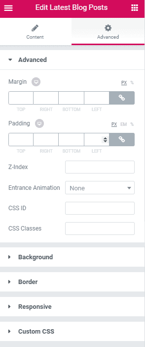
- Advanced : Control margin, padding, z-index, entrance animation and add additional id or class to apply your custom design to an element.
- Background : Control element background color, hover style and more.
- Border : Apply your custom border style configuring different options from this tab.
- Responsive : Control making this element to appear on various devices.
- Custom CSS : If you want to add any custom code, you can add it from here.
Testimonial
To add Testimonial element on a page, first-
- Go to
Pages - Click on Edit With Elementor
- Drag the Testimonial from the left EDUMODO ELEMENTS area and drop on your page.
- Customize the settings how you prefer and click on Save button to save the pages.
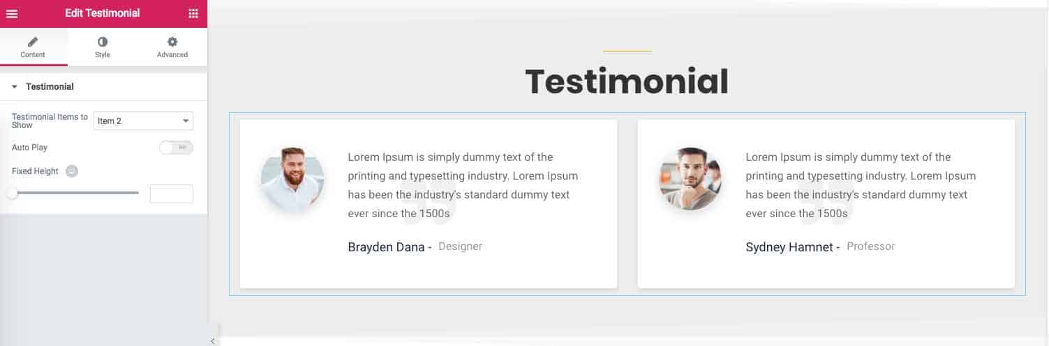
Content
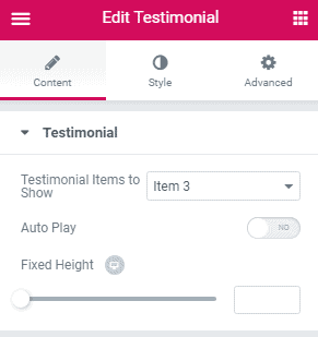
- Testimonial Item to Show : Define how many item you want to show.
- Auto Play : Toggle to enable or disable autoplay option.
- Fixed Height : If you want you can apply fixed height from here.
Style
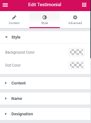
Under Style you have this options.
- Background Color : Choose the background color for your testimonial from here.
- Dot Color : Choose the color of dot that is used on testimonial from here.
Under Content you have this options.
- Content Color : Choose the content color of testimonial from here.
- Typography : If you wish you can define the typography for content from here.
Under Name you have this options.
- Name Color : Choose the color of name from here.
- Typography : If you wish you can define the typography for name from here.
Under Designation you have this options.
- Designation Color : Choose the designation color of testimonial from here.
- Typography : If you wish you can define the typography for designation from here.
Advanced
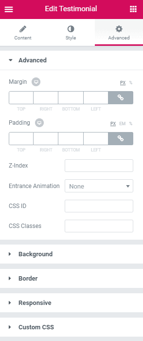
- Advanced : Control margin, padding, z-index, entrance animation and add additional id or class to apply your custom design to an element.
- Background : Control element background color, hover style and more.
- Border : Apply your custom border style configuring different options from this tab.
- Responsive : Control making this element to appear on various devices.
- Custom CSS : If you want to add any custom code, you can add it from here.
TX Courses
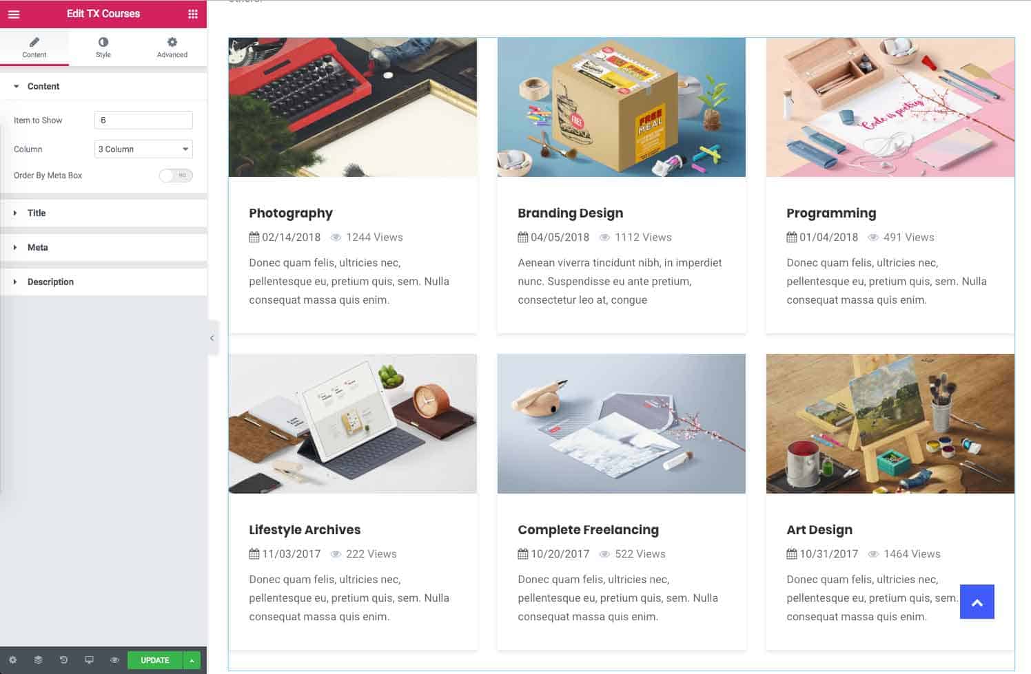
To add TX Courses element on a page, first-
- Go to
Pages - Click on Edit With Elementor
- Drag the TX Courses from the left EDUMODO ELEMENTS area and drop on your page.
- Customize the settings how you prefer and click on Save button to save the pages.
Content
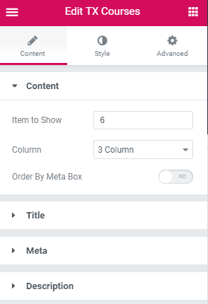 Under content you have this options.
- Item to show : Define how many courses you want to show, at here.
- Column : At here, define how many columns you want.
- Order By Meta Box : If you want to order your courses with help of meta box turn on this option.
- Order : Define whether you want to order in ascending or descending order.
- Order By : Define what criteria you want to use for ordering.
Under Title you have this options.
- Excerpt Word : Define the number of excerpt words.
- Typography : Create your own preferred typography for course title text by changing different options according to your wish.
Under Meta you have this options.
- Show Category : If you want to show category of courses than enable this option.
- Show View Count : If you want to show view count than enable this option.
- Typography : Create your own preferred typography for meta text by changing different options according to your wish.
Under Description you have this options.
- Excerpt Word : Define the number of excerpt words.
- Typography : Create your own preferred typography for description text by changing different options according to your wish.
Style
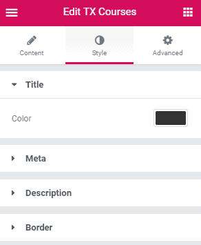
Under title you have this options.
- Color : Choose the color for title from here.
Under Meta you have this options.
- Color : Choose the color for meta text from here.
Under Description you have this options.
- Color : Choose the color for description from here.
Under Border you have this options.
- Border Color : Choose the color of border from here.
- Border Width : Maintain the border width of course from here.
- Border Radius : Maintain the border radius of course from here.
- Box Shadow : If you want to apply any box shadow than do it from here.
- Box Shadow Hover : If you want to apply any box shadow hover than do it from here.
Advanced
- Advanced : Control margin, padding, z-index, entrance animation and add additional id or class to apply your custom design to an element.
- Background : Control element background color, hover style and more.
- Border : Apply your custom border style configuring different options from this tab.
- Responsive : Control making this element to appear on various devices.
- Custom CSS : If you want to add any custom code, you can add it from here.
Teacher 1
To add Teacher1 element on a page, first-
- Go to
Pages - Click on Edit With Elementor
- Drag the Teacher 1 from the left EDUMODO ELEMENTS area and drop on your page.
- Customize the settings how you prefer and click on Save button to save the pages.
Content
 Under content you have this options.
- Item to Show : Define how many item you want to show.
- Column : Define in how many columns you want to show the items into.
Under Title you have this options.
- Title Typography : Create your own preferred typography for title text by changing different options according to your wish.
- Title Spacing : Allows you to control the spacing between title and meta information for each item.
Under Designation you have this options.
- Typography : Create your own preferred typography for designation text by changing different options according to your wish.
Under Social you have this options.
- Size : Define the social icon size.
- Title Spacing : Allows you to control the space between title and social icons.
Style
- Icon Color : Choose a color for the social icons.
- Overlay Color : Choose overlay color.
Advanced
- Element Style : Control margin, padding, z-index, entrance animation and add additional id or class to apply your custom design to an element.
- Background : Control element background color, hover style and more.
- Border : Apply your custom border style configuring different options from this tab.
- Responsive : Control making this element to appear on various devices.
- Custom CSS : If you want to add any custom code, you can add it from here.
Teacher 2
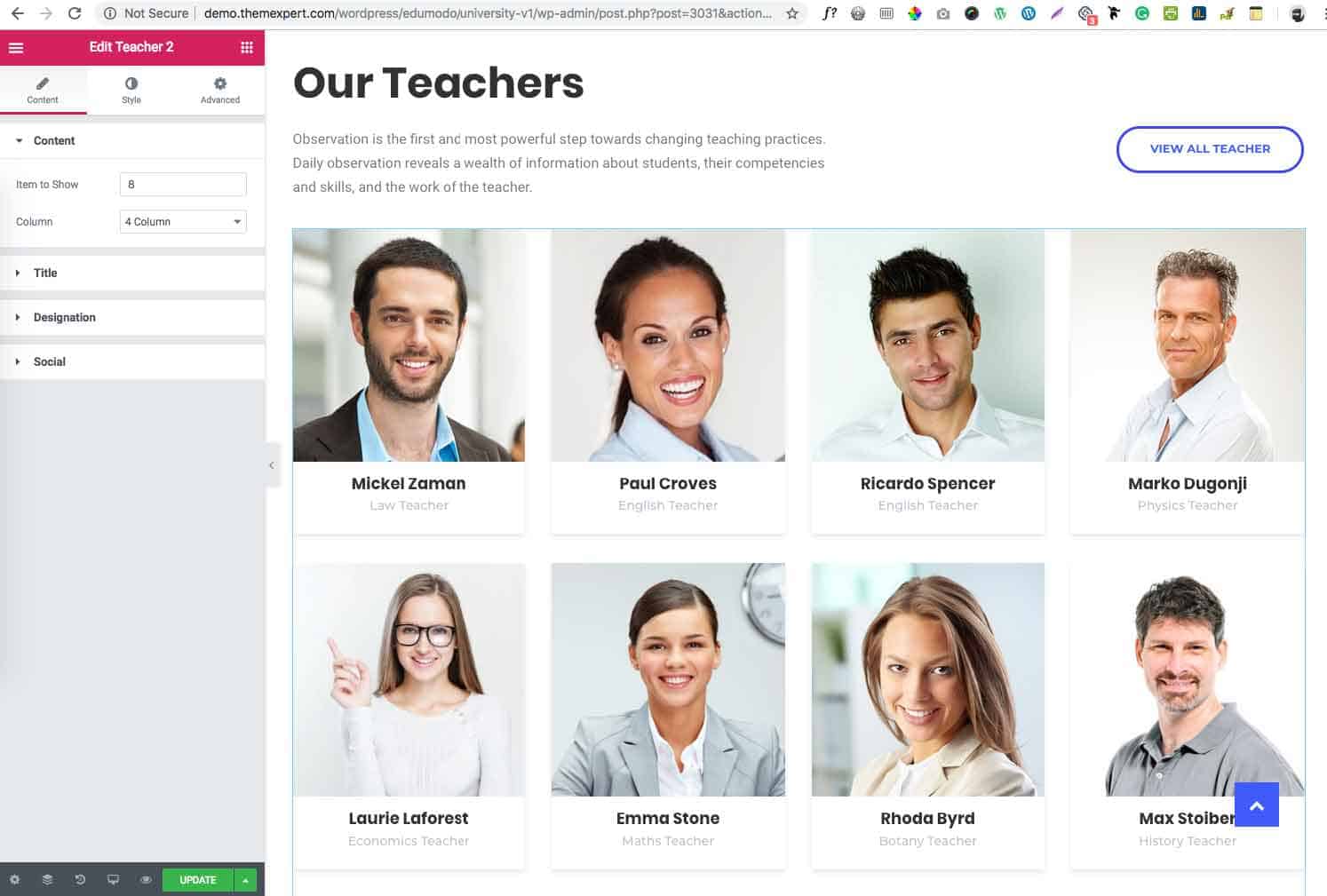
To add Teacher2 element on a page, first-
- Go to
Pages - Click on Edit With Elementor
- Drag the Teacher 2 from the left EDUMODO ELEMENTS area and drop on your page.
- Customize the settings how you prefer and click on Save button to save the pages.
Content
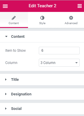
Under content you have this options.
- Item to Show : Define how many item you want to show.
- Column : Define in how many columns you want to show the items into.
Under Title you have this options.
- Typography : Create your own preferred typography for title text by changing different options according to your wish.
- Title Spacing : Allows you to control the spacing between title and meta information for each item.
Under Designation you have this options.
- Typography : Create your own preferred typography for designation text by changing different options according to your wish.
Under Social you have this options.
- Size : Define the social icon size.
- Width : Define the social icon width.
- Height : Define the social icon height.
- Title Spacing : Allows you to control the space between title and social icons.
Style
 Under Color you have this options.
- Overlay Color : Choose a overlay color from here.
Under Name you have this options.
- Color : Choose a color for the name text.
- Hover Color : Choose a Hover color for name from here.
Under Designation you have this options.
- Color : Choose the color for designation from here. Under social you have this options.
- Border Radius : Maintain border radius from here.
Under Border you have this options.
- Border Color : Choose the color of border from here.
- Border Width : Maintain the border width of course from here.
- Border Radius : Maintain the border radius of course from here.
- Box Shadow : If you want to apply any box shadow than do it from here.
- Box Shadow Hover : If you want to apply any box shadow hover than do it from here.
Advanced
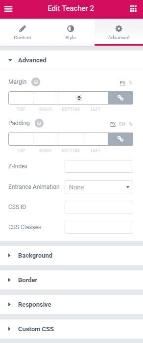
- Element Style : Control margin, padding, z-index, entrance animation and add additional id or class to apply your custom design to an element.
- Background : Control element background color, hover style and more.
- Border : Apply your custom border style configuring different options from this tab.
- Responsive : Control making this element to appear on various devices.
- Custom CSS : If you want to add any custom code, you can add it from here.
Notice
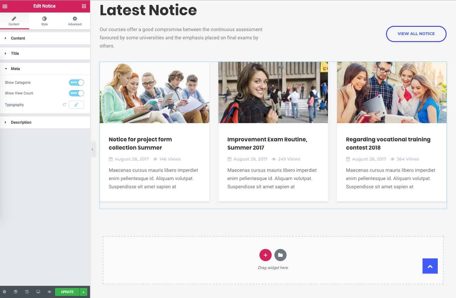
To add Notice element on a page, first-
- Go to
Pages - Click on Edit With Elementor
- Drag the Notice from the left EDUMODO ELEMENTS area and drop on your page.
- Customize the settings how you prefer and click on Save button to save the pages.
Content
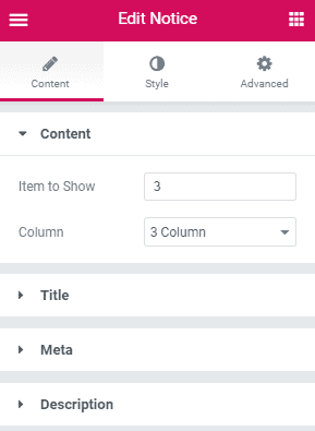
Under Content you have this options.
- Item to Show : Define how many item you want to show.
- Column : Define in how many columns you want to show the items into.
Under Title you have this options.
- Typography : Create your own preferred typography for title text by changing different options according to your wish.
Under Meta you have this options.
- Show Categories : Enable or disable showing categories.
- Show Comment : Enable or disable showing comments in each item.
- Typography : Create your own preferred typography for meta text by changing different options according to your wish.
Under description you have this option.
- Typography : Create your own preferred typography for description text by changing different options according to your wish.
Style
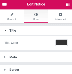 Under Title you have this option.
- Title Color : Pick a color for title text.
Under Color you have this option.
- Color : Pick a color for meta text from here.
Under Border you have this options.
- Border Color : Choose the color of border from here.
- Border Width : Maintain the border width of notice from here.
- Border Radius : Maintain the border radius of notice from here.
- Box Shadow : If you want to apply any box shadow than do it from here.
- Box Shadow Hover : If you want to apply any box shadow hover than do it from here.
Advanced
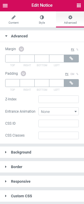
- Element Style : Control margin, padding, z-index, entrance animation and add additional id or class to apply your custom design to an element.
- Background : Control element background color, hover style and more.
- Border : Apply your custom border style configuring different options from this tab.
- Responsive : Control making this element to appear on various devices.
- Custom CSS : If you want to add any custom code, you can add it from here.
Event One
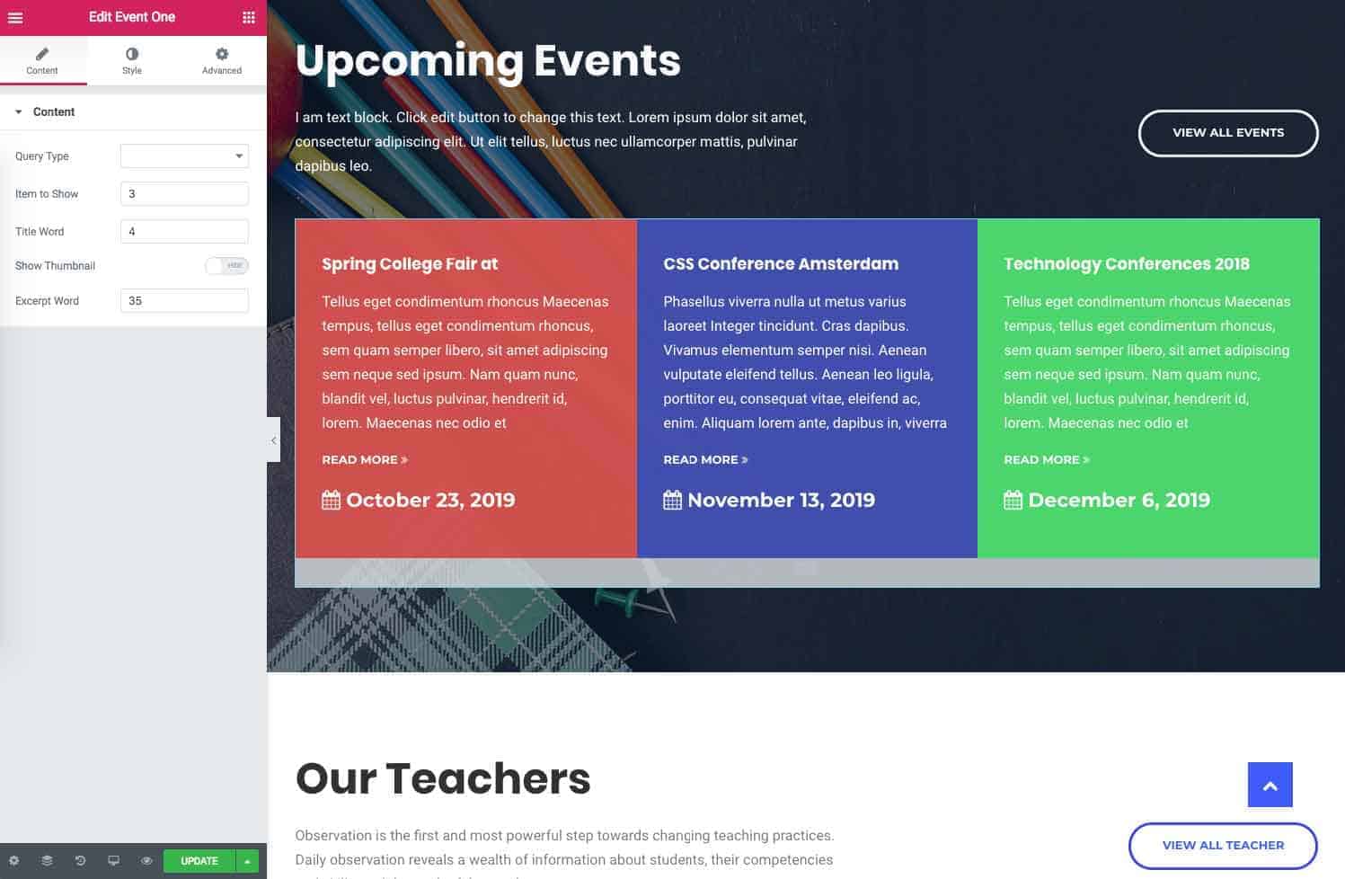
To add Event element on a page, first-
- Go to
Pages - Click on Edit With Elementor
- Drag the Event One from the left EDUMODO ELEMENTS area and drop on your page.
- Customize the settings how you prefer and click on Save button to save the pages.
Content
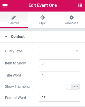
- Query Type : Allows to pick either Latest Events in ascending order or Specific Events.
- Item To Show : Number of items to show.
- Title Word : Define the maximum number of word a title can contain.
- Show Thumbnail : Hide or Show thumbnail.
- Excerpt Word : Define the number of excerpt words.
Style
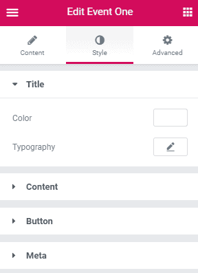
Under Title you have this options.
- Color : Choose a color for the title text.
- Title Typography : Customize the title typography according to your need. You can customize title color, family, spacing, margin and so on.
Under Content you have this options
- Content Color : Choose a color for the content text.
- Typography : Customize your content typography from here. You can change font, weight, style, size and line height from here.
Under Button you have this options.
- Button : Choose button color from here.
- Typography : Customize your button typography from here. You can change font, weight, style, size and line height from here.
Under Meta you have this options.
- Color : Choose a color for the meta text.
- Typography : Customize the title typography according to your need. You can customize title color, family, spacing, margin and so on.
Advanced
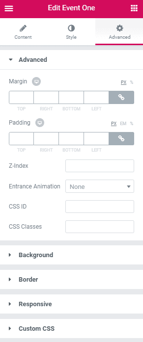
- Element Style : Control margin, padding, z-index, entrance animation and add additional id or class to apply your custom design to an element.
- Background : Control element background color, hover style and more.
- Border : Apply your custom border style configuring different options from this tab.
- Responsive : Control making this element to appear on various devices.
- Custom CSS : If you want to add any custom code, you can add it from here.
Event Two
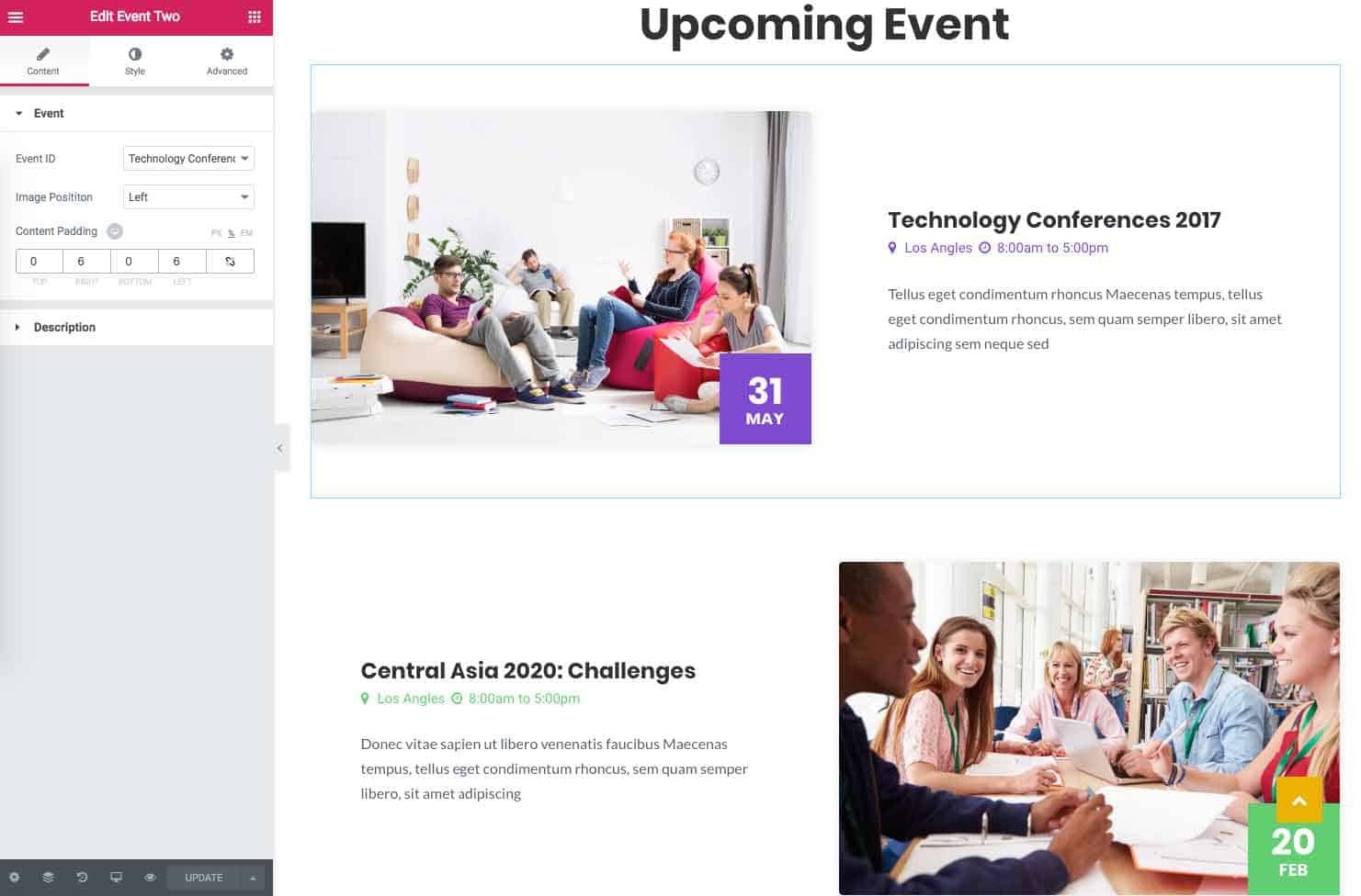
To add Event Two element on a page, first-
- Go to
Pages - Click on Edit With Elementor
- Drag the Event Two from the left EDUMODO ELEMENTS area and drop on your page.
- Customize the settings how you prefer and click on Save button to save the pages.
Content
 Under Content you have this opitons.
- Event ID : Choose event ID for your element.
- Image Position : Choose your preferred position to show event element.
- Content Padding : If you want you can add content padding from here.
Under Description you have this options.
- Typography : If you wish you can define the typography for description from here.
- Excerpt Description Word : Manage the number of excerpt description word length from here.
Style
Under Title you have this options.
- Color : Choose a color for the title text.
- Hover Color : Choose a color for hover on text.
- Typography : Customize the title typography according to your need. You can customize title color, family, spacing, margin and so on.
Under Meta you have this options.
- Color : Choose a color for the meta text.
Under Content you have this options
- Content Color : Choose a color for the content text.
- Typography : Customize your content typography from here. You can change font, weight, style, size and line height from here.
Under Date you have this options.
- Color : Choose date color from here.
- Background : Choose the date background color from here.
- Date : Customize your date typography from here. You can change font, weight, style, size and line height from here.
- Month Year : Customize the month year typography according to your need. You can customize title color, family, spacing, margin and so on.
Advanced
- Element Style : Control margin, padding, z-index, entrance animation and add additional id or class to apply your custom design to an element.
- Background : Control element background color, hover style and more.
- Border : Apply your custom border style configuring different options from this tab.
- Responsive : Control making this element to appear on various devices.
- Custom CSS : If you want to add any custom code, you can add it from here.
Learnpress Courses
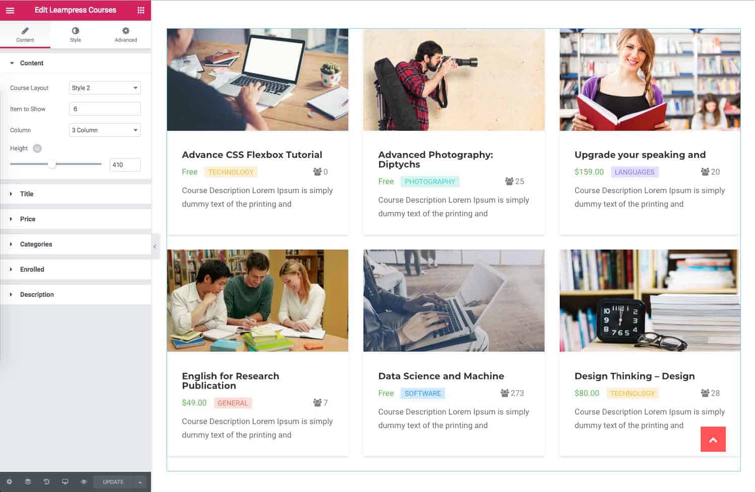
To add Learnpress Courses element on a page, first-
- Go to
Pages - Click on Edit With Elementor
- Drag the Learnpress Courses from the left EDUMODO ELEMENTS area and drop on your page.
- Customize the settings how you prefer and click on Save button to save the pages.
Content
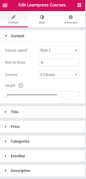 Under Content you have this options.
- Course Layout : By default you have two course layouts, choose the one that suits best.
- Item to Show : Define how many item you want to show.
- Column : Define in how many columns you want to show the items into.
- Height : Manage the height of the course from here.
Under Title you have this options.
- Typography : Create your own preferred typography for title text by changing different options according to your wish.
- Excerpt Title Word : Define the length of excerpt title length from here. Under Price you have this options.
- Show Price : Toggle to show or hide price on courses.
- Show Top Price : If you want to show price at top of the course also, toggle this option.
- Typography : Create your own preferred typography for price text by changing different options according to your wish.
Under Categories you have this options.
- Show Categories : Toggle this option to display or hide categories of courses.
- Typography : Create your own preferred typography for categories text by changing different options according to your wish.
Under Enrolled you have this options.
- Show Enrolled : If you want to show enrolled status at the course toggle this option.
- Typography : Create your own preferred typography for enrolled text by changing different options according to your wish.
Under Instructor you have this option.
- Show Instructor : Toggle this option to show or hide instructors photo on the course.
Under Description you have this options.
- Typography : Create your own preferred typography for description text by changing different options according to your wish.
- Excerpt Description Word : Define the length of excerpt description word at here.
Style
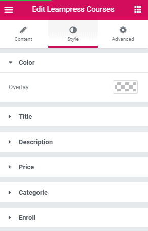 Under Color you have this option.
- Overly : Choose the color overlay from here.
Under Title you have this option.
- Title Color : Pick a color for title text.
Under Description you have this option.
- Color : Pick a color for description text.
Under Price you have this options.
- Color : Select a color for price text.
- Background : Choose a color for background of price text.
Under Categorie you have this options.
- Color : Select a color for category text.
- Background : Choose a color for background of categorie text. Under Enroll you have this option.
- Color : Select a color for enroll text.
Advanced
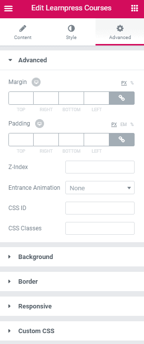
- Element Style : Control margin, padding, z-index, entrance animation and add additional id or class to apply your custom design to an element.
- Background : Control element background color, hover style and more.
- Border : Apply your custom border style configuring different options from this tab.
- Responsive : Control making this element to appear on various devices.
- Custom CSS : If you want to add any custom code, you can add it from here.
Dynamic Category
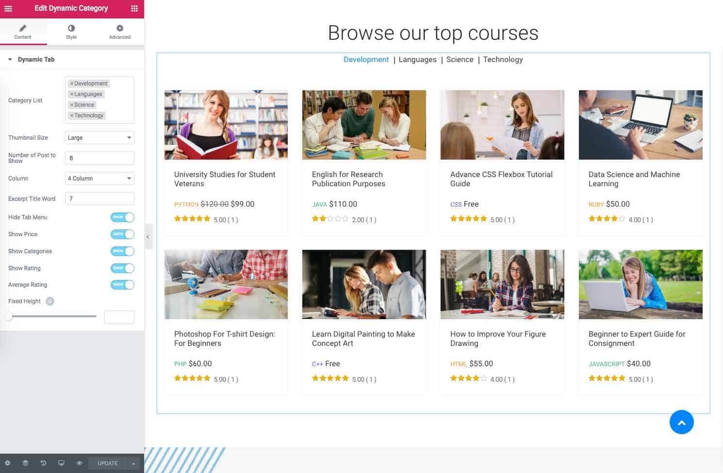
To add Dynamic Category element on a page, first-
- Go to
Pages - Click on Edit With Elementor
- Drag the Dynamic Category from the left EDUMODO ELEMENTS area and drop on your page.
- Customize the settings how you prefer and click on Save button to save the pages.
Content
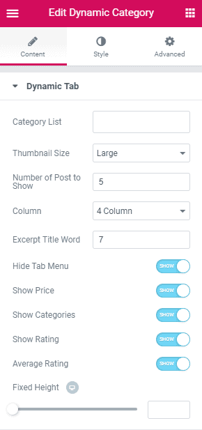
- Category List : Choose the categories that you want to include in the list.
- Thumbnail Size : Choose the thumbnail size from here. There are currently 4 thumbnail size available.
- Number of Post to Show : Choose the number of posts you want to show in the dynamic category.
- Column : Choose the column size from here.
- Excerpt Title Word : Manage the length of excerpt title word.
- Hide Tab Menu : Toggle to show or hide tab menu.
- Show Price : Toggle to show or hide price.
- Show Categories : Toggle to show or hide categories.
- Show Rating : Toggle to show or hide rating.
- Average Rating : Toggle to show or hide average rating.
- Fixed Height : If you want to apply fixed height, you can do it from here.
Style
Under Tab you have this options.
- Tab Typography : Set the tab typography for dynamic category from here.
- Tab Color : Choose the color of tab from here.
- Tab Active Color : Choose the tab active color from here.
Under layout you have this options.
- Background Color : Choose the background color from here.
- Border Width : Choose the border width for layout from here.
- Border Color : Select the border color of layout from here.
- Border Radius : Manage the border radius from this option.
- Box Shadow : If you want you can apply box shadow from here.
Under Title you have this options.
- Title Typography : Customize the title typography according to your need. You can customize title color, family, spacing, margin and so on.
- Title Color : Choose a color for the title text.
Under Category you have this options.
- Typography : Customize the category typography according to your need. You can customize title color, family, spacing, margin and so on.
- Category Color : Choose a color for the category text.
Under Price you have this options.
- Typography : Customize the price typography according to your need. You can customize title color, family, spacing, margin and so on.
- Price Color : Choose a color for the price text.
Under Rating you have this option.
- Rating Color : Choose rating color for the rating color from here.
Advanced
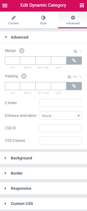
- Element Style : Control margin, padding, z-index, entrance animation and add additional id or class to apply your custom design to an element.
- Background : Control element background color, hover style and more.
- Border : Apply your custom border style configuring different options from this tab.
- Responsive : Control making this element to appear on various devices.
- Custom CSS : If you want to add any custom code, you can add it from here.
Learnpress Categories
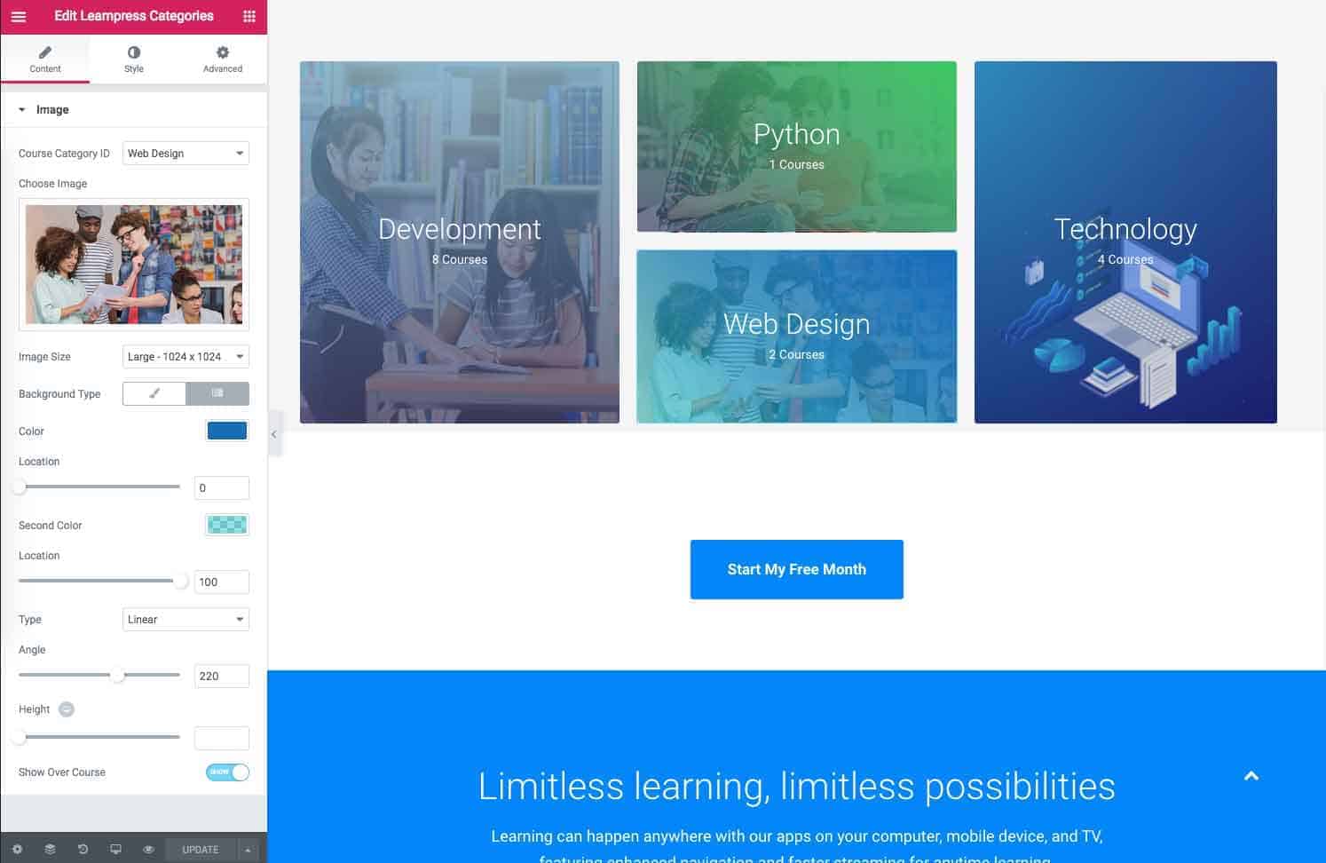
To add Learnpress Categories element on a page, first-
- Go to
Pages - Click on Edit With Elementor
- Drag the Learnpress Categories from the left EDUMODO ELEMENTS area and drop on your page.
- Customize the settings how you prefer and click on Save button to save the pages.
Content
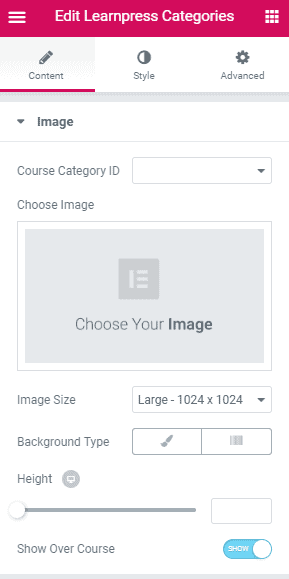
- Course Category ID : Choose course category ID from here.
- Choose Image : Choose image for your category from here.
- Image Size : Define image size from here.
- Background Type : Select the background type from here.
- Height : Adjust the height from here.
- Show Over Course : Toggle to show or hide over course.
Style
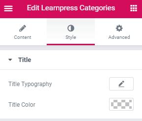
- Title Typography : Customize the title typography according to your need. You can customize title color, family, spacing, margin and so on.
- Color : Choose a color for the title text.
Advanced
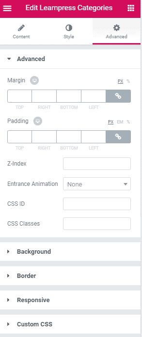
- Element Style : Control margin, padding, z-index, entrance animation and add additional id or class to apply your custom design to an element.
- Background : Control element background color, hover style and more.
- Border : Apply your custom border style configuring different options from this tab.
- Responsive : Control making this element to appear on various devices.
- Custom CSS : If you want to add any custom code, you can add it from here.
Woo Latest Product
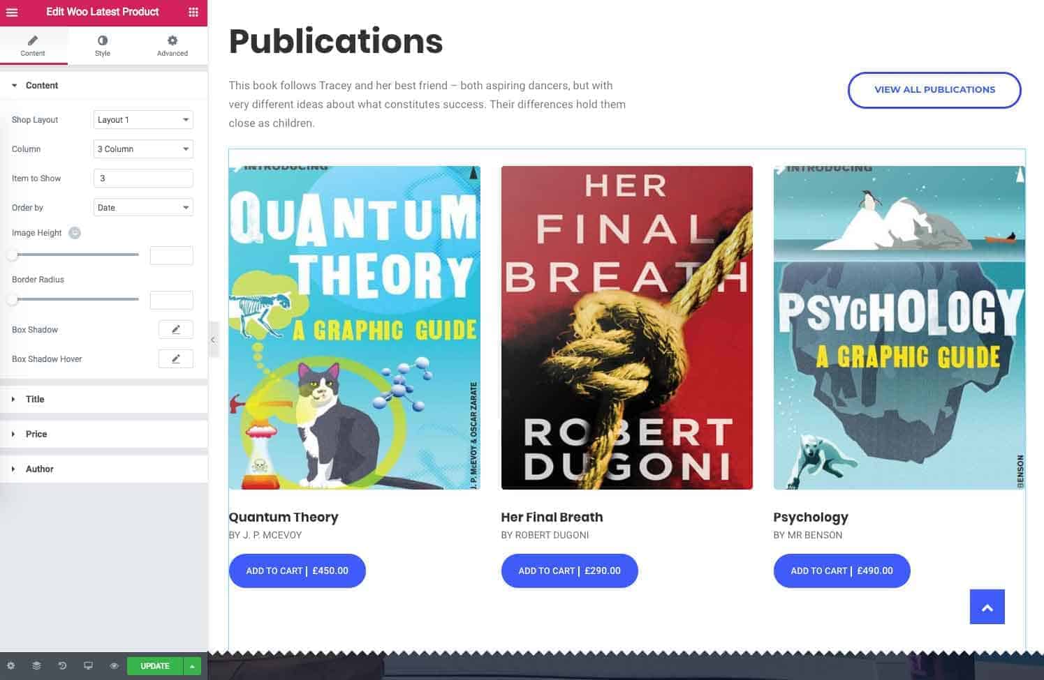
To add Woo Latest Product element on a page, first-
- Go to
Pages - Click on Edit With Elementor
- Drag the Woo Latest Product from the left EDUMODO ELEMENTS area and drop on your page.
- Customize the settings how you prefer and click on Save button to save the pages.
Content
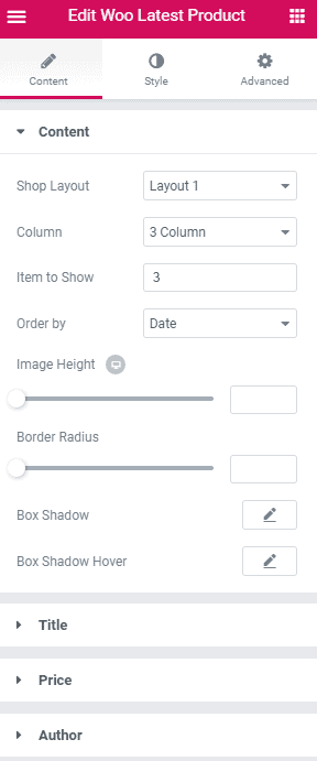
Under Content you have this options.
- Shop Layout : Choose layout that you want to use. There are currently two layouts available.
- Column : Choose the size of the column you want to use.
- Item to Show : Define how many items you want to show, at here.
- Order by : Define how you want to order products.
- Image Height : Adjust image height from here.
- Border Radius : Adjust border radius from here.
- Box Shadow : Customize box shadow from here.
- Box Shadow Hover : Customize box shadow hover from here.
Under Title you have this options.
- Title Word : Define the maximum number of word a title can contain.
- Title Color : Select the color of title text from here.
- Typography : Create your own preferred typography for title text by changing different options according to your wish.
Under Price you have this options.
- Price Color : Choose a color for the price text.
- Typography : Customize the price typography according to your need. You can customize title color, family, spacing, margin and so on.
Under Author you have this option.
- Author Color : Choose the author text color from here.
Style
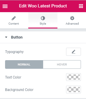
- Typography : Customize the typography according to your need. You can customize title color, family, spacing, margin and so on.
- Text Color : Choose a color for the text from here.
- Background Color : Choose a color for the background text from here.
Advanced
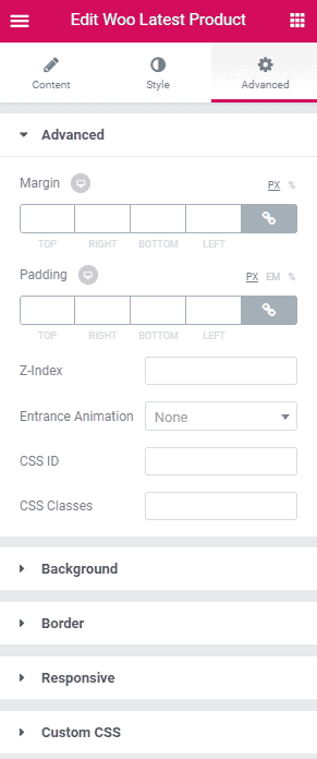
- Element Style : Control margin, padding, z-index, entrance animation and add additional id or class to apply your custom design to an element.
- Background : Control element background color, hover style and more.
- Border : Apply your custom border style configuring different options from this tab.
- Responsive : Control making this element to appear on various devices.
- Custom CSS : If you want to add any custom code, you can add it from here.
Woo Product Category
To add Woo Product Category element on a page, first-
- Go to
Pages - Click on Edit With Elementor
- Drag the Woo Product Category from the left EDUMODO ELEMENTS area and drop on your page.
- Customize the settings how you prefer and click on Save button to save the pages.
Content
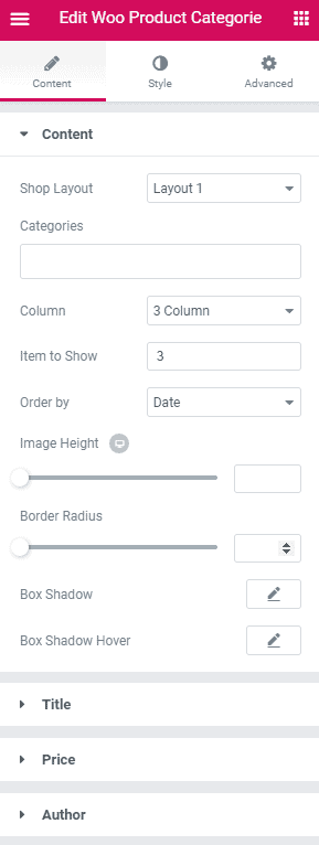
Under Content you have this options.
- Shop Layout : Choose layout that you want to use. There are currently two layouts available.
- Categories : Select the categories of product you want to show.
- Column : Choose the size of the column you want to use.
- Item to Show : Define how many items you want to show, at here.
- Order by : Define how you want to order products.
- Image Height : Adjust image height from here.
- Border Radius : Adjust border radius from here.
- Box Shadow : Customize box shadow from here.
- Box Shadow Hover : Customize box shadow hover from here.
Under Title you have this options.
- Title Word : Define the maximum number of word a title can contain.
- Title Color : Select the color of title text from here.
- Typography : Create your own preferred typography for title text by changing different options according to your wish.
Under Price you have this options.
- Price Color : Choose a color for the price text.
- Typography : Customize the price typography according to your need. You can customize title color, family, spacing, margin and so on.
Under Author you have this option.
- Author Color : Choose the author text color from here.
Style
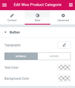
- Typography : Customize the typography according to your need. You can customize title color, family, spacing, margin and so on.
- Text Color : Choose a color for the text from here.
- Background Color : Choose a color for the background text from here.
Advanced
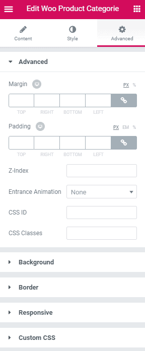
- Element Style : Control margin, padding, z-index, entrance animation and add additional id or class to apply your custom design to an element.
- Background : Control element background color, hover style and more.
- Border : Apply your custom border style configuring different options from this tab.
- Responsive : Control making this element to appear on various devices.
- Custom CSS : If you want to add any custom code, you can add it from here.
Sensei Courses
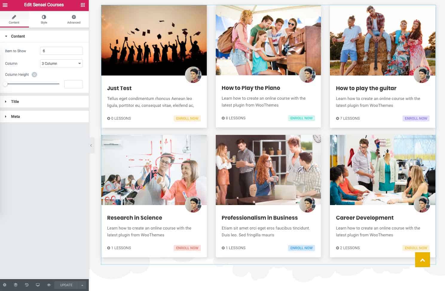
To add Sensei Courses element on a page, first-
- Go to
Pages - Click on Edit With Elementor
- Drag the Sensei Courses from the left EDUMODO ELEMENTS area and drop on your page.
- Customize the settings how you prefer and click on Save button to save the pages.
Content
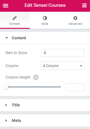 Under content you have this options.
- Item to show : Define how many courses you want to show, at here.
- Column : At here, define how many columns you want.
- Column Height : Define the height of the column from this option.
Under Title you have this options.
- Typography : Create your own preferred typography for course title text by changing different options according to your wish.
- Excerpt Title Word : Define the number of excerpt words.
Under Meta you have this options.
- Typography : Create your own preferred typography for meta text by changing different options according to your wish.
- Show Instructor : If you want to show instructor of courses than enable this option.
Style
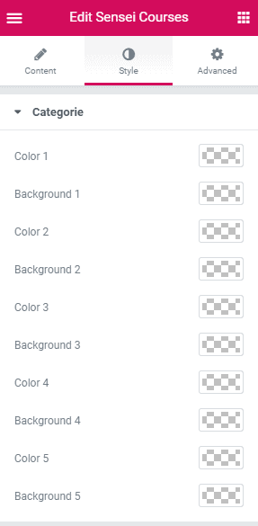
- Color : Choose the course color from here.
- Background : Choose the background color of course from herer.
Advanced :
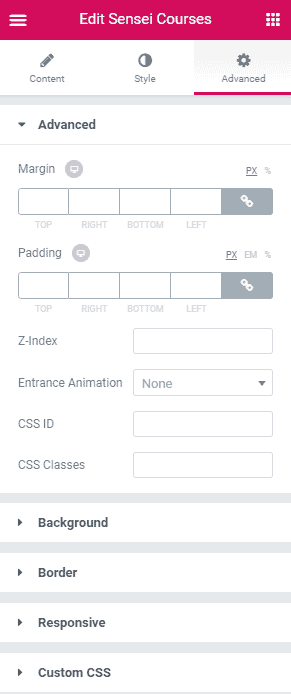
- Advanced :Control margin, padding, z-index, entrance animation and add additional id or class to apply your custom design to an element.
- Background : Control element background color, hover style and more.
- Border : Apply your custom border style configuring different options from this tab.
- Responsive : Control making this element to appear on various devices.
- Custom CSS : If you want to add any custom code, you can add it from here.
Sensei Categories
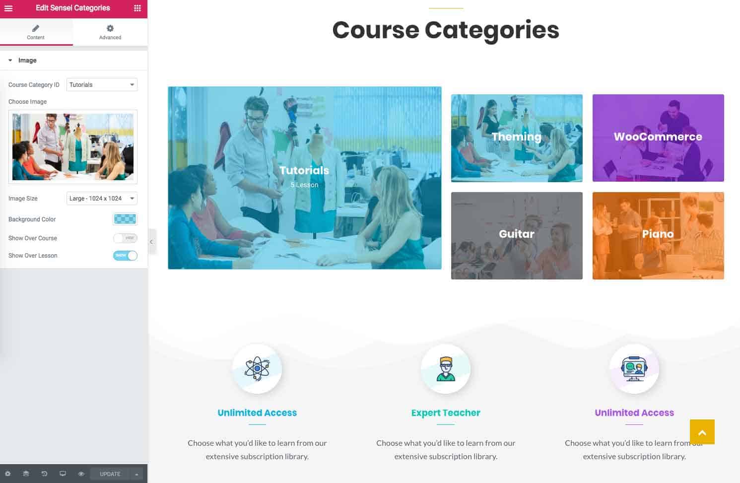
To add Course element on a page, first-
- Go to
Pages - Click on Edit With Elementor
- Drag the Sensei Categories from the left EDUMODO ELEMENTS area and drop on your page.
- Customize the settings how you prefer and click on Save button to save the pages.
Content
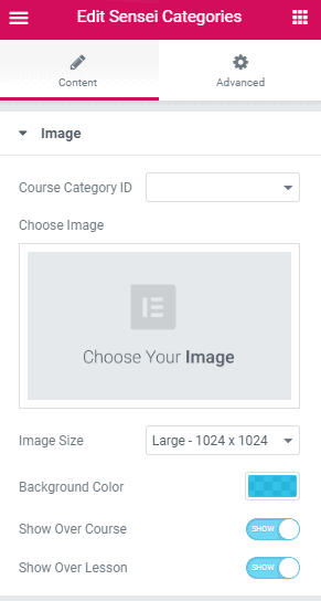
- Course Category ID : Choose course category ID from here.
- Choose Image : Choose image for your category from here.
- Image Size : Define image size from here.
- Background Color : Choose your preferred background color from here.
- Show Over Course : Toggle to show or hide over course.
- Show Over Lesson : Toggle to show or hide over lesson.
Advanced
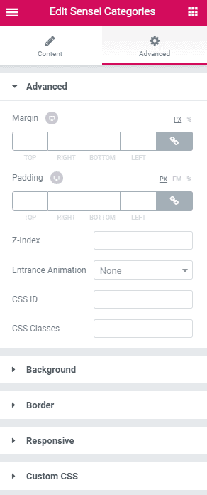
- Element Style : Control margin, padding, z-index, entrance animation and add additional id or class to apply your custom design to an element.
- Background : Control element background color, hover style and more.
- Border : Apply your custom border style configuring different options from this tab.
- Responsive : Control making this element to appear on various devices.
- Custom CSS : If you want to add any custom code, you can add it from here.
Learndash Courses
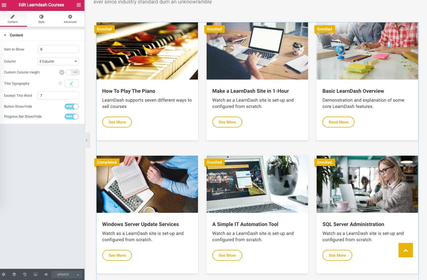
To add Learndash Courses element on a page, first-
- Go to
Pages - Click on Edit With Elementor
- Drag the Learndash Courses from the left EDUMODO ELEMENTS area and drop on your page.
- Customize the settings how you prefer and click on Save button to save the pages.
Content
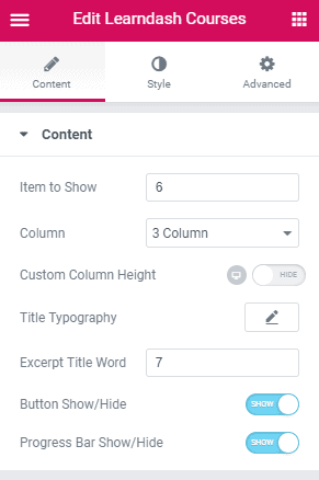 Under content you have this options.
- Item to show : Define how many courses you want to show, at here.
- Column : At here, define how many columns you want.
- Custom Column Height : Toggle this option to enable or disable custom height.
- Column Height : Define the height of the column from this option.
- Title Typography : Create your own preferred typography for course title text by changing different options according to your wish.
- Excerpt Title Word : Define the number of excerpt words.
- Button Show/Hide : Toggle to hide or show button.
- Progress Bar Show/Hide : Toggle to show or hide progress bar.
Style
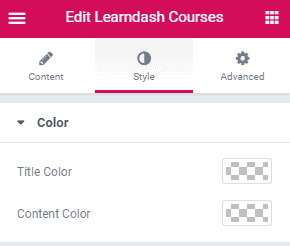
- Title Color : Choose the title color of course from here.
- Content Color : Choose the content color of course from here.
Advanced :
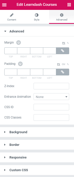
- Advanced :Control margin, padding, z-index, entrance animation and add additional id or class to apply your custom design to an element.
- Background : Control element background color, hover style and more.
- Border : Apply your custom border style configuring different options from this tab.
- Responsive : Control making this element to appear on various devices.
- Custom CSS : If you want to add any custom code, you can add it from here.
Troubleshooting
Plugin Installation stucked or failed
When you are installing required plugins, it might happen that plugin installation is taking too much time or stucked on a plugin. If this situation occurs, just reload your page and try to install plugins again. If you see any note with message “Failed or try again later”, try to install this plugins again at a later time.
Demo content import failed
If you cannot import your demo, there can be some possibilities like.
- Required plugins are not installed.
- Required plugins are not activated.
- There is more that one LMS is activated.
And last of all you might be
- Facing a hosting issue. Edumodo works on most of the hostings. But some hostings may block certain permissions. To solve this problem, you can contact your hosting provider or ask for our support and we will help you to solve this problem.
404 Error in all pages
If you face any 404 face issues, please update your permalink. To update permalink go to Settings -> Permalink and then flash permalink.
Page broken on course page or Style not loaded correctly
If you ever see your course pages are broken, check if you have 2 lms’s installed. Deactivate and uninstall the unnecessary one.
Edumodo Short Codes list
[edumodo-course-info] [edumodo-course-teacher] [edumodo-course-enroll] [edumodo-follow-us][edumodo-related-course] [edumodo-mailchimp] [quick-info] [edumodo-recent-post] [edumodo-related-course] [edumodo-testimonial]
Grow rapidly with our Joomla SEO service done by the veterans
With over 12 years of business and a vast array of Joomla templates and extensions, we know Joomla SEO better than anyone you could possiblly hire.
Improve my ranking