Arsim
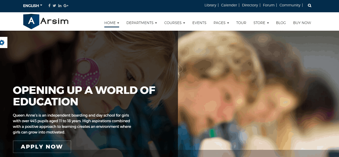
Arsim is an educational WordPress theme with huge page variations, allows you to manage courses, departments, as well as faculties, manage with ease. Its fully responsive, up to date with a bunch of trendy features like online student registration, event management, drag and drop page builder and much more that easily make the first impression of your visitors.
Key Features
- Fully Responsive
- Fast Loading
- Stunning Layout
- Multiple Home Variations
- Huge Built-in Page Collections
- SEO Optimized
- Management Toolkit
- Online registration feature
- Reusable Components
- RTL Supports
- Slider Revolution and Carousel
- Ecommerce Ready
- Stylish Megamenu
- Event Management Tool
- Drag & Drop Page Builder
- Dynamic Navigation Menu
- Smooth Collapsing Transaction
- Beautiful Blog
- bbPress Forum Integration
- Quick Social Sharing
- Multiple Social Commenting
- 306 Degree Virtual Tour
Requirements
In order to run Arsim smoothly on your server, you need to fulfill this requirement listed below:
- Wordpress: 3.9+
Download
Head over to Arsim download page and download the ArsimPackage.zip file. In this .zip file, you have everything you need.
Installation
Installing WordPress
To install this theme, you must have a working version of WordPress already installed on your server. If you need help installing WordPress, go through the link and follow the instructions: Installing WordPress
Installing Theme
There are a couple of simple steps to install Arsim theme on your server. Its quite straightforward.
If you are starting from the scratch, we recommend you to follow the installation guide below to install with the pre-built existing demo data. This is the simplest way to get started.
On the other hand, if you already have an existing WordPress site and want to apply Arsim theme, in that case, you just need to install the following package:
- arsim.zip
You can find this package inside the downloaded .zip file of Arsim theme. So, before getting started with the installing process, Extract the .zip file and you'll find the desire arsim.zip in the Theme folder after the extraction.
- Log in to the WordPress Administration Panels.
- Now, go to
Appearance> Themes> Add New> Upload Themethen click on the Choose File button then select the arsim.zip file and hit upload. - After installation being done, roll over to
Appearance> Themes. - Find just uploaded theme on the Theme Thumbnail area.
- Click the Activate button below to the theme's thumbnail, to set it as default.
Do not forget to Activate the theme as default after installation process successfully been done.
To know more, visit WordPress Codex
Active Required Plugins
There are four plugins, required for Arsim theme to work properly. Those are listed below:
- Arsim Core: theme core functionality (CPTs and shortcodes).
- Visual Composer: combine pages with flexible grid and shortcodes.
- WooCommerce: For selling Journals, Publications or Books.
- Slider Revolution: For amazing sliders.
- Contact Form 7 (optional). We recommend this for the contact form.
To activate those required plugins, simply go to Plugins
- Select all those four required plugins.
You can use the search module to find the desired plugins. The search box can be found on the right-top side of the module.
- Select Activate from the drop-down menu just above the list of plugins.
- Click to the Apply button next to the drop-down box and you are done.
To know more about the installation process of plugins, visit here: WordPress Codex
If there is any problem with automatical plugin installation, install them manually. You can find plugin bundle in your theme's /lib/plugins subdirectory. WooCommerce and Contact Form 7 can be found in WordPress plugins repository, install them through Plugins Screen
Import Demo Data
- Log in to the WordPress Administration Panels.
- Go to
Tools> Import - Select the WordPress from the list. It can be found at the bottom of the list of plugins, normally.
- Install the WordPress Importer plugin, if you haven't installed it yet.
- After being installed, click on Run Importer to open the module.
It allows you to select the demo data file from your local drive and upload into your server.
- Now, click on Choose File. Once you click on it, it prompts up a screen, allowing you to select the demo data file from your local drive.
- Choose the arsim-content-demo.xml file and click Upload file and import
Demo data files can be found in Demo folder after you extract the theme package and the path should be
/Demo/arsim-content-demo.xml.
- On the second screen, set up an author and don't forget to check the Download and import file attachments. After making sure it is checked in, click on Submit button.
You can also import widget setting via this widget Importer Plugin
Widget setting file can be found in Demo folder after you extract the theme package and the path should be
/Demo/widget_data.jason.
Theme Settings
You can differently customize theme according to your need using Easy Customization feature.
- Click on Arsim at left-bottom corner of the module screen to open up Theme Setting panel.
General Settings
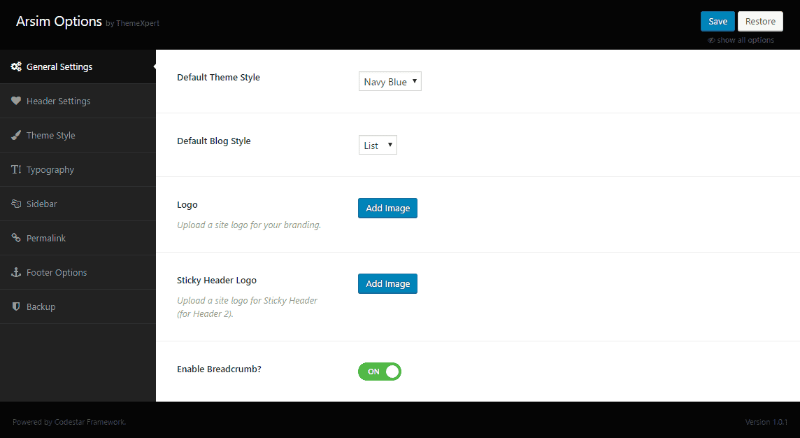
- Default Theme Style : Choose the primary theme color from the drop-down menu.
- Default Blog Style : You can either select List or Grid style for the blog with this option.
- Logo : Upload your site logo for branding.
- Sticky Header Logo : Choose a logo for the sticky header.
- Enable Breadcrumb? : Allows you the control over enabling or disabling breadcrumb for your site.
Header Settings
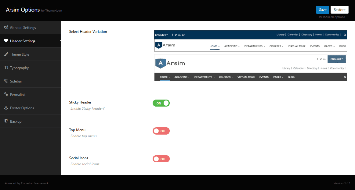
- Select Header Variation : Select the header variation from the right side preview.
- Sticky Header : Allows you to enable or disable sticky header for your site.
- Top Menu : You can enable or disable top menu with this option.
- Social Icon : To enable this option allows you to add social icons to your site. Enable this option first, then empty text boxes will appear for various social sites. You just need to provide the corresponding profile like on those empty text boxes and you are done.
Theme Style
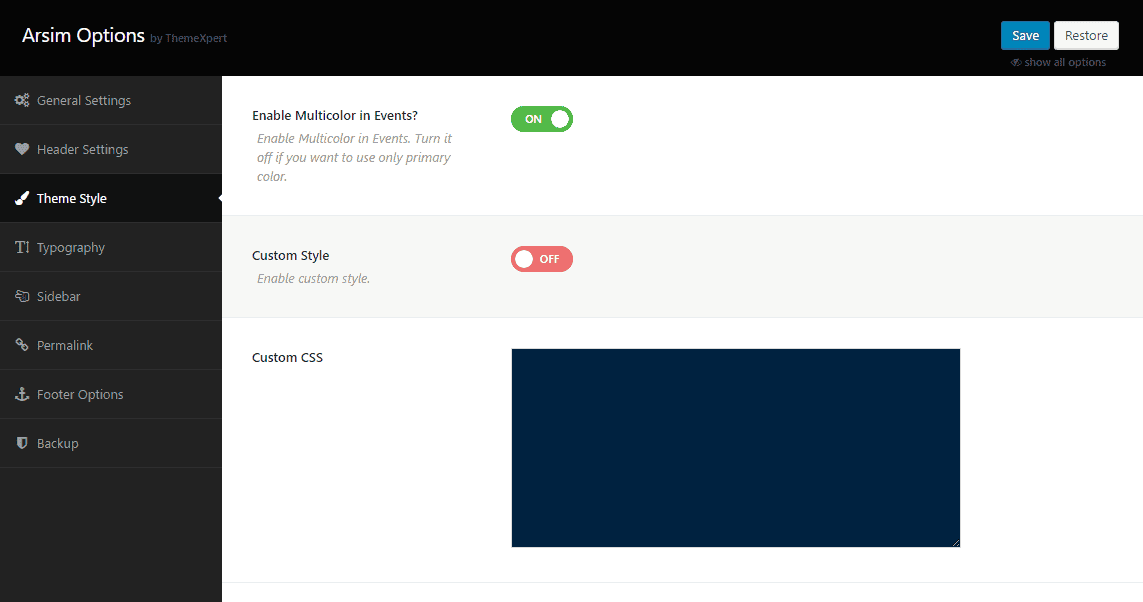
- Enable Multicolor in Events? : Allows using multiple colors on event section. By disabling this option, you can only use primary color on all sections or modules, set by default.
- Custom Style : By default this option is disabled. To enable this option, a couple of settings will appear to customize according to your preference.
- Header Primary Color : Allows your to set header primary color.
- Header Link Color : Allows your to set header Link color including Regular color, Hover color, and Active color as well.
- Menu Color : Allows your to set Menu color including Regular color, Hover color, and Active color as well.
- Top Menu Color : Allows your to set Top Menu color including Regular color, Hover color, and Active color as well.
- Body Primary Color : Allows your to set a primary color for the body.
- Body Link Color : Allows your to set Body Link color including Regular color, Hover color and Active color as well.
- Footer Primary Color : Allows your to set footer primary color.
- Footer Link Color : Allows your to set Footer Link Color including Regular color, Hover color and Active color as well.
Those above seven settings can be found only if you enable the Custom Style feature.
- Custom CSS : Write custom CSS code here.
- Custom JS : Write custom JS code here.
Typography Settings
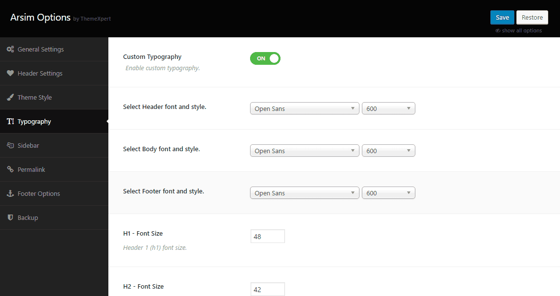
- Custom Typography : This option allows you to use thousands of google fonts in different sections in your site. First, enable this to get the customization settings to appear.
- Select Header Font and Style : Allows you to select a font style and font type for the header section.
- Select BodyFont and Style : Allows you to select a font style for the body.
- Select FooterFont and Style : Allows you to select a font style and font type for the footer section.
- H1 Font Size : Choose a font size for the H1 texts.
- H2 Font Size : Choose a font size for the H2 texts.
- H3 Font Size : Choose a font size for the H3 texts.
- H4 Font Size : Choose a font size for the H4 texts.
- H5 Font Size : Choose a font size for the H5 texts.
- H6 Font Size : Choose a font size for the H6 texts.
- P Font Size : Choose a font size for the Paragraph texts.
Sidebar Settings
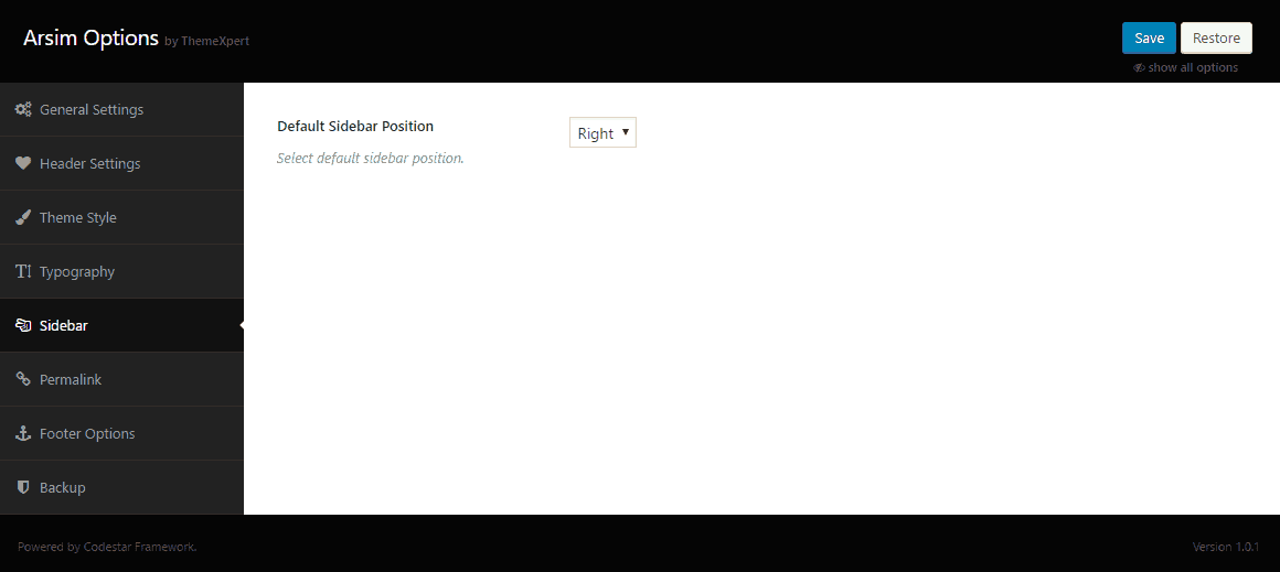
- Default Sidebar Position : Set the default sidebar position. You can either choose Left or Right from the drop-down menu.
Permalink Settings

- Custom Permalink : To enable this feature allows you to customize permalink according to your needs.
Post Type
- Course Slug : Write your desired custom slug for the Course Post Type in the empty text box next to this option.
- Notice Board Slug : Write your desired custom slug for the Notice Board Post Type in the empty text box next to this option.
- Teachers Slug : Write your desired custom slug for the Teachers Post Type in the empty text box next to this option.
- Testimonial Slug : Write your desired custom slug for the Testimonial Post Type in the empty text box next to this option.
Taxonomy
- Course Category Slug : Write your desired custom slug for the Course Category Taxonomy in the empty text box next to this option.
- Notice Board Category Slug : Write your desired custom slug for the Notice Board Category Taxonomy in the empty text box next to this option.
- Course Name Slug : Write your desired custom slug for the Course Name Taxonomy in the empty text box next to this option.
After you generate your own preferred custom slug, its IMPORTANT to go to
Settingsmodule from the left sidebar and click on Save Changes button in the bottom-left corner.
Footer Option
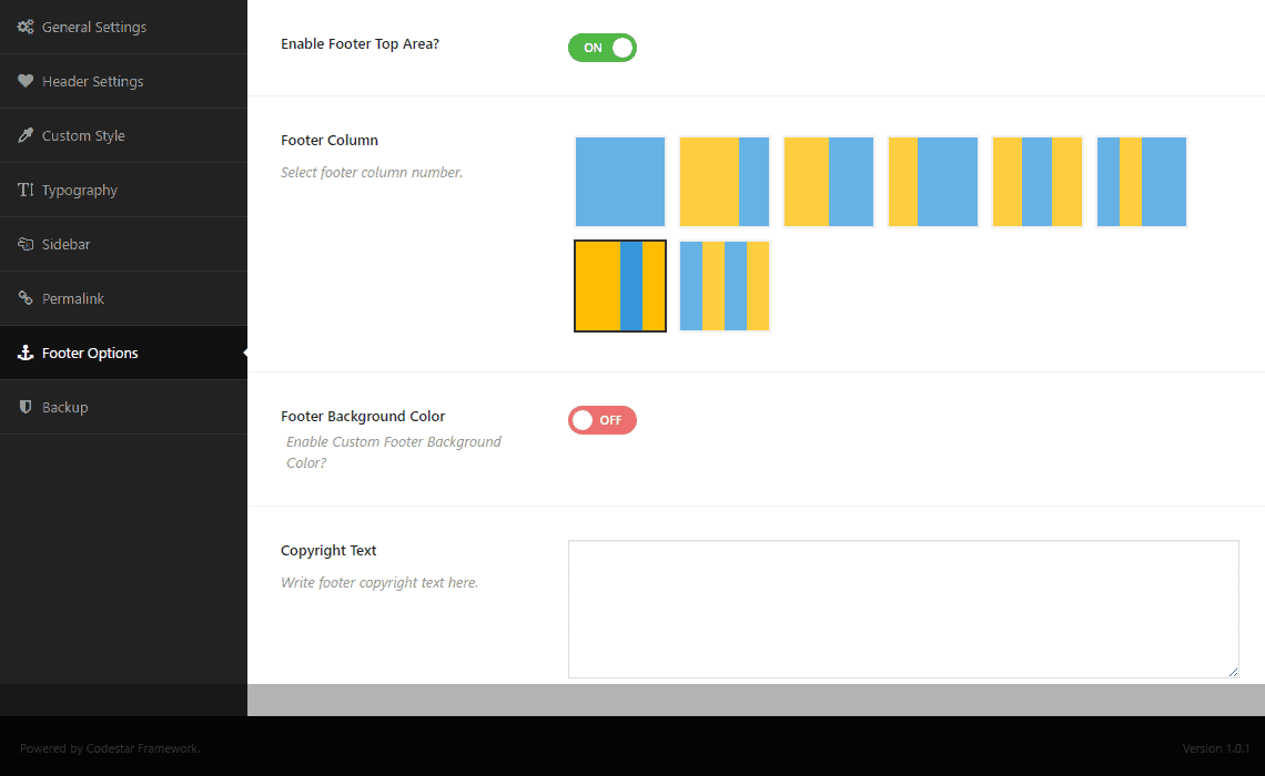
- Footer Column : Define the number of columns you need in your site footer.
- Custom Background : Choose a footer background color.
- Copyright Text : Write your copyright text here.
- ThemeXpert Credit : Keep it enabled if you want to give us credit. You can disable this option either.
Backup Settings
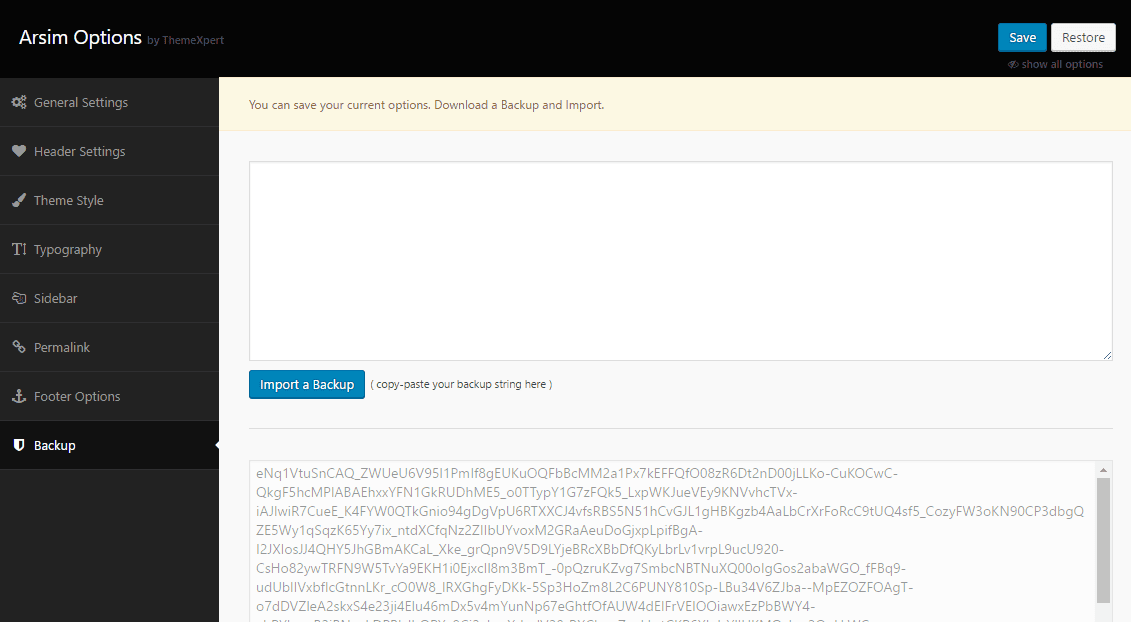
- Import and Backup : This button allows you to import a backup theme. Just to paste the backed up string on the empty text box and then click this button.
- Import and Download Backup : With this button, you can make a backup of your current theme.
How To's
Setup Homepage
- Go to
Settings > Reading - Select A Static page on Front page displays option.
- Choose Home from the Front-page drop-down menu.
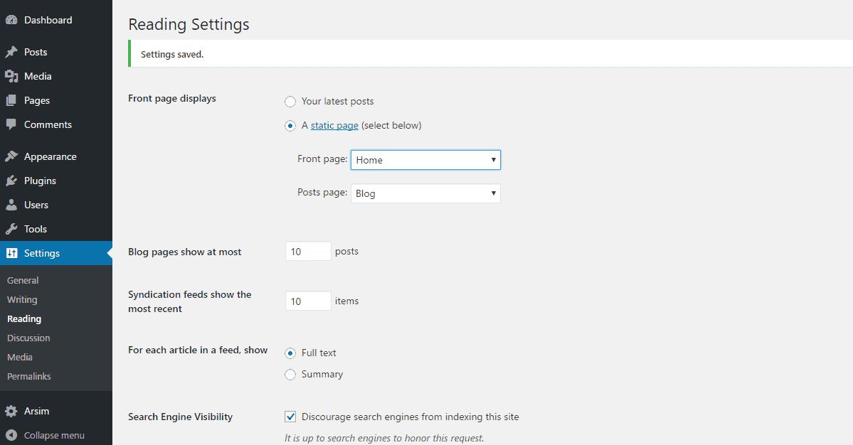
- Select Blog from the Post page drop-down menu.(optional)
- Use the left-bottom Save Changes button to save the settings.
Creating Pages
- Go to
Pages> Click Add New button. - Give a page title on the Add New Page text box.
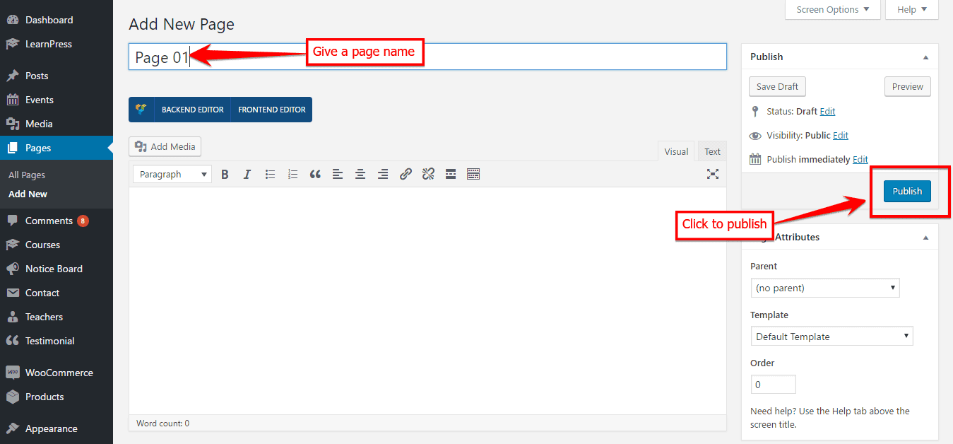
- Click on Publish button to save the page.
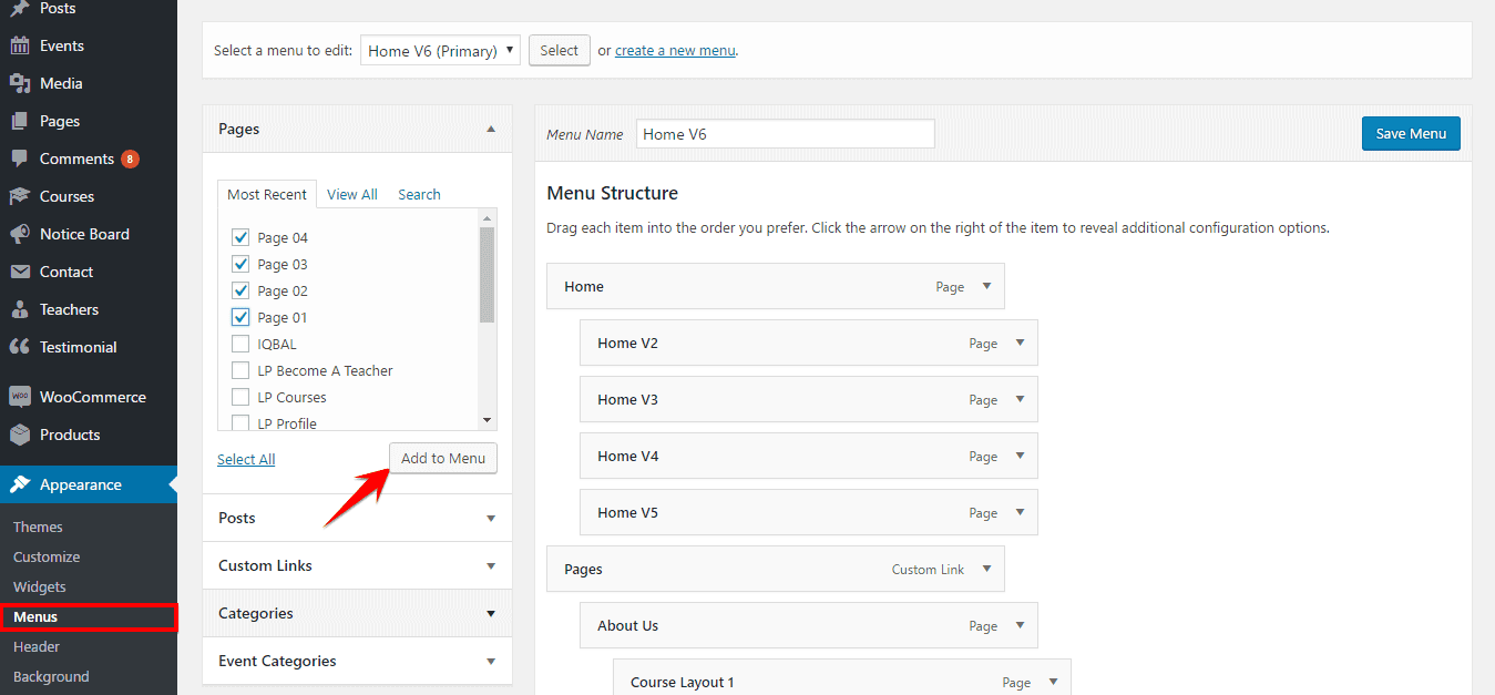
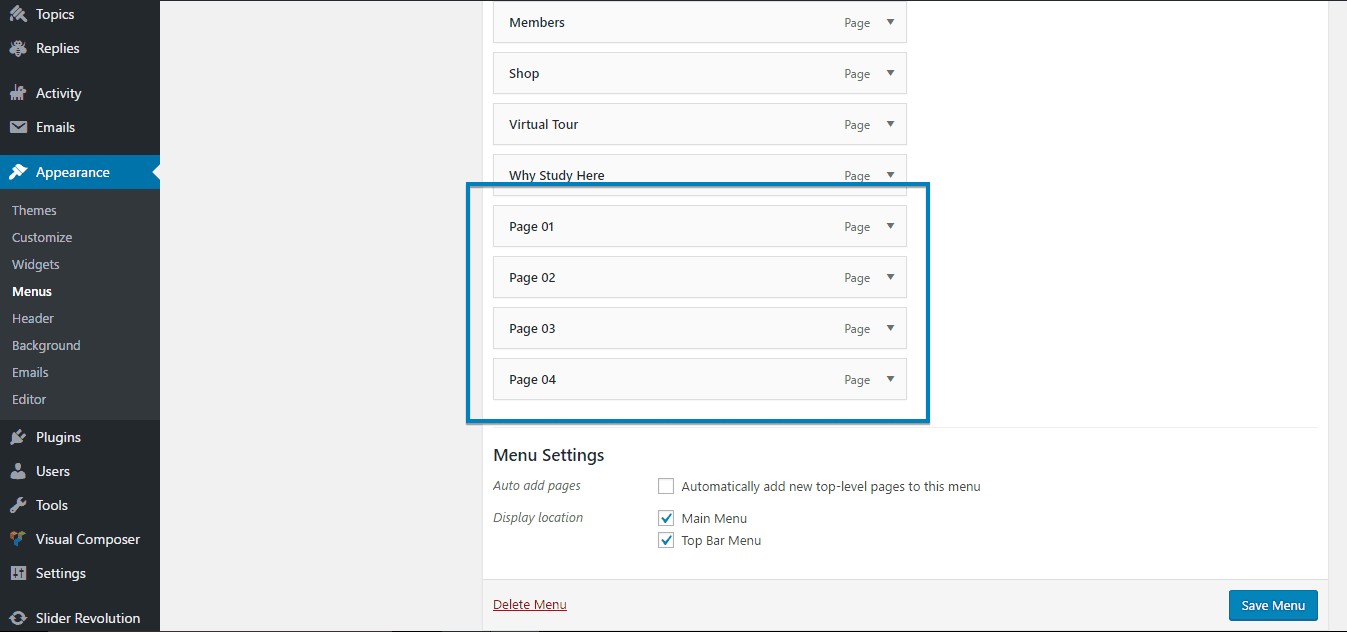
If everything is done ok then you can find those created pages on Appearance> Menus.
Now, you can create Menu and assign those pages in different menus.
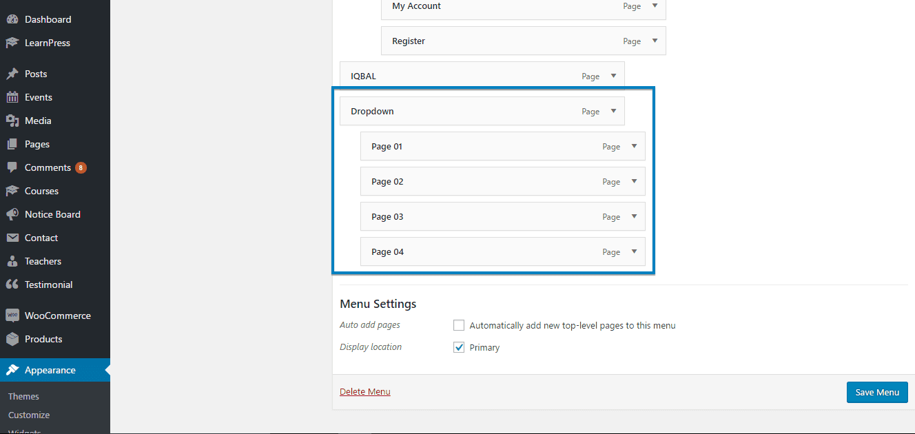
Creating Dropdown Menu
- Go to
Appearance> Menus - Select a main-menu and drag the submenu items right below the main-menu.
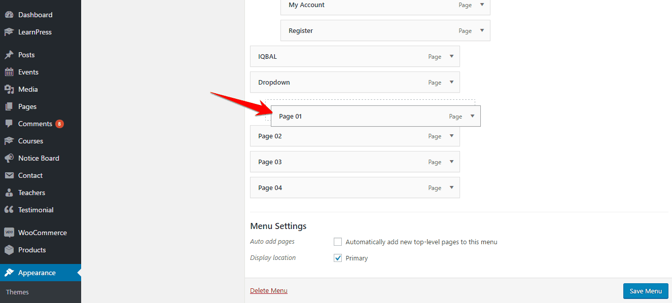
- Click on Save Menu on the right-bottom side of the module and you are done.
Creating Megamenu
- Go to
Appearance> Menus - First, make a drop-down menu including sub-items into the sub-items.
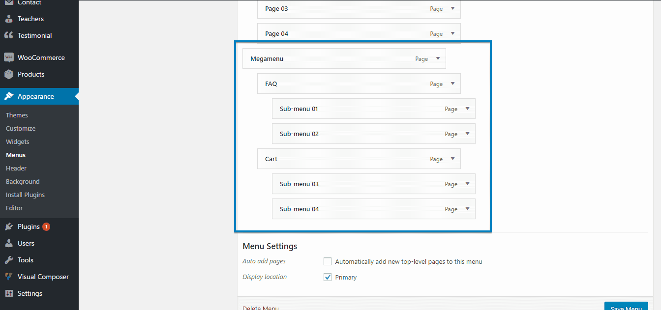
- Click the expand button of the parent menu of megamenu and check the option Enable megamenu.
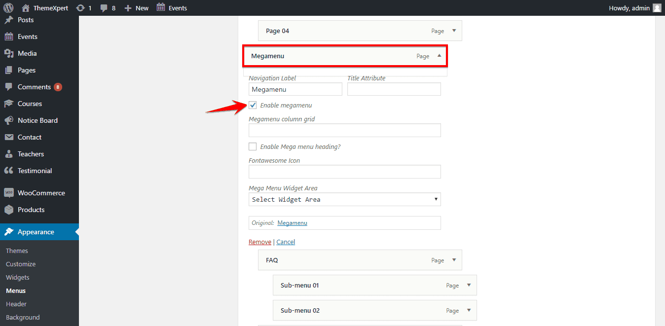
- Expand the sub-menu items then set a numeric number on megamenu column grid to define the number of columns within a total of 12. ( If your megamenu subitems are 2 then the number should be 6, as 6+6=12, if subitems are 3 then it is 4, as 4+4+4=12 ). Make sure Enable megamenu heading option is checked in.
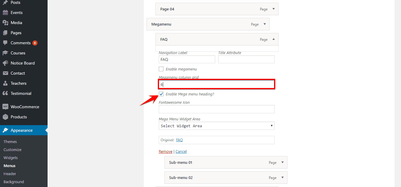
- After everything is done according to the right way, click Save Menu button to save the settings successfully.
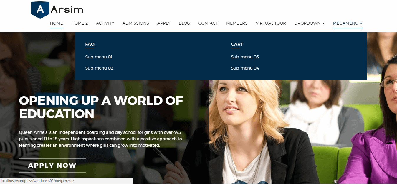
Front-end appearance would be like below:
Creating Events
To create a new event, follow the instruction below;
- Go to
Events> Add Newand a configuration module will appear. - Enter the event title on the very first empty text box.
- Write event detail content text on the content area. You can import media like images, audios etc. on the content area simply with the Add Media button above the content area box.
- On Event Meta tab, define the meta information of the event like Start date, End date, Start time, End time, Join now button link, location and detail information of speakers as well. You can upload a header background image for the event from the upper part of Event Meta tab.
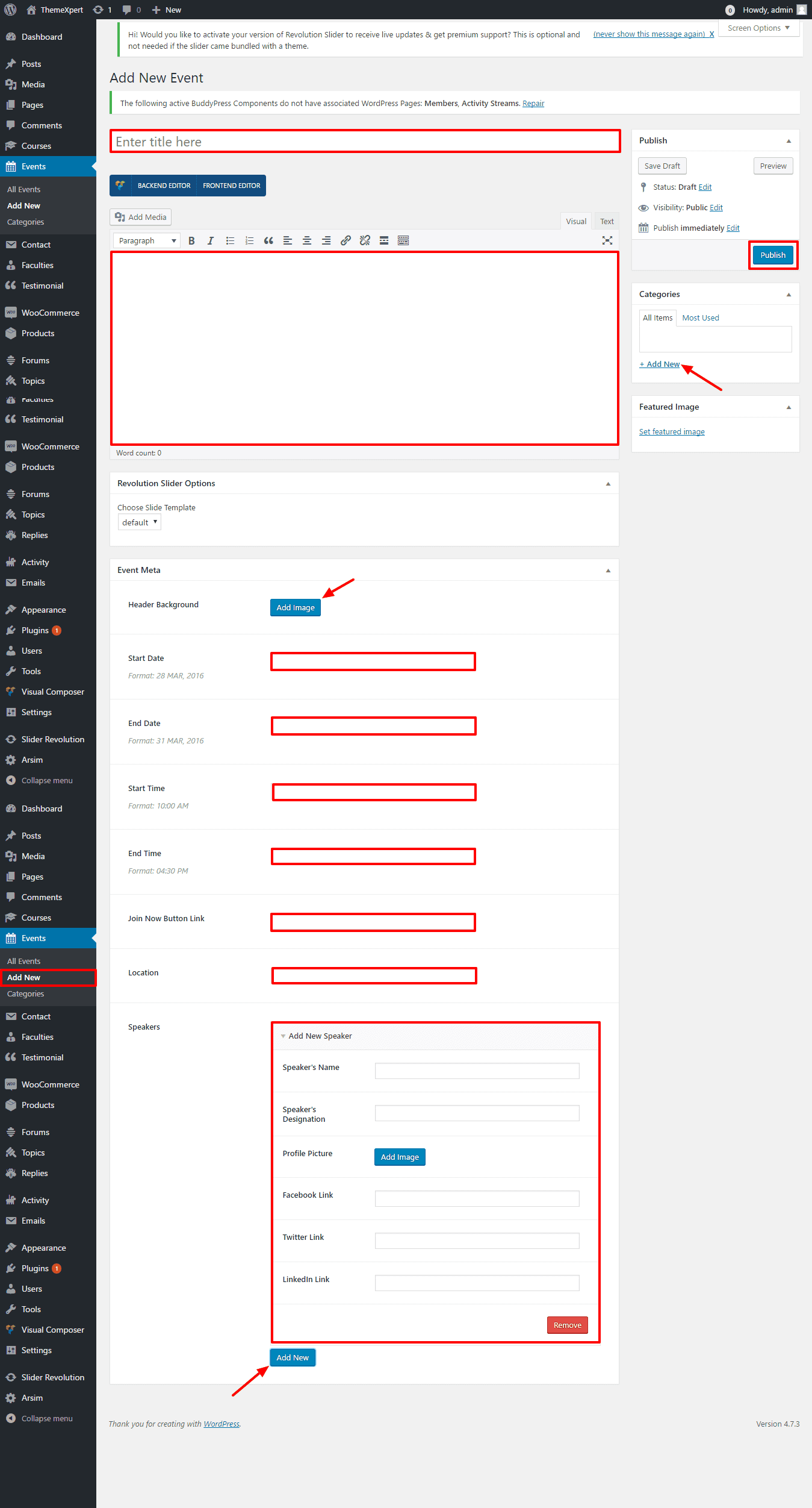
- On the right side of the module, select or create a new category for the event and add a featured image for the event as pointed on the screenshot.
- After everything is done according to the instruction, click on the Publish button from the right-top of the module and your done adding a new event successfully.
Creating Faculties
To create a new Faculty, follow the instruction below;
- Go to
Faculties> Add Newand a configuration module will appear. - Enter the Faculty title on the very first empty text box.
- On Faculty Information tab, define the detail information of the faculty like Designation, Biography, Educations, Subjects, as well as Social Networks.
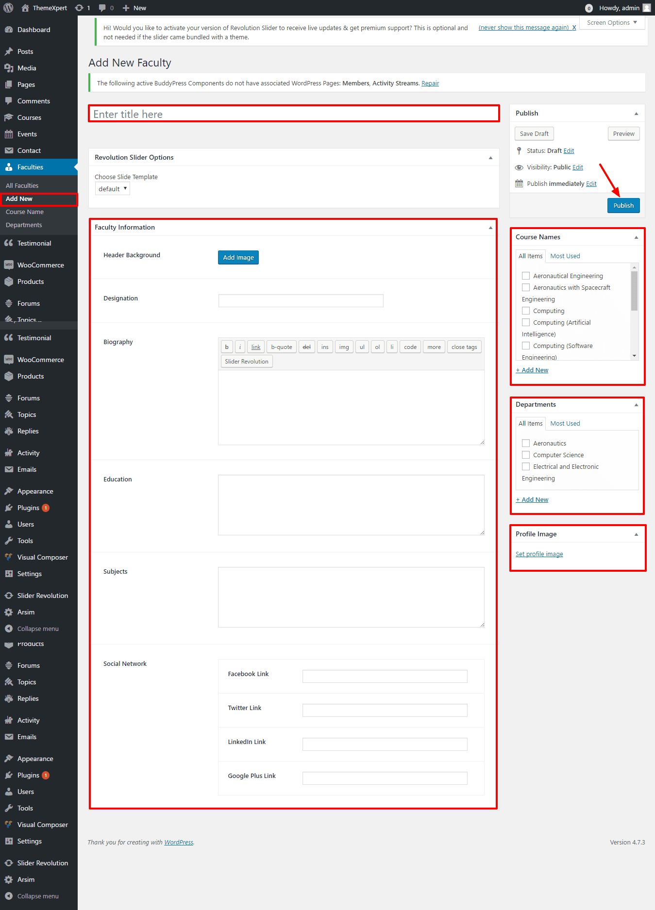
- On the right side of the module, select an existing Course name or create a new Course then select, select an existing Department or create a new Department then select, and upload a profile image for the faculty as pointed on the screenshot.
- After everything is done according to the instruction, click on the Publish button from the right-top of the module and your done adding a new faculty successfully.
Creating Courses
To create a new Course, follow the instruction below;
- Go to
Courses> Add Newand a configuration module will appear. - Enter the Course title on the very first empty text box.
- Write course detail content text on the content area. You can import media like images, audios etc. on the content area simply with the Add Media button above the content area box.
- On Course Module tab, select faculty for the course and you can add module below this just by enabling the Add Module option.
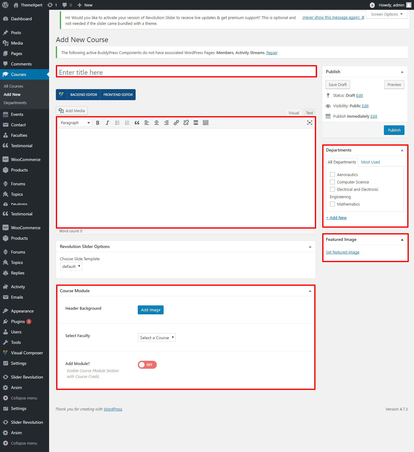
- On the right side of the module, select an existing department name or create a new department then select, and upload a featured image for the course as pointed on the screenshot.
- After everything is done according to the instruction, click on the Publish button from the right-top of the module and your done adding a new course successfully.
You must create Faculties first to create a new course.
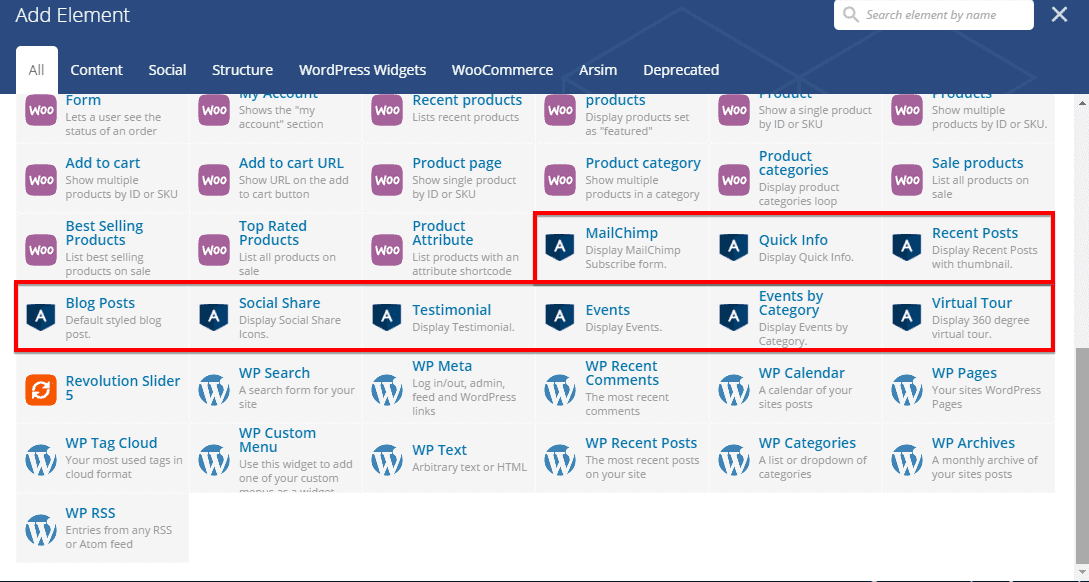
Elements & Shortcodes
You can add an element on a page in two different ways. Either you can use just the simple shortcode on the content area of that page or you can add element manually. You will have plenty of default elements to add or you can add our developed elements those are only for Arsim theme from the Arsim tab.
Visual Composer
Visual Composer is the best Drag and Drop visual editor for building pages, posts etc. in a WordPress site. If you are not familiar with Visual Composer, we recommend you to take a look at the following videos:
-
Getting Started with Visual Composer Getting Started With Visual Composer - YouTube
-
Cloning Elements How to Clone Elements with Visual Composer for WordPress - YouTube
-
Rows & Columns How to Add Row and Column with Visual Composer for WordPress - YouTube
- Create & Re-use Templates How to Use Templates in Visual Composer How to save separate Row or Section as a Template
Our developed elements those are only for Arsim theme can be found in Arsim tab under Visual Composer.
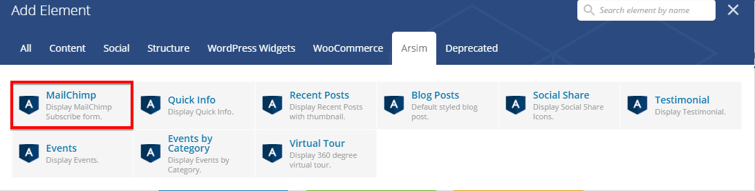
MailChimp
Shortcode : [arsim-chimp action=""]
Manual Process :
To add MailChimp element on a page, first-
- Go to
Pages - Click on Edit With Visual Composer
- Click on Add Elements
- From Arsim tab, click on the element named MailChimp
- Configure the settings module according to your preferences and then
- Click on Save Changes to save the settings.
MailChimp Settings
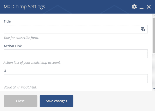
- Title : Title for Subscribe Form.
- Action Link : Action Link of your MailChimp account.
- U : Provide your mail server here.
- ID : Provide your mail server id here.
- Email Label : Label for Email field of the Form.
- Button Label : Label for Submit Button of the Form.
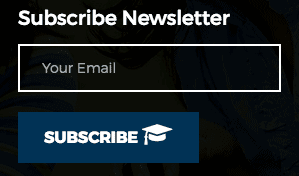
The front-end appearance would be like below if everything was just according to the instruction.
Quick Info
Shortcode : [quick-info icon-1="fa-" info-1="Info" ]
Manual Process :
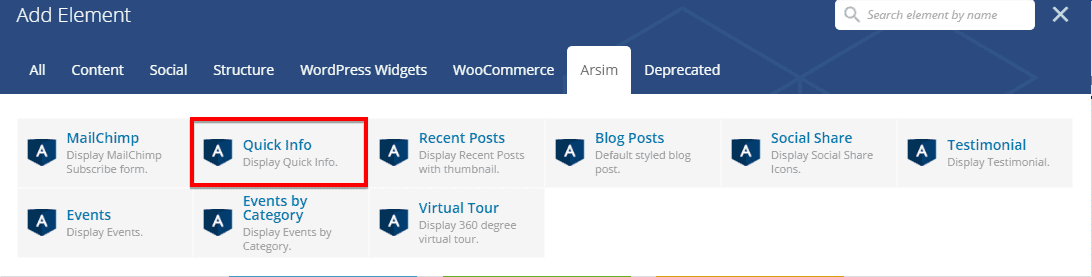
To add Quick Info element on a page, first-
- Go to
Pages - Click on Edit With Visual Composer
- Click on Add Elements
- From Arsim tab, click on the element named Quick Info
- Configure the settings module according to your preferences and then
- Click on Save Changes to save the settings.
Quick Info Settings
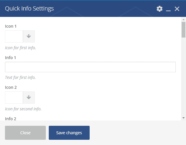
- Icon 1 : Select a icon for info 1 by simply clicking on the right side arrow button next to this option.
- Info 1 : Write info 1 here.
- Icon 2 : Select a icon for info 2.
- Info 2 : Write info 2 here.
- Icon 3 : Select a icon for info 3.
- Info 3 : Write info 3 here.
- Icon 4 : Select a icon for info 4.
- Info 4 : Write info 4 here.
- Icon 5 : Select a icon for info 5.
- Info 5 : Write info 5 here.
- Icon 6 : Select a icon for info 6.
- Info 6 : Write info 6 here.
- Icon 7 : Select a icon for info 7.
- Info 7 : Write info 7 here.
- Icon 8 : Select a icon for info 8.
- Info 8 : Write info 8 here.
- Icon 9 :Select a icon for info 9.
- Info 9 : Write info 9 here.
- Icon 10 : Select a icon for info 10.
- Info 10 : Write info 10 here.
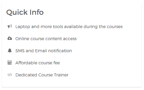
The front-end appearance would be like below if everything was just according to the instruction.
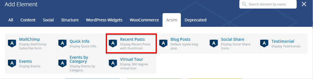
Recent Posts
Shortcode : [arsim-recent-post]
Manual Process :
To add Recent Posts element on a page, first-
- Go to
Pages - Click on Edit With Visual Composer
- Click on Add Elements
- From Arsim tab, click on the element named Recent Posts
- Configure the settings module according to your preferences and then
- Click on Save Changes to save the settings.
Recent Posts Settings
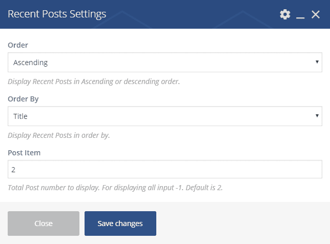
- Order : Display post in either Ascending or Descending order.
- Order By : Display Recent Posts in order by Title, Date, Name or Random.
- Post Item : Define the number of posts you want to show on this module.
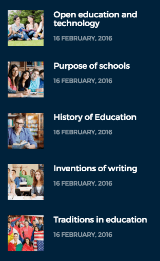
The front-end appearance would be like below if everything was just according to the instruction.
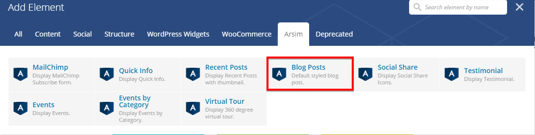
Blog Posts
Shortcode : [arsim-blog]
Manual Process :
To add Blog Posts element on a page, first-
- Go to
Pages - Click on Edit With Visual Composer
- Click on Add Elements
- From Arsim tab, click on the element named Blog Posts
- Click on Save Changes to save the settings.
Blog Posts Settings
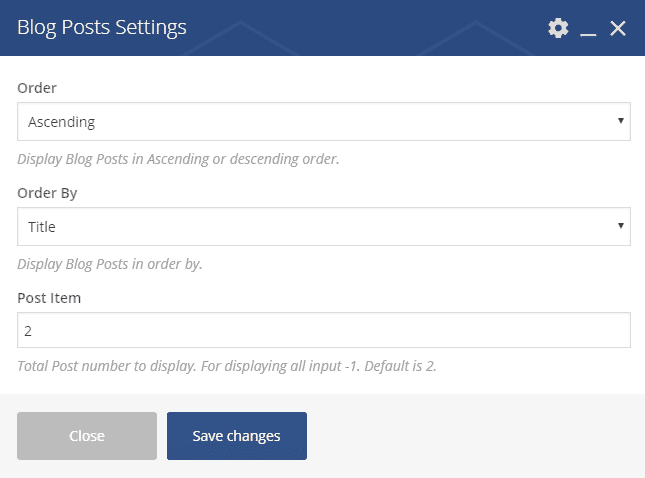
- Order : You can display Course Instructors either in ascending order or in descending order with this option.
- Order By : You can display Course Instructors ordered by Title, Name, Date, or Random.
- Post Item : Select number of items from the drop-down to display its instructors onto your preferred page.
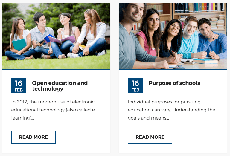
The front-end appearance would be like below if everything was just according to the instruction.
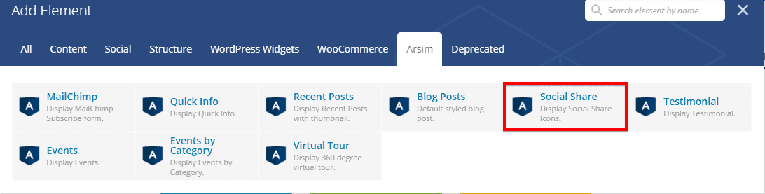
Social Share
Shortcode : [arsim-share]
Manual Process :
To add Social Share element on a page, first-
- Go to
Pages - Click on Edit With Visual Composer
- Click on Add Elements
- From Arsim tab, click on the element named Social Share
- Configure the settings module according to your preferences and then
- Click on Save Changes to save the settings.
Social Share Settings
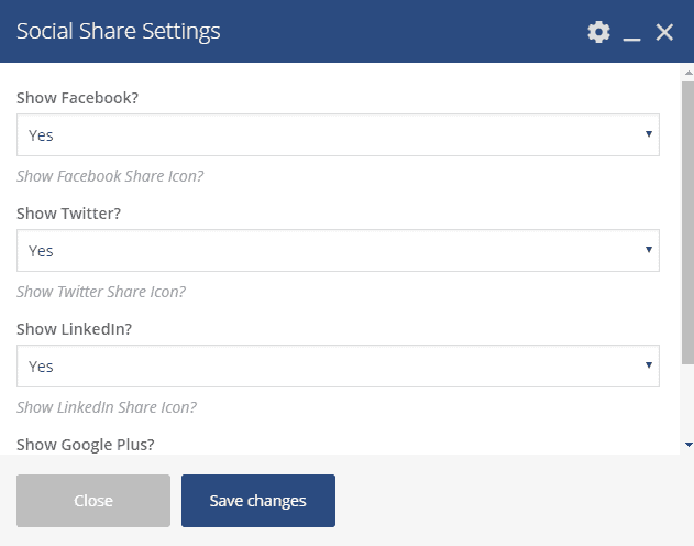
- Show Facebook? : You can enable or disable showing facebook sharing icon.
- Show Twitter? : You can enable or disable showing twitter sharing icon.
- Show LinkedIn? : You can enable or disable showing LinkedIn sharing icon.
- Show Google Plus? : You can enable or disable showing Google Plus sharing icon.
The front-end appearance would be like below if everything was just according to the instruction.

Testimonial
Shortcode : [arsim-testimonial]
Manual Process :
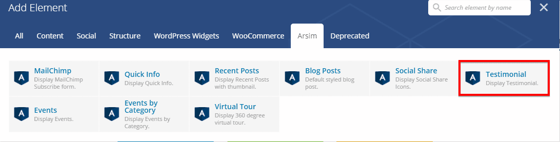
To add Testimonial element on a page, first-
- Go to
Pages - Click on Edit With Visual Composer
- Click on Add Elements
- From Arsim tab, click on the element named Testimonial
- Configure the settings module according to your preferences and then
- Click on Save Changes to save the settings.
Testimonial Settings
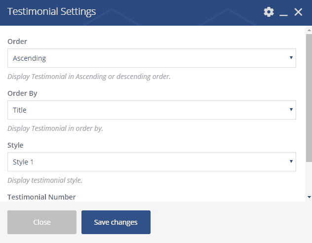
- Order : Display in Ascending or Descending order.
- Order By : Display testimonials in order by Title, Date, Name or Random.
- Style : Select a style from the drop-down menu.
- Testimonial Number : Define the number of testimonials you want to show.
The front-end appearance would be like below if everything was just according to the instruction.

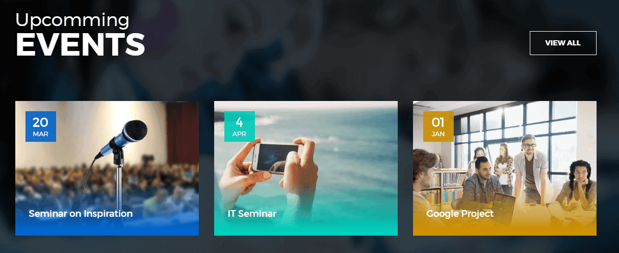
Events
Shortcode : [arsim-events]
Manual Process :
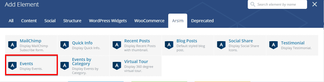
To add Events element on a page, first-
- Go to
Pages - Click on Edit With Visual Composer
- Click on Add Elements
- From Arsim tab, click on the element named Events
- Configure the settings module according to your preferences and then
- Click on Save Changes to save the settings.
Events Settings
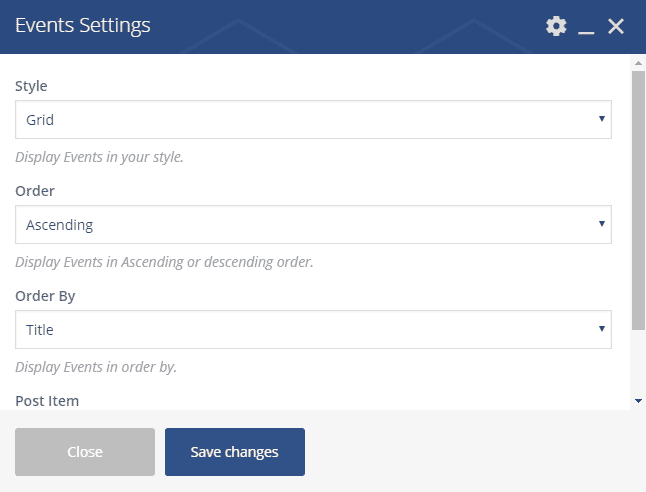
- Style : Select a style from the drop-down menu.
- Order : Display in Ascending or Descending order.
- Order By : Display Events in order by Title, Date, Name or Random.
- Post Item : Define the number of posts you want to show.
The front-end appearance would be like below if everything was just according to the instruction.
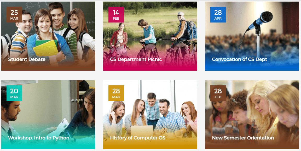
Events By Category
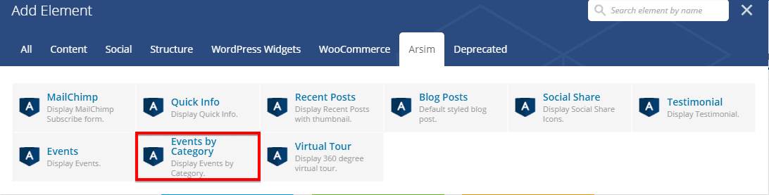
Shortcode : [arsim-events]
Manual Process :
To add Events By Category element on a page, first-
- Go to
Pages - Click on Edit With Visual Composer
- Click on Add Elements
- From Arsim tab, click on the element named Events By Category
- Configure the settings module according to your preferences and then
- Click on Save Changes to save the settings.
Events By Category Settings
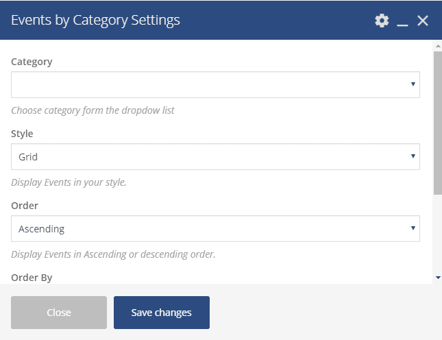
- Category : Select a events category from the drop-down menu.
- Style : Select a style from the drop-down menu.
- Order : Display in Ascending or Descending order.
- Order By : Display Events in order by Title, Date, Name or Random.
- Post Item : Define the number of posts you want to show.
The front-end appearance would be like below if everything was just according to the instruction.
Virtual Tour
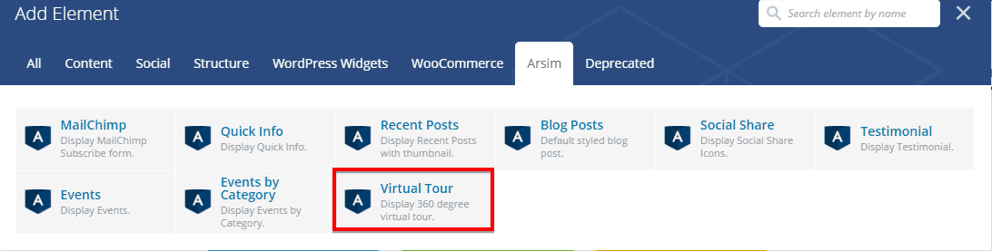
Shortcode : [virtual-tour]
Manual Process :
To add Virtual Tour element on a page, first-
- Go to
Pages - Click on Edit With Visual Composer
- Click on Add Elements
- From Arsim tab, click on the element named Virtual Tour
- Configure the settings module according to your preferences and then
- Click on Save Changes to save the settings.
Virtual Tour Settings
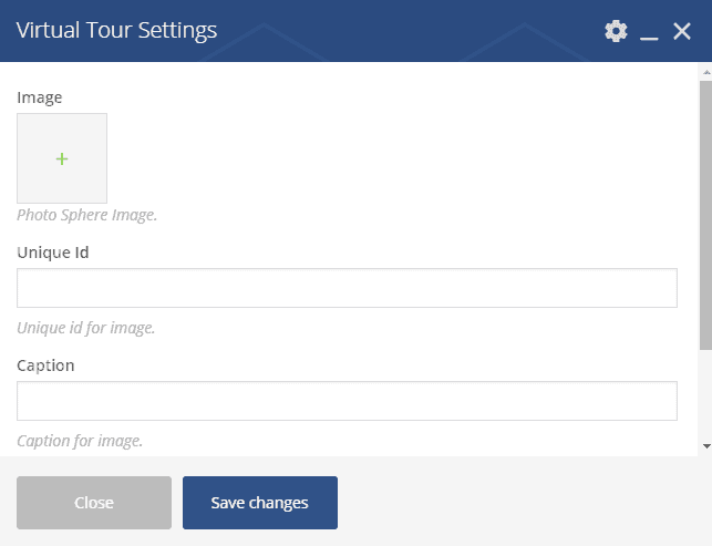
- Image : Select a photosphere image to represent in a stunning virtual way.
- Unique ID : Put a unique ID of the image.
- Caption : Write a caption for this module.
- Height : Define the height.
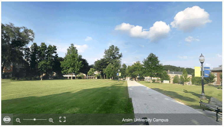
The front-end appearance would be like below if everything was just according to the instruction.
Helpers
Arsim has a few helper classes. Those can be used frequently in any div, sections in your site just by defining the class. Classes are listed below;
color-whitefor white text color.color-darkestfor darkest text color.color-darkerfor darker text color.color-darkfor dark text color.color-grayfor gray text color.color-lightfor light text color.color-lighterfor lighter text color.color-lightestfor lightest text color.color-blackfor black text color.bg-primefor primary background color.bg-prime-lightfor primary light background color.bg-prime-darkfor primary dark background color.shadow-boxfor shadow box or section.
See our other WordPress theme Eventas with detailed documentation.
Grow rapidly with our Joomla SEO service done by the veterans
With over 12 years of business and a vast array of Joomla templates and extensions, we know Joomla SEO better than anyone you could possiblly hire.
Improve my ranking