Call to Action
‘Call to action’ is an instruction to your visitor to perform an immediate task. It combines title, text, image and button element which you can style along with a box background colors and much more. The element uses animation and CSS to create user interaction that appear when the user hovers over call to action section. To add this element in a section follow these steps.
- Select Add New Element from column to open elements list modal
- From there select Call to action element
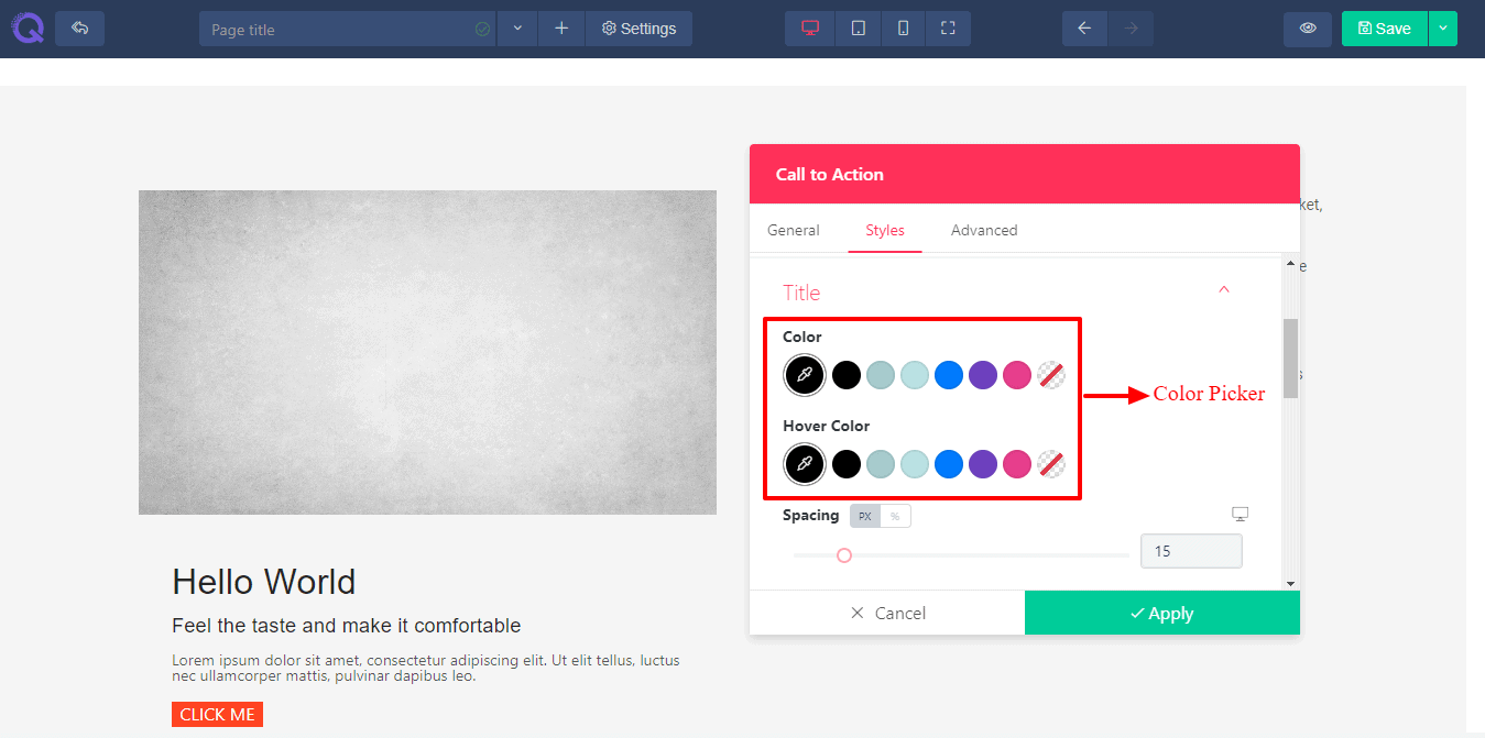
A popup will appear showing three tabs - General, Styles ,& Advanced. These tabs will help you to modify the call to action element in your own way. The details are given below.
General Tab
 The general tab holds the basic setting of call to action element. You’ll find the following editing options here.
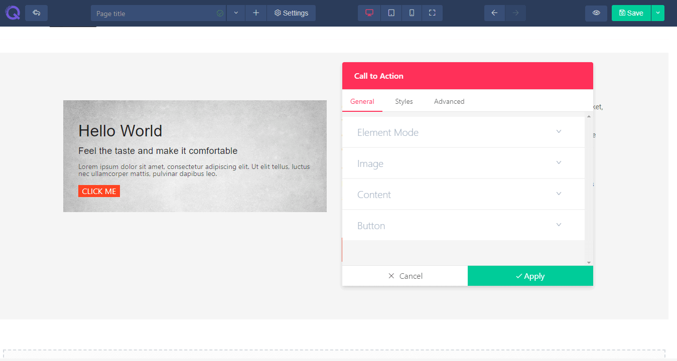
- Element Mode - With element mode option you can choose how you want to set call to action element. You can go for a classic look where image will appear first and then the following fields will appear one by one- title, subtitle, description and button. And if you go for cover mode then the text field and button will overlay above the image.
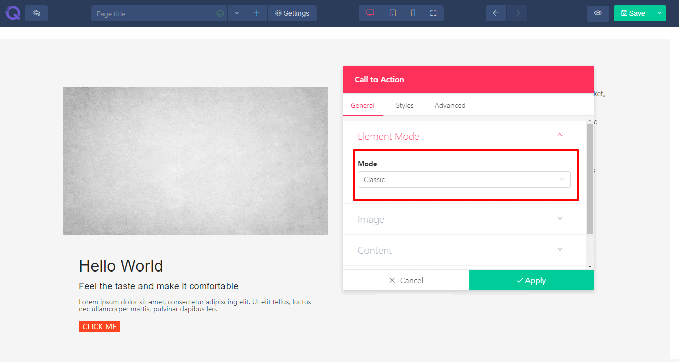 Call to action in classic mode.
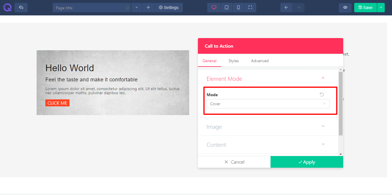 Call to action in cover mode.
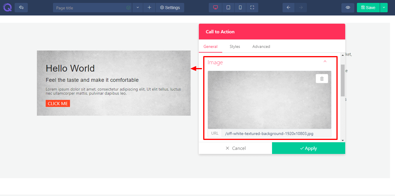
 - Image - Image field will allow you to set a proper image in your call to action element. You can choose your image from media manager and set it just the way you want. You can add an alternate text to it and a caption under the image.
- Image Position - Image position will help you to set the image in different positions. You can set it in left, middle or right of the text field.
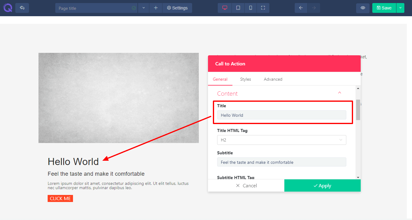
- Title - Title field will help you to add a new title in the section. A title represents a short note of the details described below. It attracts a user view first. If a user finds the title interesting, then he goes for the rest of the details.
- Title HTML Tag - HTML tag will set the title size according to html header tag. There are 6 tags - h1 to h6. H1 is the largest tag and h6 is the smallest tag. But if you want to resize larger than h1 or smaller than h6 then you need to change the title size from style tab.
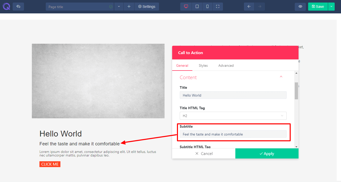
- Subtitle - Subtitle is similar to title field. You can set a subtitle under a title. You can set the subtitle size with HTML tag or you can change the title size from style tab.
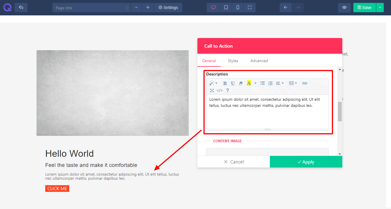
- Description - Description field is available if you want to insert some broad text or code or quote, whatever you like. You can write the text and edit with basic editing settings.
- Content Image- Content image field is available for you if you want to insert another image inside the content field. You can choose the image from media manager. You can add an alternate text which is optional and caption under the image which is optional too.
- Button - The button field is available for you where you can change button text, set button type and provide a link to it. Moreover you can set if you want to open the designated link in the same window or in a new one.
Styles Tab
 Styles tab will help you style up the call to action element. Here you’ll find seven editing fields : Content, Content Image, Title, Subtitle, Description, Button and Background. The editing options are provided according to each field.
- Height - The height option is provided for image. You can set a default height or just set to your accordance by scrolling the slider.
- Vertical Position - Vertical position option allows you to set the text fields in accordance with image. You can set your text title, subtitle and description in 3 positions of image - top, middle or bottom.
- Alignment - Alignment option will allow you to set all the fields of call to action in an align. You can set alignment in 3 positions - left, centre and right.
- Hover Animation - Hover animation feature is one of the most dynamic feature to go along with call to action element. You can add animation to it with the control of time delay.
- Content Image - Content image field will help you to add imagine inside the content along with a few controls. Including image width control, spacing between content image and text fields and border radius if you want a slight round border.
- Color - A few color picker is provided for different operations. You’ll find color setting options for text field, hovering text, background, setting a border color, button color, background overlay color etc.
- Font - Font option will help you to change the font of text. There are thousands of google font provided in a dropdown option. You can go for any of them. You can change the font of Title, subtitle, description and button text.
- Size - You can control the size of each text field. Just scroll the slider and set the size. Or just provide a digit value for it in the value box situated right next to the slider.
- Line Height - Line height option will help you to set the height of each and every line. This will insert space between the lines.
- Letter Spacing -Letter spacing option will help you to set space between each and every letter. This will help you to avoid the collision between the letters.
- Text Shadow - Text shadow effect will help you to add a shadow under the text to give a 3D look. Or you can blur the effect to show your text clearly.
- Border Width - Border width will help you to set the width of the border. You can set a fine line to it or just bold it out, whatever you want.
- Padding - In the content option and button option you’ll find a padding control option. This padding will control the inside space of the content field and button, in case you want to insert a few space.
- Button- This field will allow you to style up the button in your way. You can add an image to it or a solid color or just leave it with a plain text. You can provide a hover effect to it which gives a splendid look. You can set a border of the button along with a radius. You can even give your button a floating look by adding a box shadow effect to it.
Advanced Tab
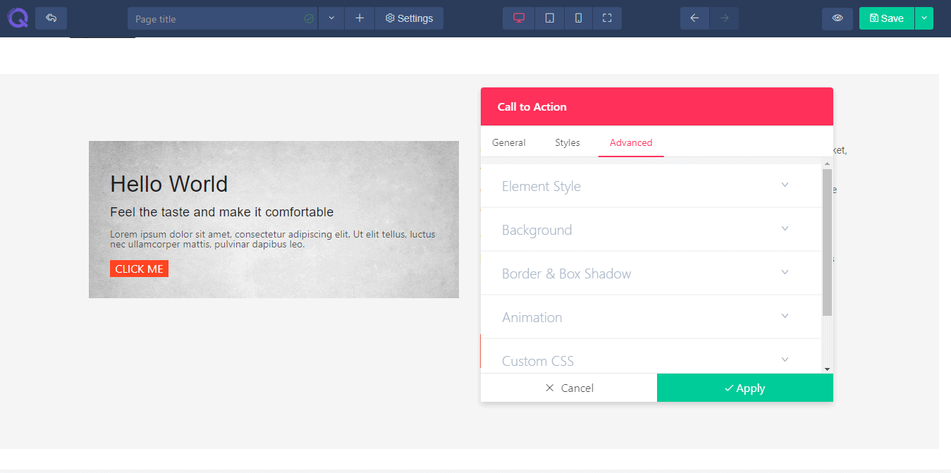 The advanced tab has the advanced level of settings. You can edit them if you find it necessary or just leave it just the way it is. Here you’ll find six fields : Element styles, Background, Border & Box Shadow, Animation, Custom CSS, and Identifier. These fields are described below in details.
- Element style - Here you’ll find the margin, padding and z-index option. Margin will help you to add space in accordance with page. Padding will help you to add space in accordance with the column. Z-index will work if you have 2 elements overlapping and you want to display the below element on top. Increment the z-index value and the below element will appear on top.
- Background - Background field will allow you to set a background in the column. You can set an image, a solid color or gradient effect of multiple colors.
- Border & Box Shadow - You can give a nice designed border and box shadow to your column. Set a border type, border radius if you want a bit of round shape in the corner. And box shadow effect will give your column a floating effect. You can set color to it, spread the color or add blur it.
- Animation - Animation field will allow you to add a transition effect to the element. Select the entrance animation from the given effects, set the delay time and enable the repeat option (this is optional).
- Custom CSS - This field is available only on PRO version If you are a developer then you can add CSS code of your own to the site by using this operation. Just write the code and click the apply button. You’re CSS code will be added to the content and it won't affect the existing css effect..
- Identifier - This field holds the CSS id of every specific content. This will help you to edit the CSS section if you want to bring any changes in css style.
Grow rapidly with our Joomla SEO service done by the veterans
With over 12 years of business and a vast array of Joomla templates and extensions, we know Joomla SEO better than anyone you could possiblly hire.
Improve my ranking